The home of architecture and design in the Asia-Pacific
Get the latest design news direct to your inbox!
Get the latest design news direct to your inbox!
Pantone points to an increased use of colour confidence in the home thanks to the alignment of fashion and interior palettes trends. Anna Flanders reports.
January 18th, 2012
Home furnishings are increasingly being linked to fashion trends, lead times between the two are narrowing and that’s driving the march of more colour into our interiors, according to Pantone’s vice-president of fashion, home and interiors Laurie Pressman.
“With so much colour in fashion right now, people are getting more comfortable with seeing and wearing it. So, as people continue to spend more time at home, this comfort has translated into colour being used as a way to liven up their living spaces,” she says.
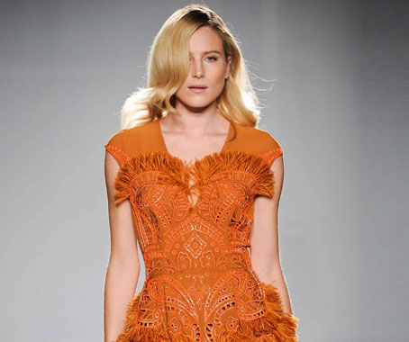
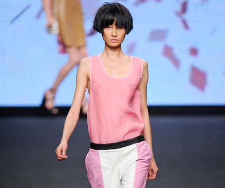
Dress by Matthew Williamson, from ’Vegetable Garden’ Stylesight runway analysis
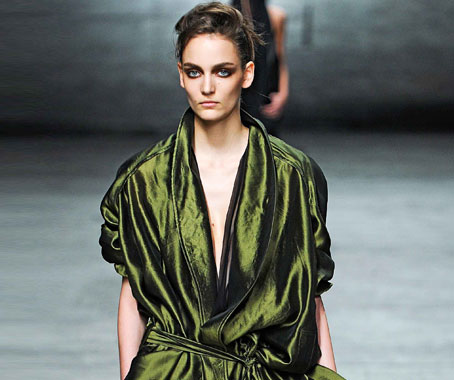
Clothing by Haider Ackermann, from ’Vegetable Garden’ Stylesight runway analysis
“We are seeing bolder shades and novel colour combinations showing up in a big way in some very unexpected places, like countertop appliances and seating.
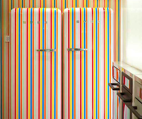
Fab fridges by Smeg, pictured in Smeg’s Melbourne showroom
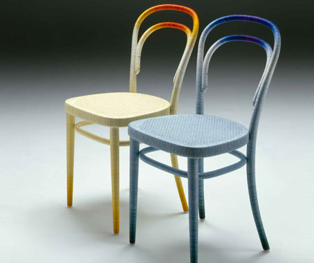
’Spool’ chairs by Keisuke Fujiwara, courtesy of the designer
“However, when it comes to higher ticket furniture or floor and window treatments, we are still seeing more neutral shades playing a big role. The key is to mix the playful with the practical.”
Pantone’s latest interior palettes range from a conservative, relaxing and quiet Nonchalance, which features pastel pinks, ethereal blues, soft egret white, taupe, gray and grape tones, to an attention-grabbing Back to the Fuschia colourway, which features reds, purples, pinks and a peridot.
Clothing by CNC Costume National, ’Bubblegum’ Stylesight Runway Flash Trend Alert
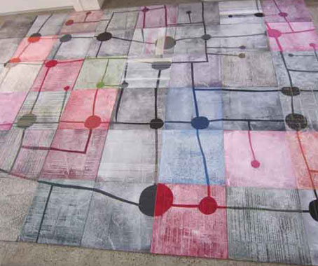
Carpet tiles by Julie Paterson, of Cloth, with InterfaceFLOR; The Project, SiD 2011, photo by Mark Gambino
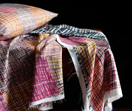
Fabric designs by Regina Wilson, photo by Andrew Cowan, courtesy of Koskela
“However, a stand-out trend is the continued international presence of metallics and woodgrains, used on their own or together.
“The natural warmth of the wood plays into our need for sturdiness, security and comfort while the shiny metallic finish speaks to technology and is futuristic. The combination of these two opposite materials serves as a balance, though its contemporary feeling seems better suited for a more modern space,” Laurie says.
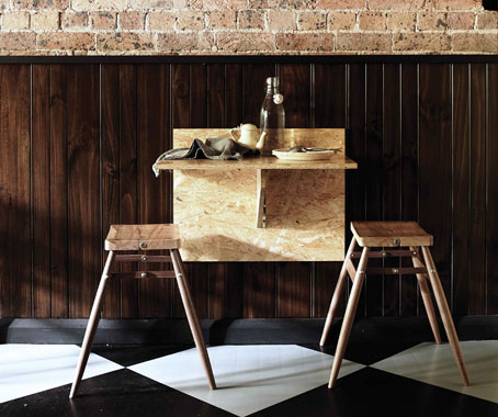
Image from Nomad by Sibella Court, published by Chronicle Books
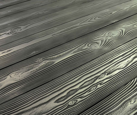
Ingrain Pewter by Axolotl
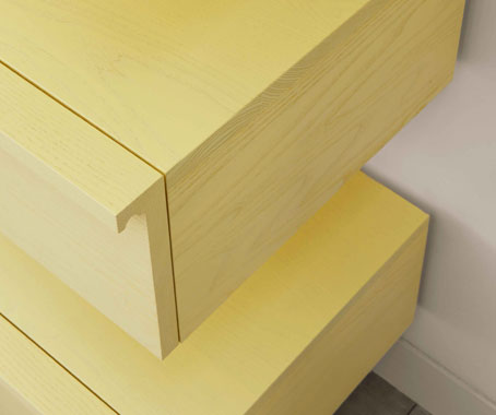
Wall drawers by Bassam Fellows, available in Australia through Living Edge
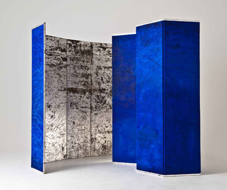
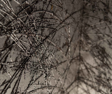
Japanese folding screen, and detail, by Maio Motoko, recently on show at Lesley Kehoe Galleries
Pantone discerns its trend colours, combinations and stylings through observations of the natural world and influences that will impact the world in the future, such as social issues, the economy, technology, lifestyles and playstyles, diversions, entertainments and the needs, moods, fantasies and aspirations of consumers.
Hero image: Wall panels by FORM US WITH LOVE and TRAÜLLIT, available in Australia through Fred, photo by Jonas Lindstrom.
This story is courtesy of the DQ blog. For more on colour and directional trends, pick up issue 44 of DQ – and visit designquarterly.com.au
INDESIGN is on instagram
Follow @indesignlive
A searchable and comprehensive guide for specifying leading products and their suppliers
Keep up to date with the latest and greatest from our industry BFF's!
The internet never sleeps! Here's the stuff you might have missed