The home of architecture and design in the Asia-Pacific
Get the latest design news direct to your inbox!
Get the latest design news direct to your inbox!
As an antidote to modern-day stresses, pastels are relaxing and relieving, capturing those escapist holiday vibes.


October 9th, 2018
Pastel colours come in and out of fashion. They were hot in the 1950s when people decked out their houses in pastel-coloured hues, symbolic of the prosperity and optimism of the era. They had a moment in the 1980s with shows like Miami Vice. And they’ve made a return in recent years with the popularity of Millennial pink and Pantone’s Color of the Year 2016, Rose Quartz and Serenity. The soft, sweet hues are seen as an antidote to the stress of modern-day life – much like a vacation.

Which is why pastel colours are a fitting choice for the new Vacation café in Melbourne, designed by Therefore. Vacations are often about relaxing and escapism, and the owners of Vacation (a café and speciality coffee brand) take a more relaxed approach to coffee. “Conceptually, Vacation is to be considered more like a lifestyle brand than a coffee company. The clients see their approach as novel, and the interior aims to reflect this notion of originality,” says Alex Lake, director of Therefore.

“The palette, furnishings and details all pursue the inventive, original, and abstracted. There is also a literal nod to the name Vacation, with the design reflecting a sense of escapism and delight.”
Avoiding obvious café tropes, Alex used a whimsical pastel colour palette, punches of geometric pattern and custom and designer furniture and lighting. He took cues from the forms within the building and the personality of the Vacation brand identity created by The Company You Keep. “There are still references to the format of traditional espresso bars, such as tiled mosaic floors and communal furniture, but each has been abstracted to create something new,” Alex explains.
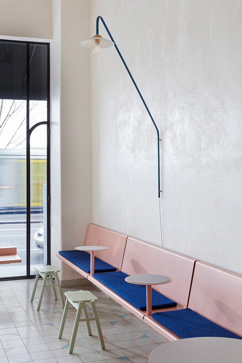
Removing the existing low ceilings revealed the internal height of the heritage building, creating a light and lofty space. An overhead barrel-vault ceiling covers an existing stairwell and provides a compressed spatial experience at the rear of the café. This curve is mimicked in the arched doorways in the centre of the plan and in the rounded corners of the Millennial-pink-coloured bar.
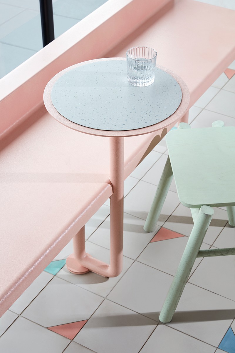
The soft-pink hue continues with a standing window bar with horizontal posts holding newspapers and magazines, and custom steel banquette seating with built-in side tables around the perimeter of the café. Pastel-green moveable stools allow for flexibility and circulation, and a large Muller van Severen wall lamp provides illumination.
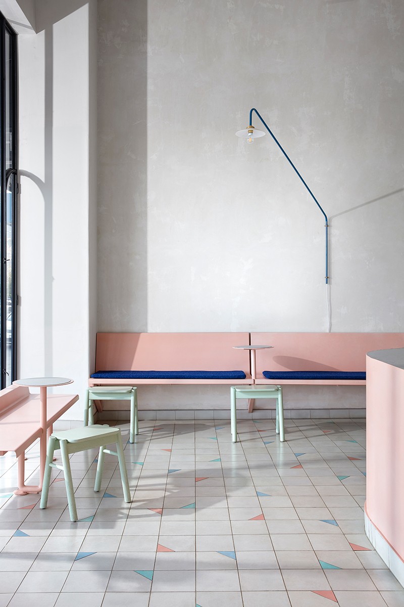
Alex selected finishes with lustre, texture and colour. Hand-cut encaustic floor tiles with French blue, Miami green and soft pink triangular inlays abstract the idea of a traditional tiled floor. Vinyl flooring on table and bar tops is an uncommon application of a common material, as is steel plate joinery on drawers, cupboard, joinery units and shelving.
Pastels lighten the mood in Vacation, reflecting the owners’ laid-back approach to speciality coffee. They’re relaxed and relieving and perfect for capturing those escapist holiday vibes.
INDESIGN is on instagram
Follow @indesignlive
A searchable and comprehensive guide for specifying leading products and their suppliers
Keep up to date with the latest and greatest from our industry BFF's!
The internet never sleeps! Here's the stuff you might have missed