The home of architecture and design in the Asia-Pacific
Get the latest design news direct to your inbox!
Get the latest design news direct to your inbox!
Designers are all across the idea of creating experiences. However, more often than not it’s left for retail and hospitality projects, but what about the workplace? The team at Hot Black has considered experiential design for the workplace fit-out of superfund HESTA.


Employees today are identifying with where they work beyond the name and standing of a business or organisation in the marketplace, according to Hot Black design director, Sophie Safrin. The Melbourne-based interior design consultancy is responding by advocating the treatment of brand “in a more diffused way” when translating their clients’ corporate identity within built environments and conceptual design for workplace environments.
Who people choose to work for is not necessarily driven by getting a particular businesses’ name on a CV anymore, “it’s about fulfilling things like flexible work environments, working with fantastic professionals, healthy working and being in an environment that’s supportive of innovation and change,” Safrin asserts.
Challenging the usual first encounter within a workplace of the reception desk, big anchor signage, visual branding with mission statements and the like, is Hot Black’s 1500-square-metre workspace design and fit-out for HESTA. Hot Black’s preliminary workplace analysis sought to better discern staff requirements, office culture and brand values of the national industry fund for the health and community services sector.
In particular, opportunities to implement corporate identity were explored “that would enable staff and visitors to appreciate the brand – beyond the previous prominent use of purple and green visual graphics,” says Safrin.
The workspace’s unusual hexagonal envelope within an iconic Melbourne CBD building presented its share of design challenges. Conversely, the single-level office offered the potential to design spaces that flowed, addressed the client’s key priority for better staff connectivity and capitalised on natural light, views and net lettable area.” Architecturally it was important to develop some organic elements through the space and promote a sense of fluidity throughout,” Safrin says.
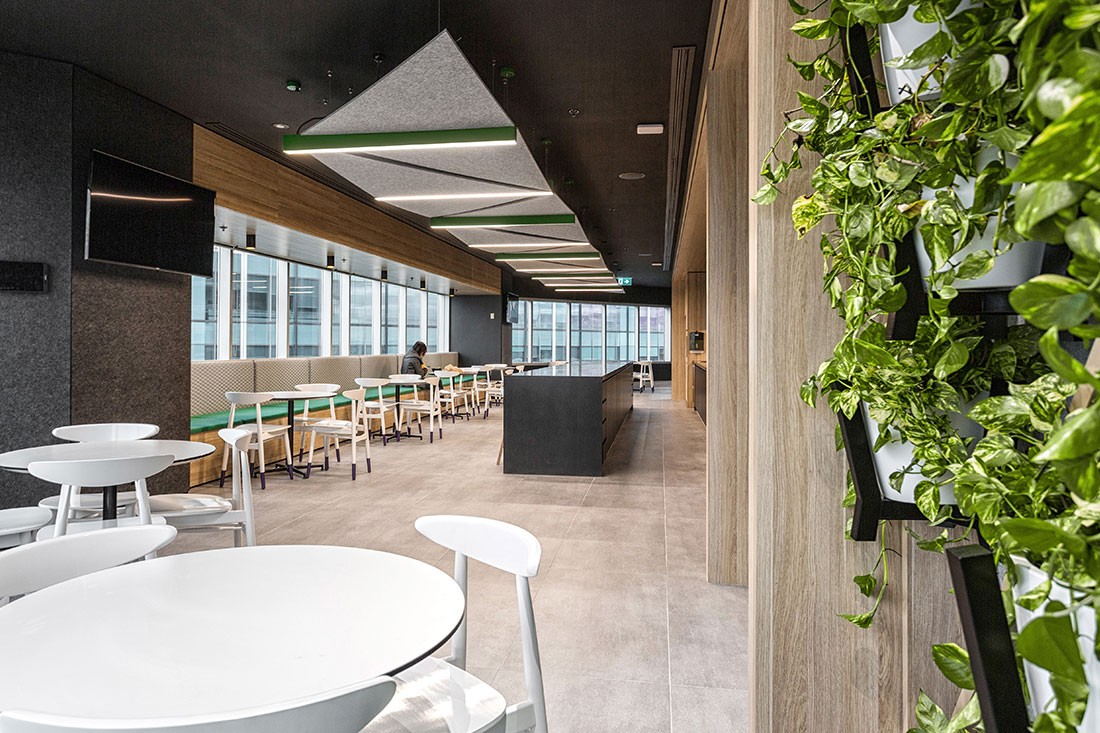
The need for a delineated sense of hierarchy within the space with respect to work types and work zones was offset by a series of cellular meeting spaces and informal settings. Functionally, the collaborative zones are designed to segment clusters of individual workstations, encourage impromptu conversations and avoid the development of “executive silos”.
It was a unique tenancy that invited creative geometrical treatment by Hot Black. “Visually we stripped away any references to the organisation’s branding and instead looked at how we could represent the branding themes as geometry and pieces to a puzzle.”
The underlying idea of a ‘kit of parts’ acknowledges the valued role that each staff member plays and the organisation’s function in providing services to an industry sector concerned with supporting people.
Having people engage with the organisation from a material context replaced previous emphasis on visual branding in front-of-house and beyond. “We looked at the nature of solidity and architecturally how we could represent that through the use of materials that had a tactile feel,” explains Safrin.
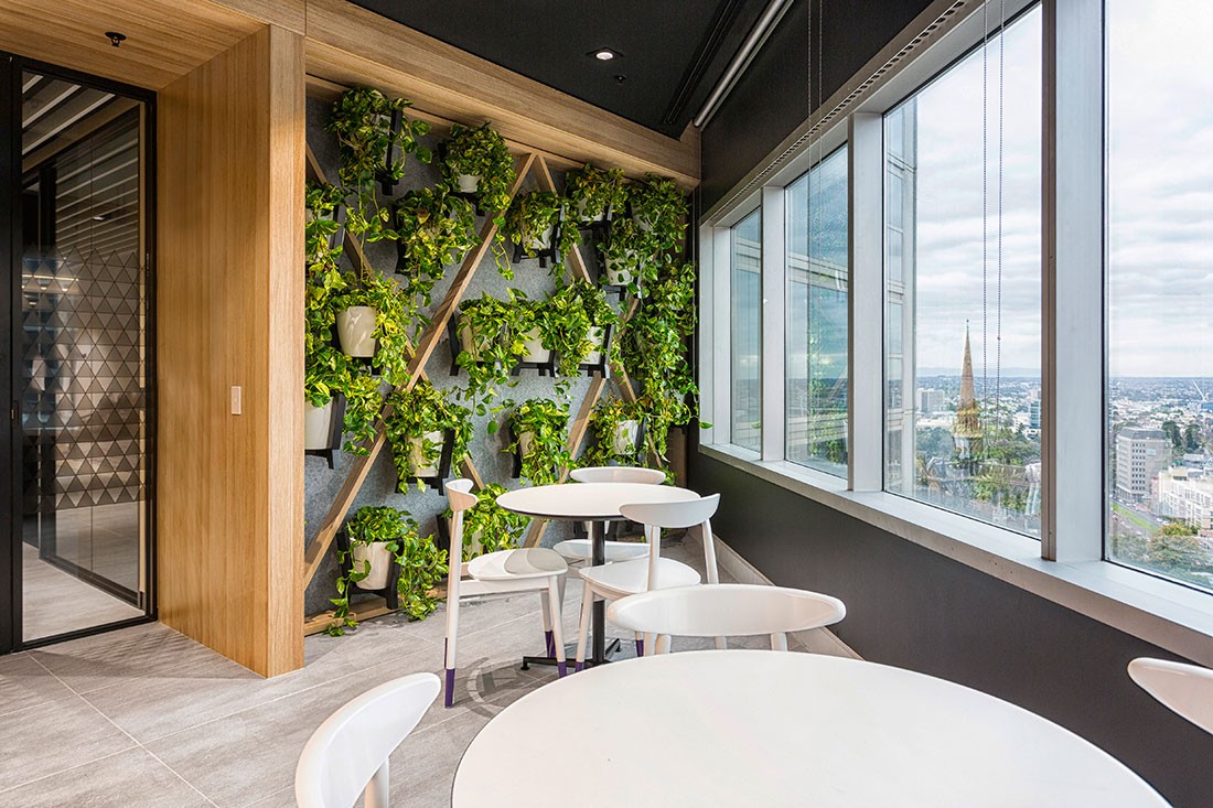
A focus on textures encompassed the extensive use of timber that was applied to main circulation paths, areas of staff congregation, ceiling treatments, wall finishes and cabinetry detailing “to create warm and welcoming zones amidst a quite understated palette.”
Consistent with Hot Black’s philosophy that brands needn’t be in-your-face to be effectively communicated, HESTA’s corporate purple is selectively applied to elements such as light fittings, seating upholstery and as socks on Something Beginning With’s Ren chairs.
The greater emphasis placed on leveraging the corporate identity’s green than had previously been the case is apparent in sculptural plantings, light fittings and various woven and acoustic materials. Chosen for its calming influence and sense of vitality, the colour provided another opportunity to draw connection to HESTA’s commitment to health.
This approach of interpreting the brand in a less defined and less structured way throughout a workplace, is one that Safrin believes can open a company up to being an ‘employer of choice’ and that can assist in appealing to a younger employee demographic.
In any design environment typology, “the design details and the work we do within the spatial context should enable visitors and occupiers to be able to touch and feel the brand through an architectural interpretation,” she says. The creation of talking points or reflecting on details that are synonymous with a brand’s identity and mission statements are two such examples.
And it’s not just the benefit of a brand becoming memorable, Safrin stresses, experiential design – especially in hospitality and retail spaces – allows customers to experience a more meaningful connection with the brand.
Read our 5 minutes with Hot Black’s Sophie Safrin here. This article originally appeared in issue #60 of Design Quarterly.
INDESIGN is on instagram
Follow @indesignlive
A searchable and comprehensive guide for specifying leading products and their suppliers
Keep up to date with the latest and greatest from our industry BFF's!
The internet never sleeps! Here's the stuff you might have missed