The home of architecture and design in the Asia-Pacific
Get the latest design news direct to your inbox!
Get the latest design news direct to your inbox!
How do you add emphasis and a point of difference when working with a cookie-cutter building shell? Space Popular created a monochrome backdrop to let a collection of custom furniture visually punch through.

Because of Thailand’s limited geographic sprawl, the vast majority of its shopfronts are designed with a cookie-cutter approach to achieve one defining feature – utility. Here, designers are faced with a pretty big challenge to inject a measure of unpredictability into what are otherwise very predictable spaces.
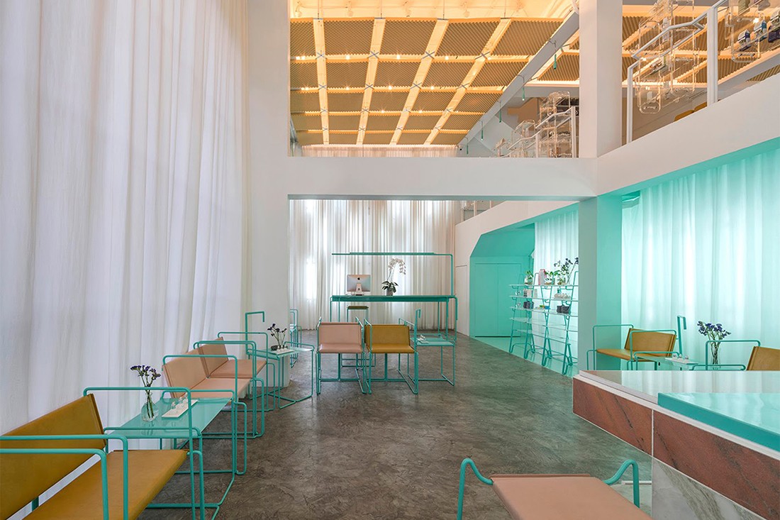
This was the brief given to local design firm Space Popular in its reimagining of Bangkok’s Infinity Spa, spread across two traditional Thai shophouses. “These concrete shells all share the same layout, sizes, proportions and materials; being the most generic spatial typology in the city where all kinds of programs are stuffed,” say Space Popular architects Lara Lesmes and Fredrik Hellberg.

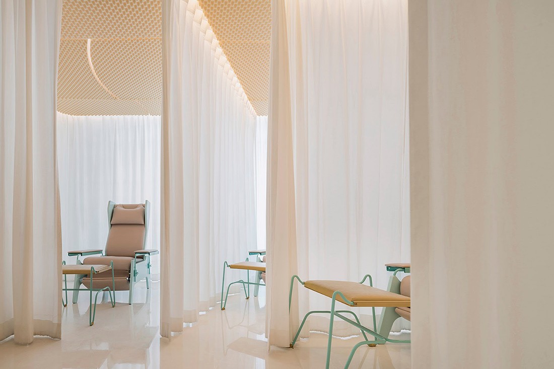
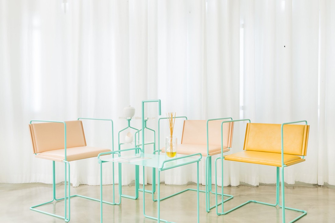
“Besides the practical issues that this typology poses, experientially the aim was to visually eliminate the concrete shell with the use of few materials – paint, light and textiles – and concentrate the attention on the nearly 20 custom-designed furniture pieces that would communicate purpose in an otherwise muted space.”
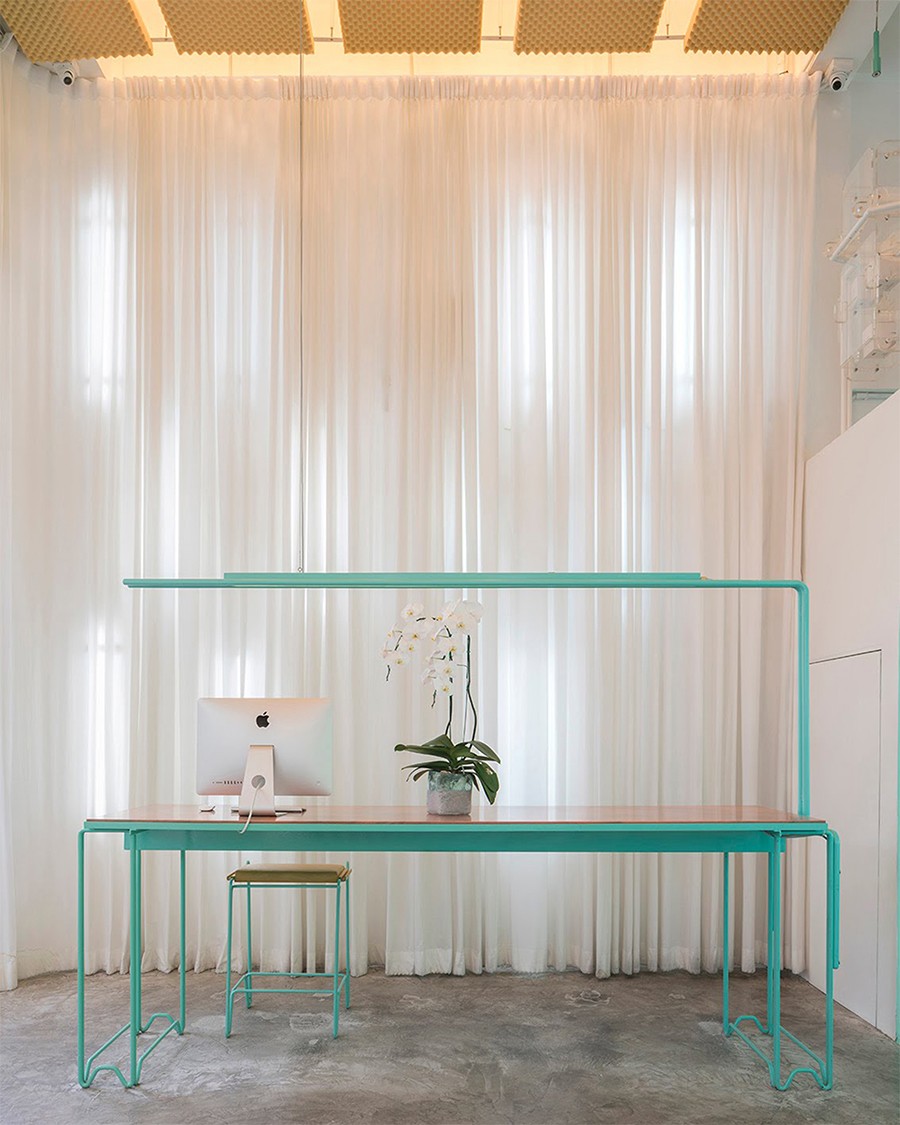
Sections of bright turquoise paintwork and matching furniture, for example, offset the otherwise white-washed treatment rooms. These rooms are draped with back-lit curtains – providing a neutral backdrop for the brightly coloured furniture.
As well as designing the interior, Space Popular also created bespoke furniture, including manicurists’ tables, adjustable massage chairs and shelving with niches designed to hold specific nail polish bottles.
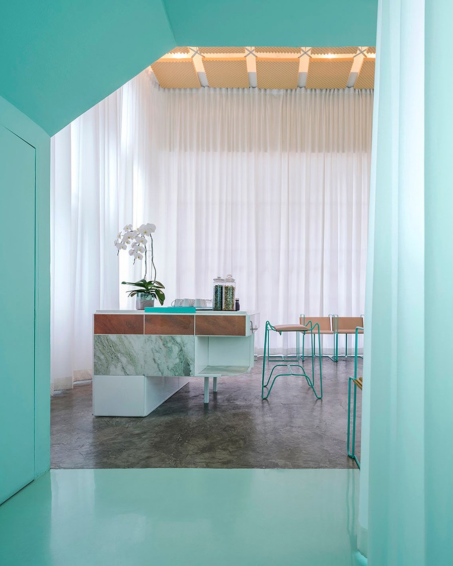
“The lack of architectural features lets the eye travel from object to object undistracted. The furniture pieces are in extreme contrast with the background: while the space is monochrome, white, soft and textured, the objects feature a high saturation polychromy with smooth materials such as metal, marble and leather.
Together they constitute a collective identity through their forms and colours, constructing the identity of the space while addressing very important and distinct issues of comfort and ergonomics,” say Lesmes and Hellberg.
–
See some more retail design inspiration. And join our mailing list to always be inspired.
INDESIGN is on instagram
Follow @indesignlive
A searchable and comprehensive guide for specifying leading products and their suppliers
Keep up to date with the latest and greatest from our industry BFF's!
The internet never sleeps! Here's the stuff you might have missed