The home of architecture and design in the Asia-Pacific

Get the latest design news direct to your inbox!

Montana

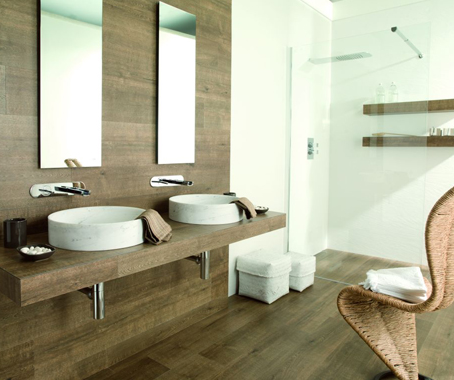
Montana is the latest finish in the innovative PAR-KER range from Spanish manufacturer, Porcelanosa Group.

Montana


BY

September 16th, 2011


This season, their Venis factory has released a range of timber-look porcelain tiles that soften any space with their muted tones and soft, natural grain.
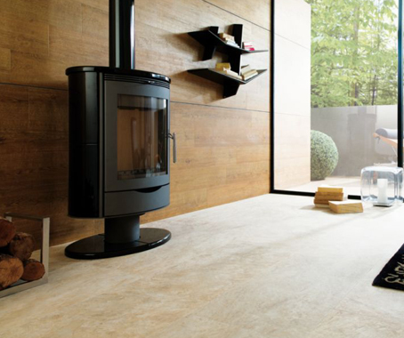
The Montana series is available in eight colours from cool whites through soft greys and warm honeys: Blank, Taupe, Wild, Cottage, Noce, Doussie and Ash.

The PAR-KER range of tiles allows free use of timber throughout internal and external areas, without the drawbacks of the raw material. Unlike timber, PAR-KER requires no felling of trees and no ongoing maintenance in terms of sanding and resealing. It is non-porous, UV resistant and hard wearing.
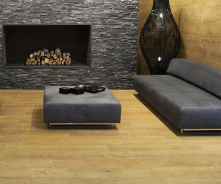
Commercially, domestically, inside and out, PAR-KER offers the look and feel of timber but all the benefits of tile.

The Montana range has been produced using the Porcelanosa Group’s inkjet technology. This allows the range to express true to form notches, grains and texture, just as real timber would. This process also ensures a non-repetitive print, so the product can be used with the assurance of “natural movement” throughout floors and walls.
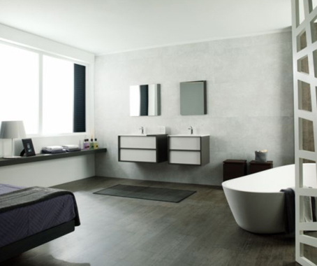
Montana offers a stunning colour pallet, the subtle beauty of timber and all the confidence of a technical porcelain product.

Earp Bros
earp.com.au
INDESIGN is on instagram

Follow @indesignlive


The Indesign Collection

A searchable and comprehensive guide for specifying leading products and their suppliers


Indesign Our Partners

Keep up to date with the latest and greatest from our industry BFF's!

A collective vision: The whimsical workplace with Intuit, COX and MillerKnoll

A collective vision: The whimsical workplace with Intuit, COX and MillerKnoll

Stepping into Intuit’s Sydney workplace certainly doesn’t feel like walking into an office. Why? In this film, we discover that, when joy takes precedence as a design driver, even a high-performing commercial CBD headquarters can feel like an intuitive wonderland that invites employees to choose their own adventure.

From canvas to commercial interiors: Woven Image collaborates with Ben Goss

From canvas to commercial interiors: Woven Image collaborates with Ben Goss

As Woven Image celebrates 40 years, it introduces a new collection developed in collaboration with Australian artist Ben Goss, inspired by his original artwork Where the Kookaburra Sits into a vibrant collection of digitally printed EchoPanel® murals and patterns.

Dale O’Brien on sitting easy with Herman Miller’s Verus Chair

Dale O’Brien on sitting easy with Herman Miller’s Verus Chair

In the first instalment of our three-part series exploring what it means to sit your best, we pose the question to Gray Puksand’s Dale O’Brien, who discusses the importance of ease and majority rule when it comes to sitting and reveals why specifying a task chair is not unlike choosing a Volvo.

Dipped in integrity: The profound depth of Aeron Chair’s extended palette

Dipped in integrity: The profound depth of Aeron Chair’s extended palette

Aeron Chair’s new shades, Nightfall and Jasper, arrive with a sense of quiet cohesion – no bells and whistles, no loud technicolour; just two timeless, perfectly versatile near-neutrals. But the new hues aren’t just about colour – and their significance is much more profound than their surface-level subtlety might suggest.

Related Stories


While you were sleeping

The internet never sleeps! Here's the stuff you might have missed