The home of architecture and design in the Asia-Pacific
Get the latest design news direct to your inbox!
Get the latest design news direct to your inbox!
Type designer Vincent Chan, who delivered a keynote speech with the Powerhouse as part of Sydney Design Week, tells us about the history and importance of this niche profession.
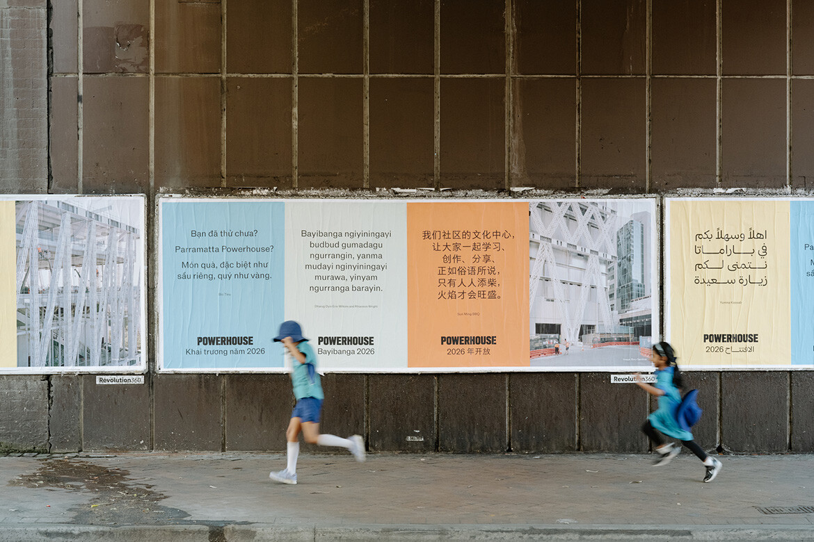
Photo by Hamish McIntosh.

September 29th, 2025
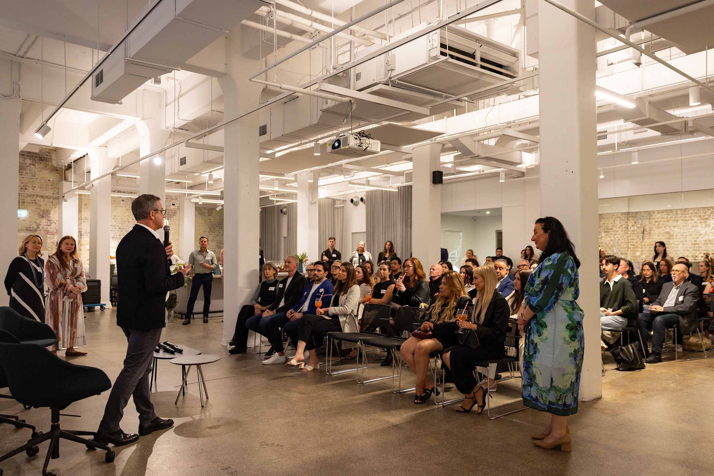
Sydney Design Week 2025 has just concluded, with Powerhouse once again bringing a highly varied group of speakers together in the city for a range of events. Vincent Chan, usually based in Melbourne, is one such inclusion. As a type designer, he occupies a rather unique position in the wider design industry. It’s a rare professional specialisation, but one that carries hidden power – “you might not think twice about [the typeface] that you read on your phone first thing every morning… there’s something lovely about the anonymity around that,” says Chan. “I love how type can sit there, do its job and then disappear.”
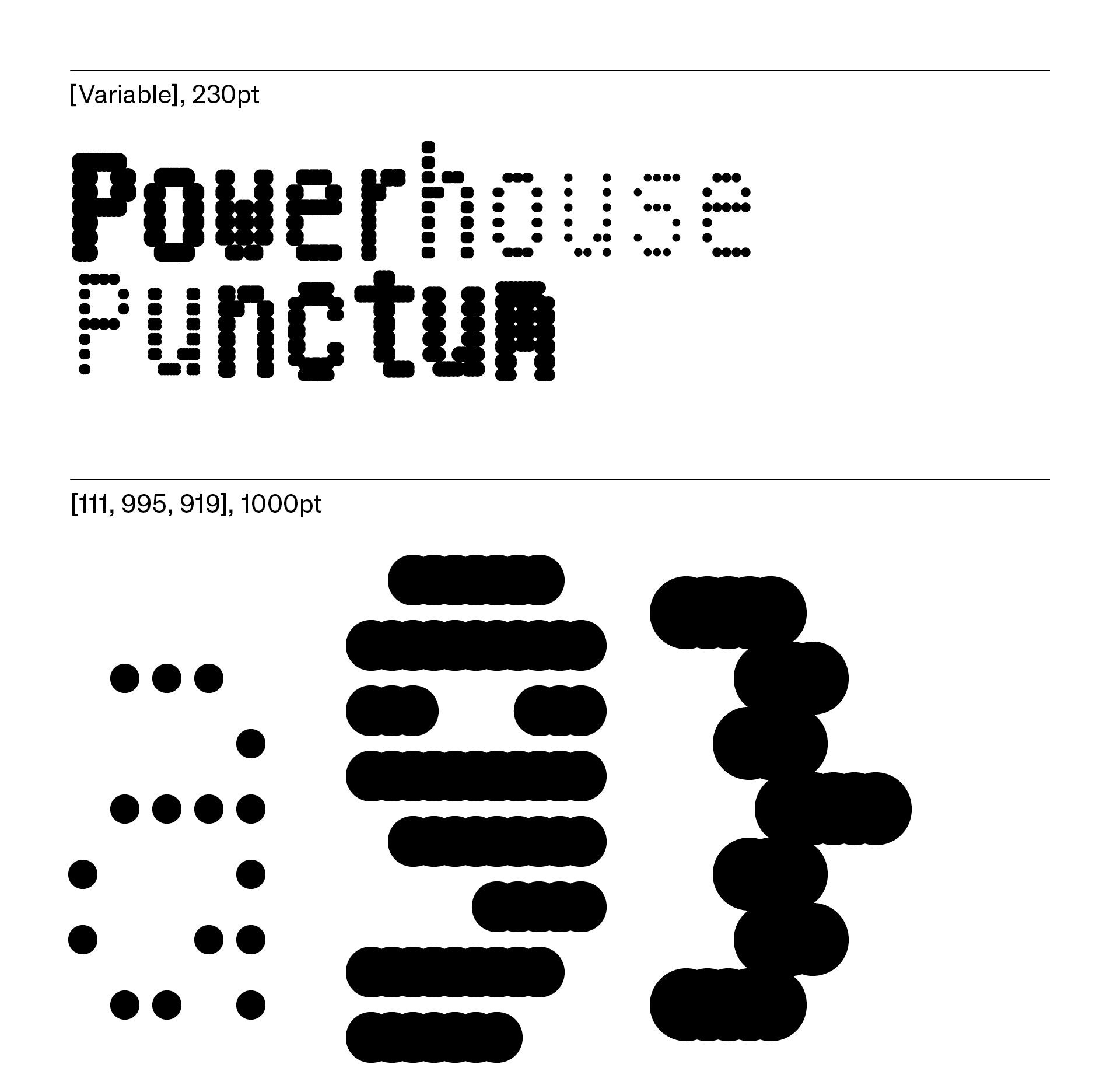
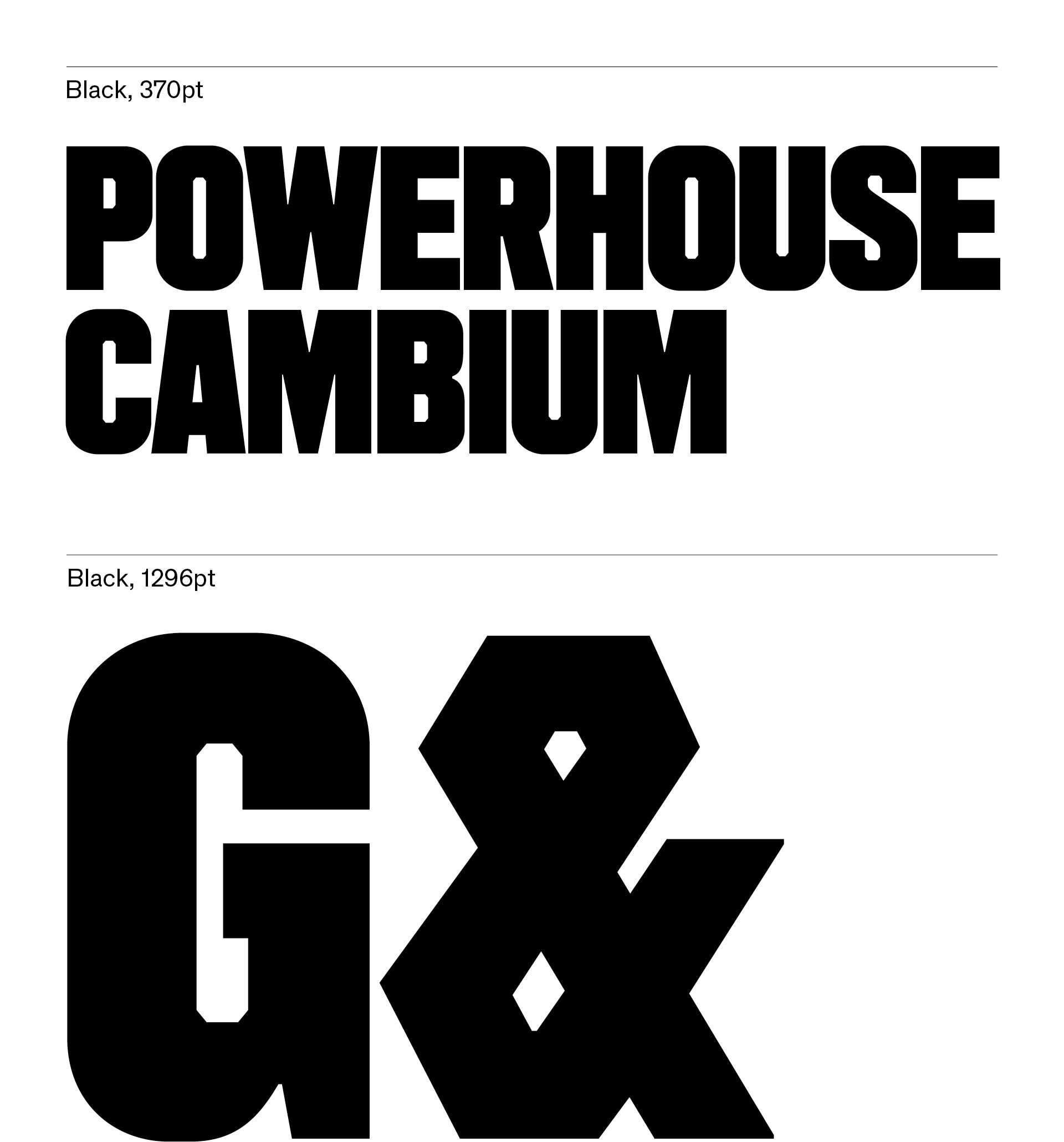
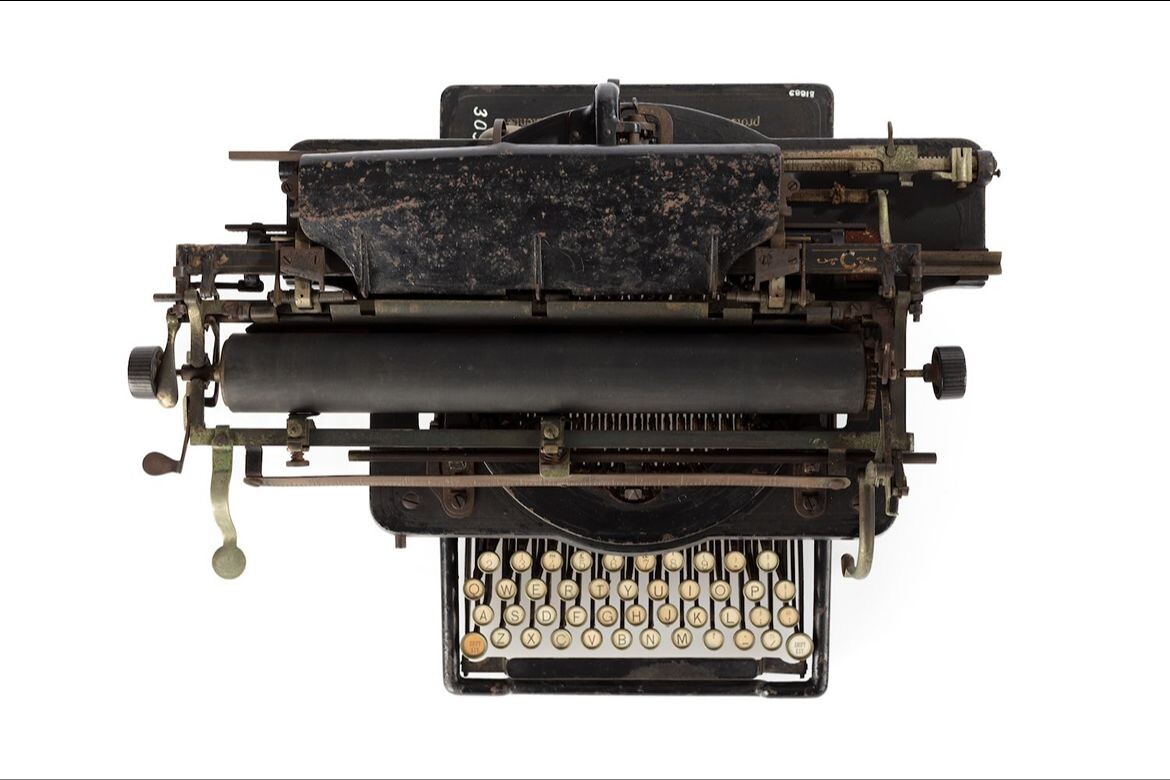
Chan delivered a keynote speech, followed by a panel discussion, in Parramatta with the Powerhouse Museum during Sydney Design Week. “It’s about a project that was initiated in 2021 – I was part of a revitalisation of the identity of the Powerhouse with Studio Ongarato as a typeface designer… specifically with the remit to design three fonts that would somehow respond to the Powerhouse’s collection. I spent some time in the bowels of the archive, mining their incredible collection of industrial objects, typwriters, old signs, calculators [and so on],” he explains.

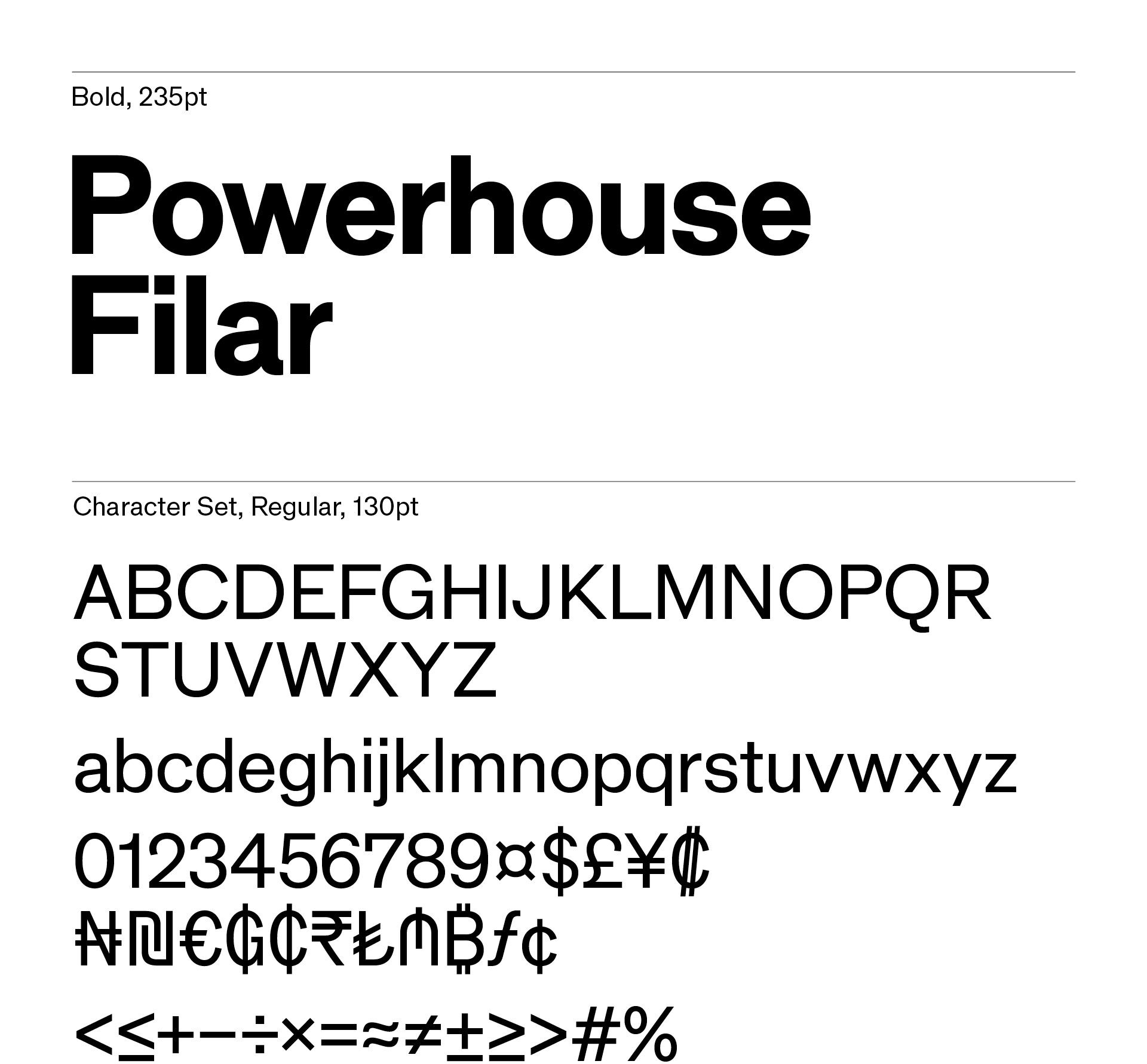
The results can be seen in the Powerhouse’s distinctive brand today through the three fonts: Filar, Punctum and Cambium. The way in which Chan describes the task as an act of translation gives some clue as to the wider design implications of type work. The creations are “raw material” that can then be taken and used by graphic designers and others as they integrate parts into a designed whole.
Powerhouse also specified some of the output as open source, and “not a lot of institutions have this particular remit [of] making their brand typeface available to anyone, so I really love that brief,” notes Chan. “It’s a nice salve to protectionism in. terms of institutional work, and I’m here to tell that story.”
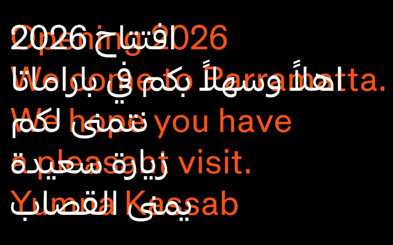
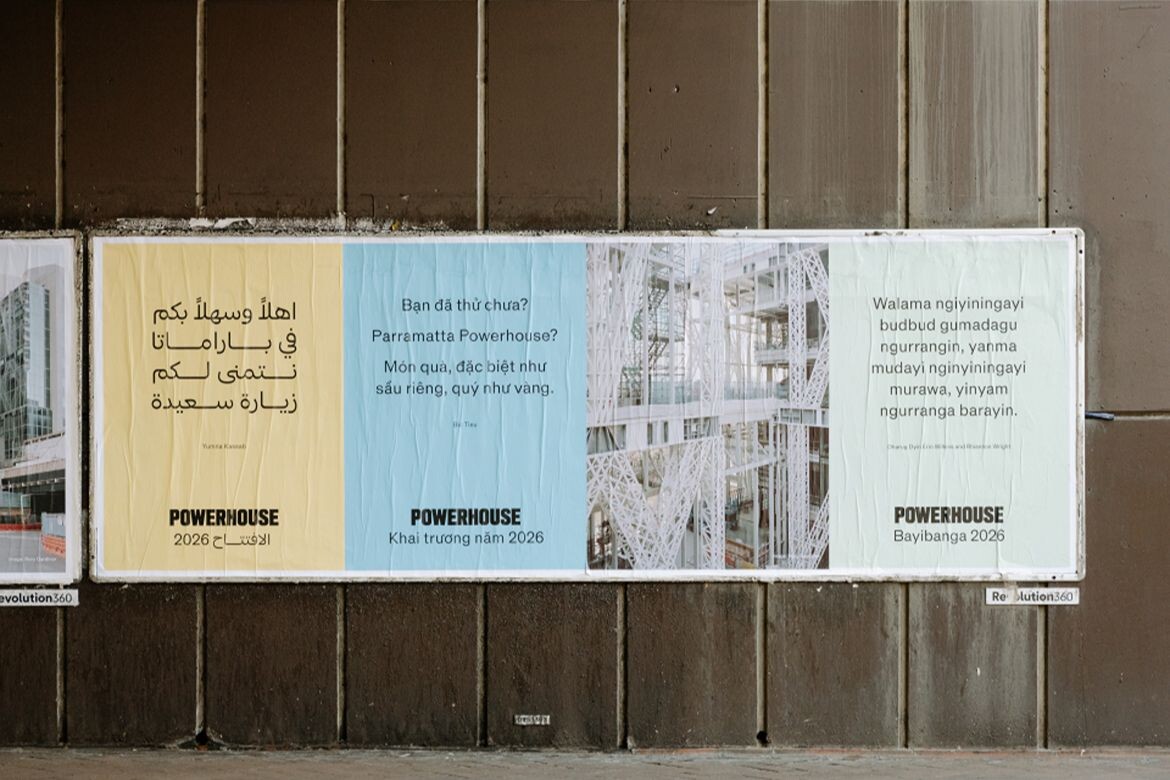
More recently, Chan’s work with the Powerhouse has included a program focused on multilingual campaign extending to Arabic, simplified Chinese, Vietnamese and Dharug. He explains how the program was a collaboration with writers focused on the distinct multicultural identity of Parramatta: “my job was essentially to collaborate with type designers to realise those other scripts.”
Interestingly, Chan’s work here has been explicitly focused on graphics and form, as he does not read Arabic or simplified Chinese. He collaborated with Khajag Apelion and Wei Huang respectively for these parts of the process, again underlining the collaborative and design-based nature of the work. “I can speak purely formally, but I’m very much leaning on their suggestions,” he adds.
Related: The architects behind Powerhouse Parramatta
Perhaps all too easily overlooked, type design has been a ubiquitous part of daily life since the industrial revolution, with adjacent arts such as calligraphy obviously having long, rich histories too. “What I love about type design, as well as graphic design, is that it can traverse the worlds of design high and low… I think of it in an industrial design paradigm, but I do think it also has the ability to be front and centre at times – to call attention to itself,” explains Chan. “But more often than not, the type that I draw sits in the background [and] communicates itself in a much more subliminal way.”
With only a handful of practitioners making a living solely from type design in Australia today, Sydney Design Week is providing a timely prompt for all of us in the design world to reflect on the quiet, ever-present power and presence of it in our lives today.
Sydney Design Week
powerhouse.com.au
INDESIGN is on instagram
Follow @indesignlive
A searchable and comprehensive guide for specifying leading products and their suppliers
Keep up to date with the latest and greatest from our industry BFF's!
The internet never sleeps! Here's the stuff you might have missed