The home of architecture and design in the Asia-Pacific
Get the latest design news direct to your inbox!
Get the latest design news direct to your inbox!
The blogosphere is buzzing with the work of a recent British Graphic Design graduate.
July 28th, 2010
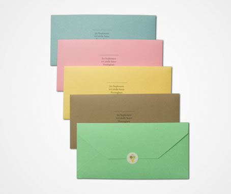
Joe Stephenson may have only just graduated in Graphic Design from Nottingham Trent University, but the British designer is already garnering praise for his unique branding work.
With internships at Interbrand and JKR already under his belt, Stephenson is set to start at the London office of global brand and design consultancy Elmwood.
What made you choose to go into branding?
I love branding, but I never had a great urge to go into it – I think that is good because it means I come at it from a different angle, and I think it’s important to have a range of work in your portfolio that shows you can think outside the world of branding.
Describe your design aesthetic.
Precise and clean, yet imaginative and occasionally witty.
How do you approach each of your projects?
With no idea of what the final outcome is going to look like. I think that’s important when trying to interpret a brief – to let whatever you find out about the relevant subject matter stimulate the generation of ideas. Once you have a good idea, the appropriate visual styling becomes apparent.
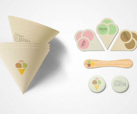
What has been your favourite project so far?
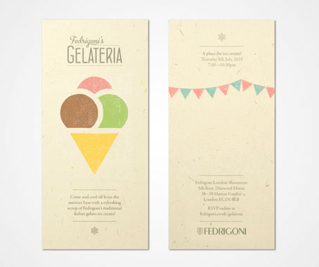
Fedrigoni’s Gelateria. Fedrigoni are an Italian paper merchants and the brief was to promote their London Paper Showroom to designers.
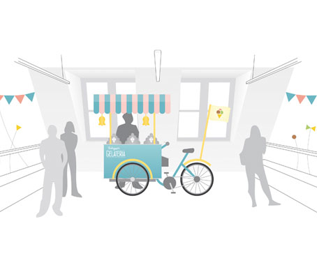
My idea was to hold a summer evening event in the Fedrigoni London Showroom, where a classic Italian street-vending cart would serve gelato to guests as they browse and collect paper samples, enjoy Italian street music and learn about the showroom and its various uses.
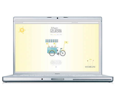
The first mobile gelato cart was developed near Verona in northern Italy, where Fedrigoni was established. All promotional material, ephemera and showroom decorations were made from the Fedrigoni Woodstock paper range.
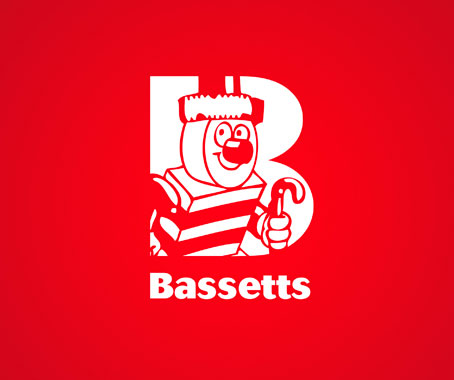
Could you tell us a little bit about the Bassetts Allsorts re-branding?
Bassetts Allsorts was a re-branding project I worked on during one of my placements at London branding and packaging agency JKR.
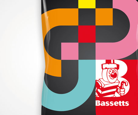
I created the new ’B-window’ logo, updating the iconic Bertie Bassett whilst keeping him central to the brand. The geometric pattern on the packs create a flexible architecture, taking inspiration from the vivid colours, tastes and shapes of the Allsorts sweets themselves.
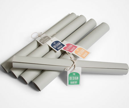
How about The Design Bakery project?
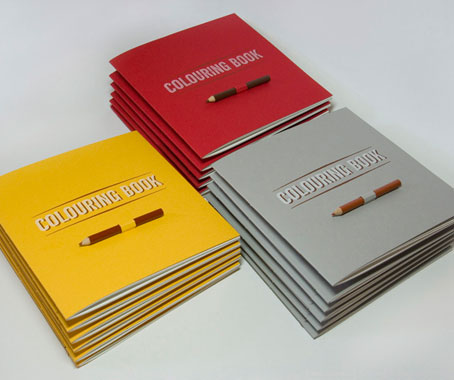
The Design Bakery is an on-going collaborative project with Toby Edwards and Luke Elliott, after initially being a fund-raising project for the Nottingham Trent University Graphic Design Degree Show (111) identity and promotional material (also designed by myself, Toby and Luke).
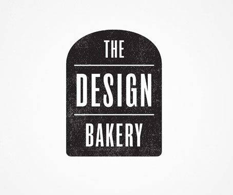
It came about through a common love of all things bread. After an amusing discussion about how many variations of bread there are, The Design Bakery was established.
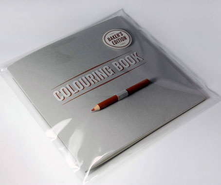
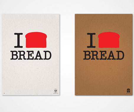
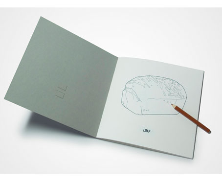
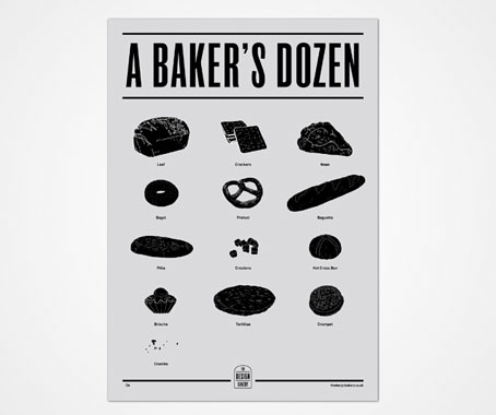
We silkscreen-printed limited edition posters (I Loaf [White] Bread, I Loaf [Brown] Bread and A Baker’s Dozen). A ’Baker’s Edition’ colouring book was produced, with hand-drawn illustrations, a hand-bound silkscreen-printed cover and a UV-varnished, embossed ’Baker’s Edition’ sticker.
Supplied with one brown pencil to colour in each of the thirteen bread illustrations (including ’Loaf’, ’Naan’, ’Pitta’ and ’Crumbs’).
We’re hoping to evolve The Design Bakery into a blog, delivering a fresh batch of design, straight from the oven, every day.
What can we expect from you in the near future?
Somewhere down the line I plan to start up a studio with Toby Edwards and Luke Elliott (the two other guys from The Design Bakery), as we get on and work so well together it would be a shame not to!
We won a pitch to design NTU’s Graphic Design Degree Show identity and all promotional material and were very pleased with the outcome.
But for now I am really looking forward to working in London, and to a holiday with my girlfriend before I start!
Joe Stephenson
joestephenson.co.uk
INDESIGN is on instagram
Follow @indesignlive
A searchable and comprehensive guide for specifying leading products and their suppliers
Keep up to date with the latest and greatest from our industry BFF's!
The internet never sleeps! Here's the stuff you might have missed