The home of architecture and design in the Asia-Pacific
Get the latest design news direct to your inbox!
Get the latest design news direct to your inbox!
Carole Whiting is an artistic whirlwind of creativity, and the interiors she’s crafted have to be seen to be believed.

Peace project, photography by Sharyn Cairns.

November 14th, 2022
With the eye and ability of a consummate professional it is a momentary surprise to learn that Carole Whiting has only been in the industry ten years. Six in the current iteration and the four preceding in a joint venture with her former partner, Steven Whiting (Whiting Architects). That said, her previous career in advertising production brings a cinematic lens to the way she shapes an interior.
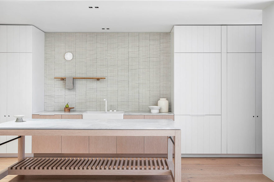
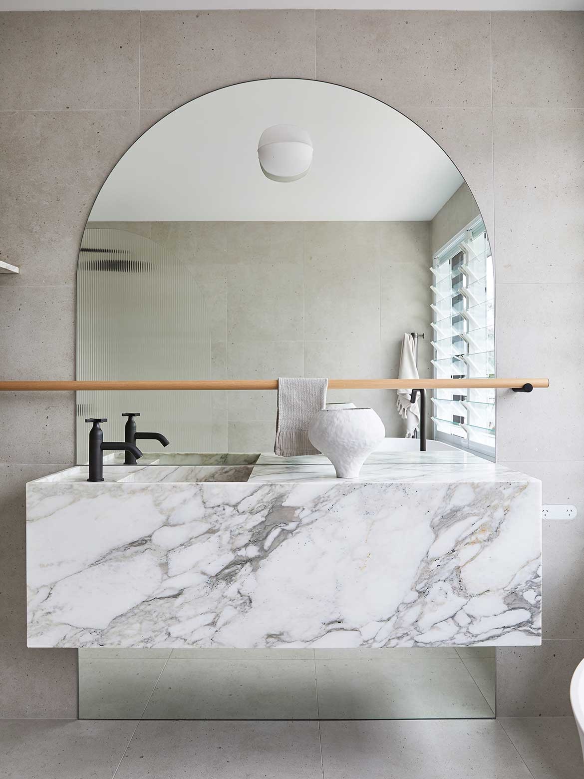
That and her innate appreciation for the handcrafted, meticulously detailed and physical sensibility of natural materials, which are allowed centre stage in her projects.
At six years, her practice has reached a size that suits her well, with architects and contractors brought in as projects demand: “We’re four, and that’s my sweet spot. I’ve been up and I’ve been down from that. And that’s my sweet spot” says Whiting who works Australia wide across residential, commercial and multi res.
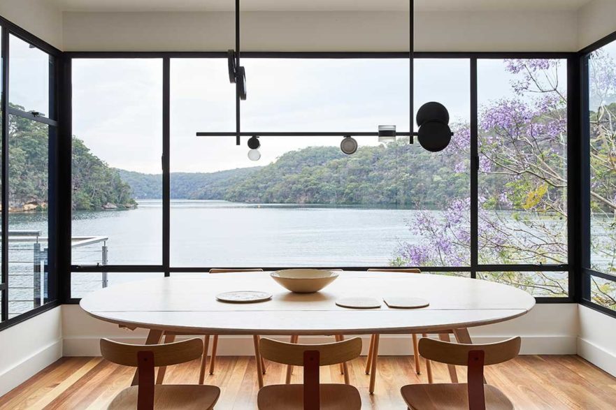
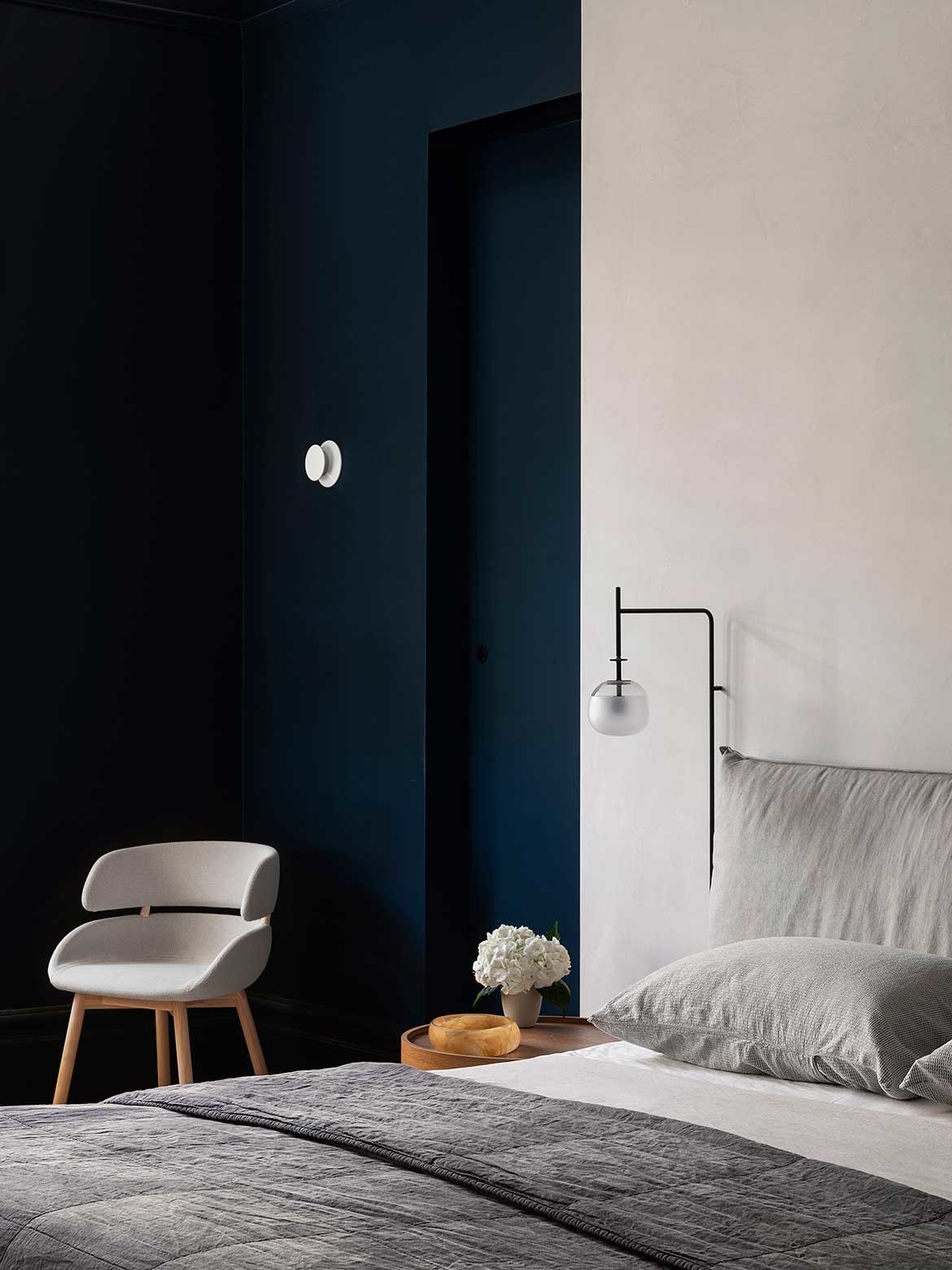
Her work for V-ZUG has been ongoing with the brands aesthetic of dark expanses framing the intimate moment of domesticity sitting comfortably within her oeuvre. Balancing the whole with natural shades of stone, each of the showrooms is the benefit of her ability to bring understated interest to the design without taking from the product on offer.
The tight rows of vertical tiles on the V-ZUG mobile kitchen, for example, or the tonal pairing of leather stool pads with the surrounding brick wall, in the V-ZUG Winnings Showroom in Richmond. It is these subtle details that make the projects elegant and domestic in appeal.
Other work in the commercial sector includes work for Manteau Noir, where her inclination to natural materials works perfectly for the Aesop products being displayed. Her exhibition stand for Admonter is a particular delight and exemplifies Whiting as a designer.
Here, the natural tone of the Admonter wooden flooring is arranged as a balanced and dynamic setting that draws the eye across the timber. Framed with black elements the stand is clearly defined. And, then there are the huge white paper lamps with dramatic black horizontal bands. Anchoring the whole while drawing the attention of passers-by, the balance and rhythm of the stand is perfection.
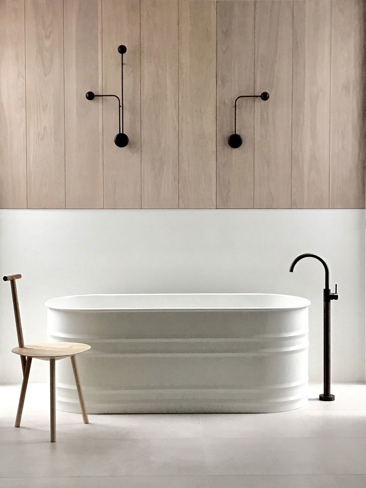
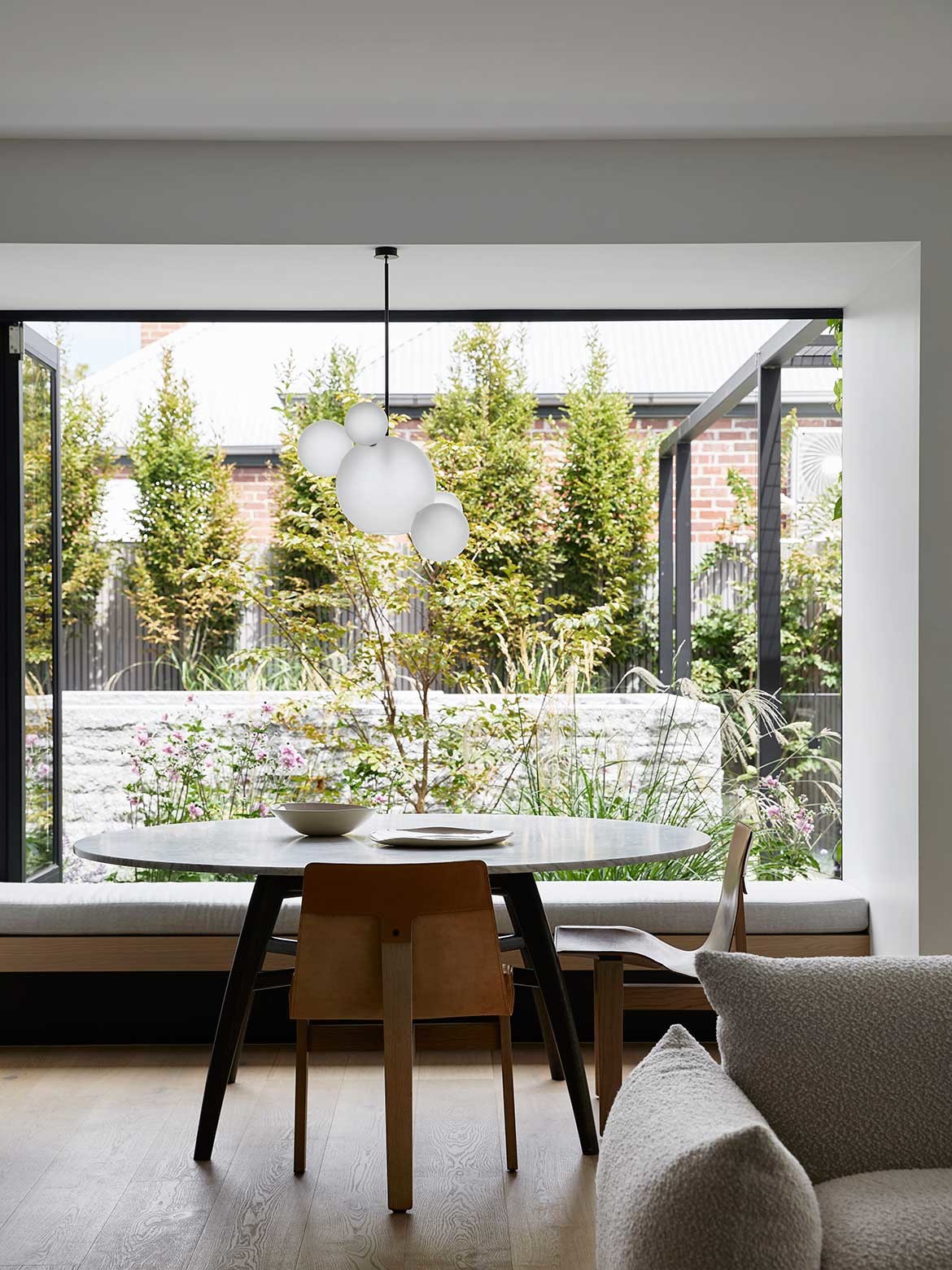
Her reduced palette continues into her residential work with homes that are made for living: “I always think your home is where you go to breathe, somewhere to go home, kick your shoes off and feel like you can really relax and let your hair down. And that’s what home is, to me. It’s somewhere to breathe,” says Whiting.
As to the reduced palette typifying her work, it should be noted that hers is a layering of natural tones with defining moments of contrast, whether textural or through the use of dark shades: “It’s not strictly black and white, but it does tend to be fairly monochrome. And, and I just really like that. Let the people and the artwork and the activities be the colour” says Whiting, who adds “that’s a double-edged sword, you get pigeonholed into ‘she doesn’t use colour’ or people come knowing what they are going to get, it would be rare for someone to come to me saying let’s use some really strong colour.” That said, one client has done just that, with an art filled interior of colour that will be completed next year.
Whiting has in fact a great appreciation for art, which comes into her project through her clients’ existing collections or is built from scratch. Looking over her body of work, there is a consistency of quality to the art works curated through her interiors.
Often monochrome and abstract, but always interesting and enlivening, the artworks are hung with a harmonious eye to the interior as a whole, without being reduced to a design element. This is an interesting aspect of her design ability as many get this wrong either in scale or visual volume. With Whiting, the works are contextualised as art, celebrated and framed by the interior, and always catching the eye.
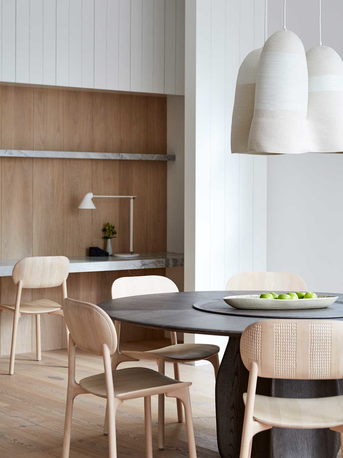
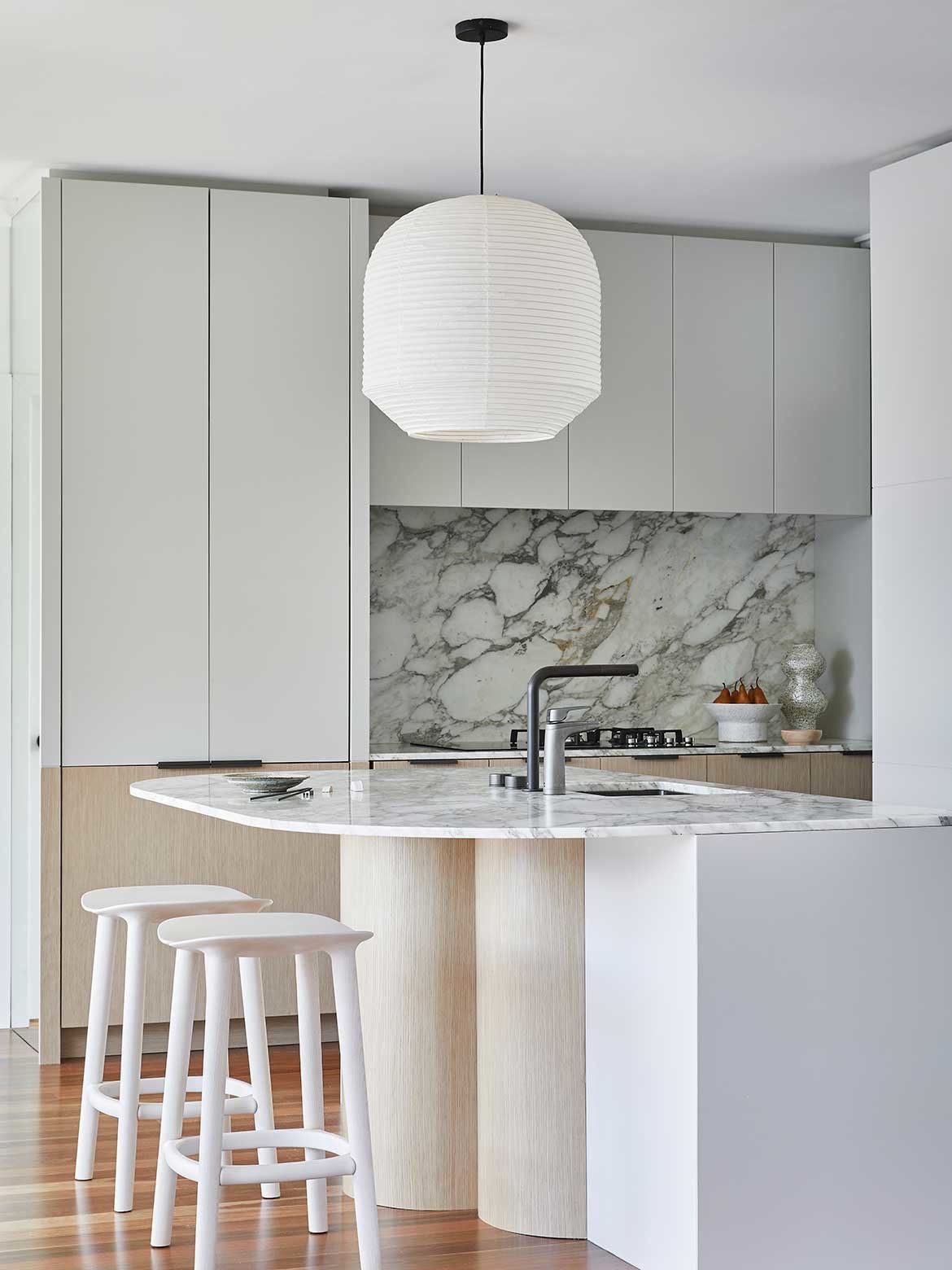
One of the key elements to a whiting interior in the lighting. In particular, pendant lights, which are introduced as sculptural forms that effectively set each room or area. Large globes, dramatic lines and interesting combinations of form are always just right: “I’m really fussy about lighting. And I think that’s something that Steven [Whiting] taught me way back. Lighting is painting with light,” says Whiting before acknowledging, “that’s my film background too.”
It is the material quality of natural timber and stone however that truly marks her work. “I’m drawn to Scandinavian and Japanese craftsmanship and honesty in the making. There is a knack to looking at a natural material without trying to embellish it, to just appreciate it for what it is,” says Whiting.
Carole Whiting Studio
carolewhiting.com
We think you might like this article about Cheshire Architects and its own style of architecture and interior design.
INDESIGN is on instagram
Follow @indesignlive
A searchable and comprehensive guide for specifying leading products and their suppliers
Keep up to date with the latest and greatest from our industry BFF's!
The internet never sleeps! Here's the stuff you might have missed