The home of architecture and design in the Asia-Pacific
Get the latest design news direct to your inbox!
Get the latest design news direct to your inbox!
A new level of ambitious and considered use of colour has been achieved by the exceptional projects recognised in the Dulux Colour Awards 2020.


Now in its 34th year, the annual Dulux Colour Awards has become a trusty barometer of antipodean architecture and design progression. Acting as a gauge for evolving attitudes and abilities when it comes to incorporating colour in design, as well as setting the benchmark for ‘best in class’, the esteemed awards program entices ever-more ambitious and considered use of colour in design projects, year on year.
Decidedly the most ambitious and considered colour case studies yet are the projects recognised in the Dulux Colour Awards 2020 — until next year, at least.
This year’s program fetched over 450 entries, with project submissions from across Australia and New Zealand, each vying to receive accolades attributed to six categories. Needless to say that Adele Winteridge, Jean-Pierre Biasol, Jonathan Richards, Kathryn Robson and Toni Brandso — the five astute industry leaders whose job it was to judge them all — had their work cut out for them.
At the end of the day, they reached unanimous resolve. All five judges, along with Dulux, were blown away by the level of ambition demonstrated across such a wide range of project types, from social housing to workspaces and educational facilities.
“We are usually spoiled with extraordinarily creative colour use in private and commercial applications,” the judges commented, “but to see that same level of ambition and execution in public works signifies an increased recognition of the universal role colour can play in spatial experiences.”
Dulux’s colour and communications manager Andrea Lucena-Orr echoed the judges’ sentiment. “Overall, the high degree of creativity encapsulated in such a vast breadth of architectural genres makes this year’s award winners really stand out,” she said. “It goes to the heart of our awards program to recognise such vision.”
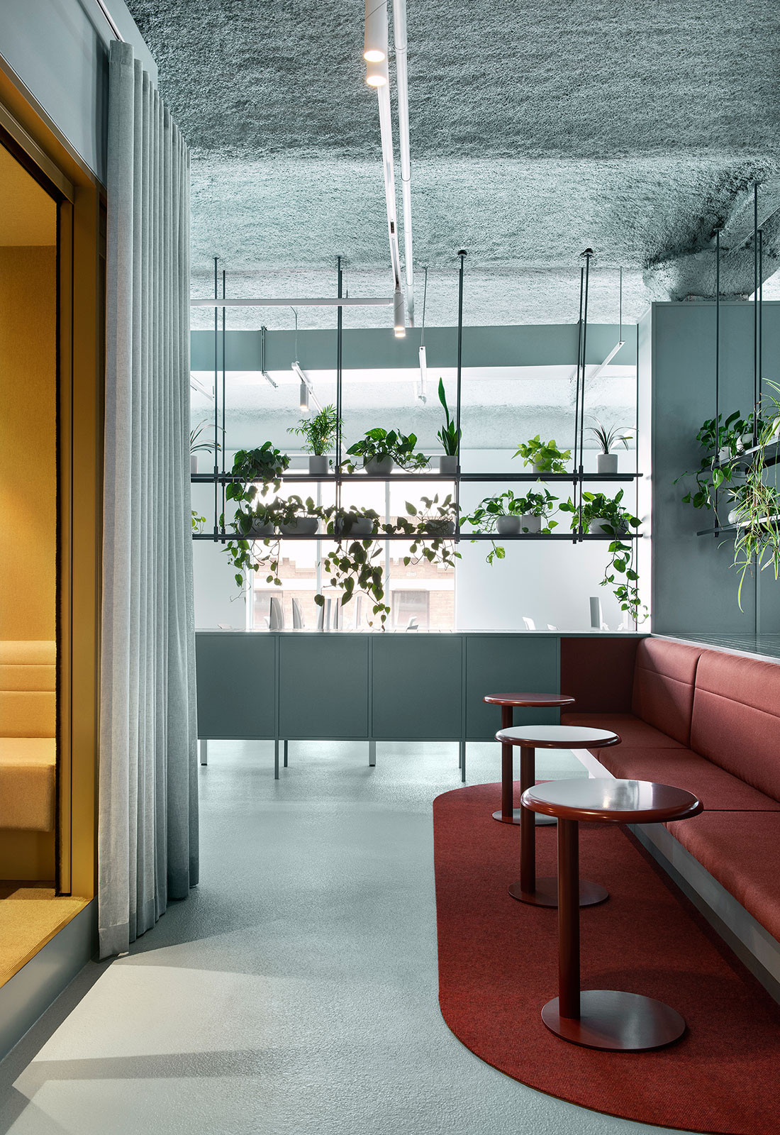
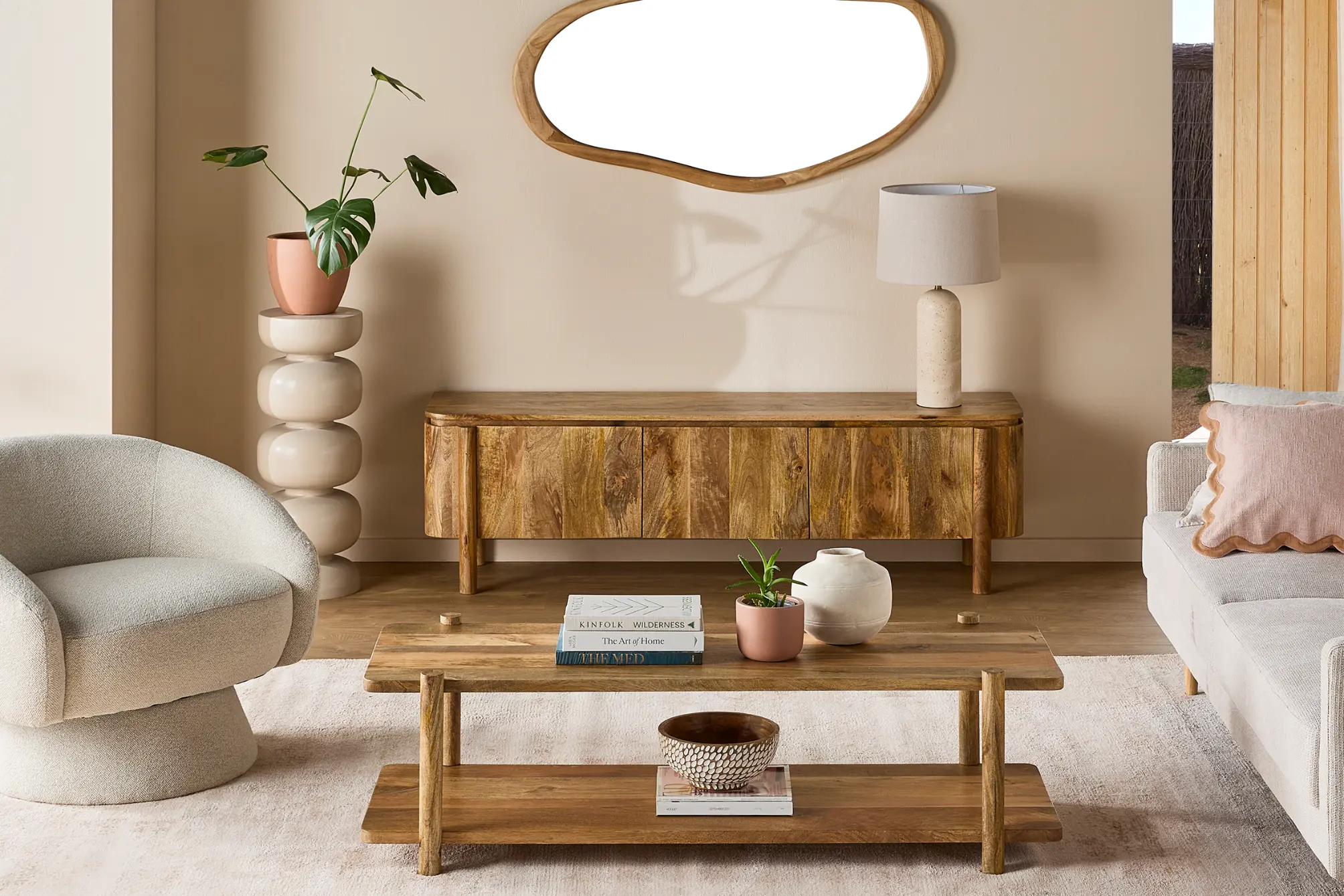
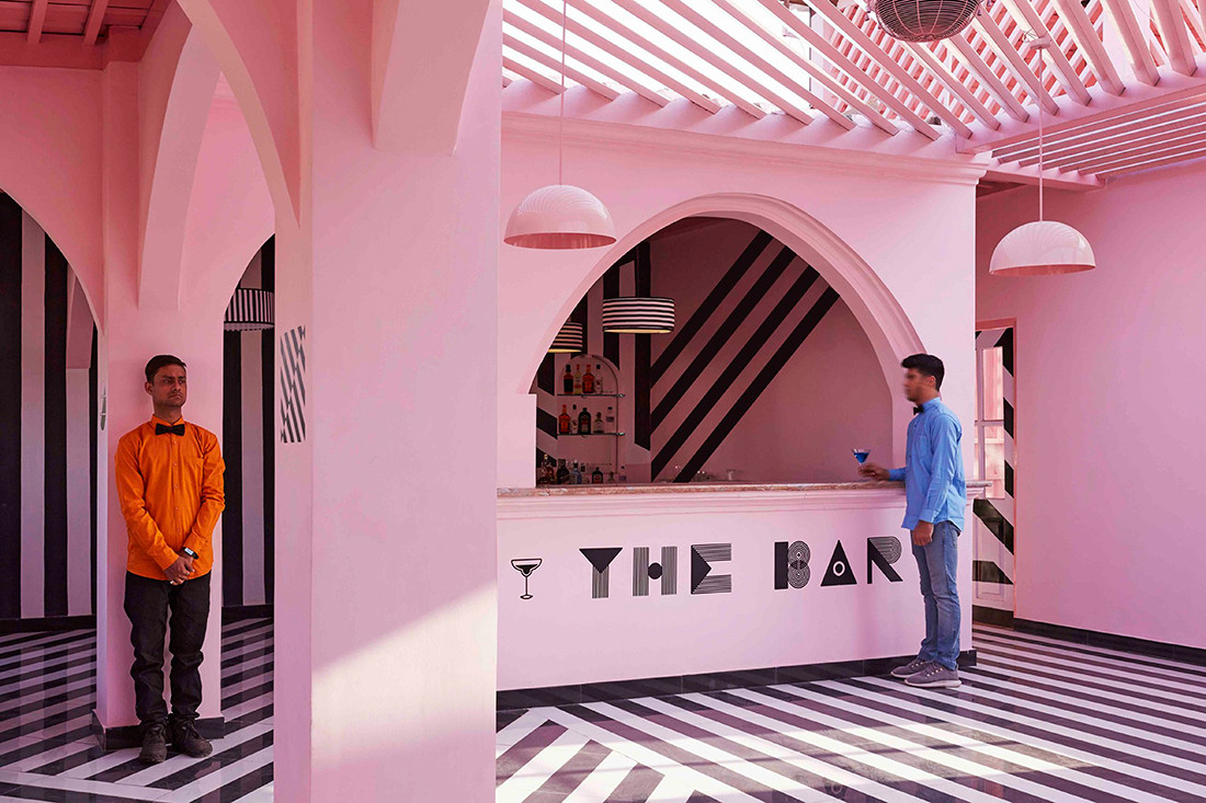
What the judges said: “Barely recognisable as a workplace and more akin to a contemporary hospitality venue, this highly refined ‘office’ space is a typological hybrid in which colour plays the pivotal role.”
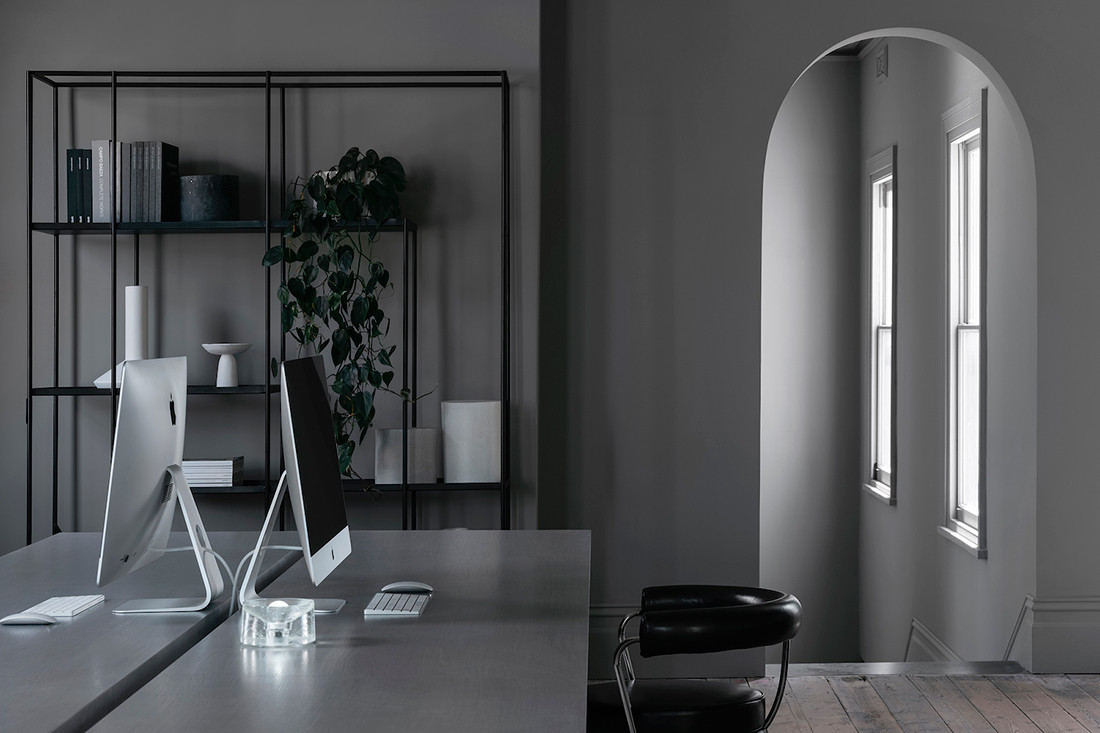
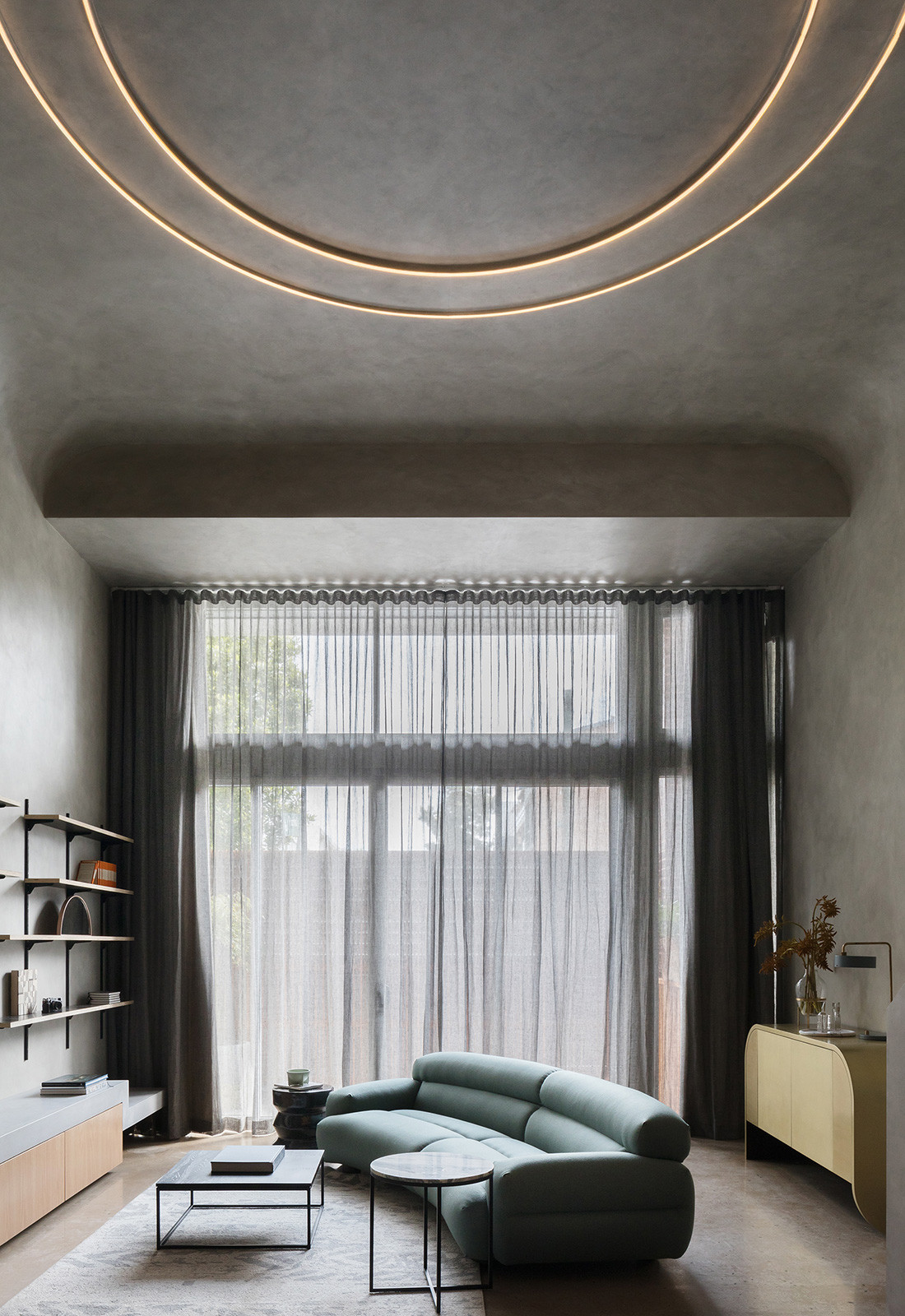
What the judges said: “This is the epitome of brave design. It is always challenging to use one colour well, because it requires conviction and precision, but this project demonstrates both. The layering of rich grey tones across so many surfaces makes the occupant feel as though they have been swallowed up by a shadow and the effect is cooling, calming and powerful all at once.”

What the judges said: “The impact and sophistication of this interior set it apart and totally fulfil the architects’ aim to conceive of it more as a public performing arts facility than a school building. Its sculptural elements are striking in themselves, but the accentuation of their curvaceous forms by strong black outlines or full swathes of the hue on structural components like the stairs, is masterful.”
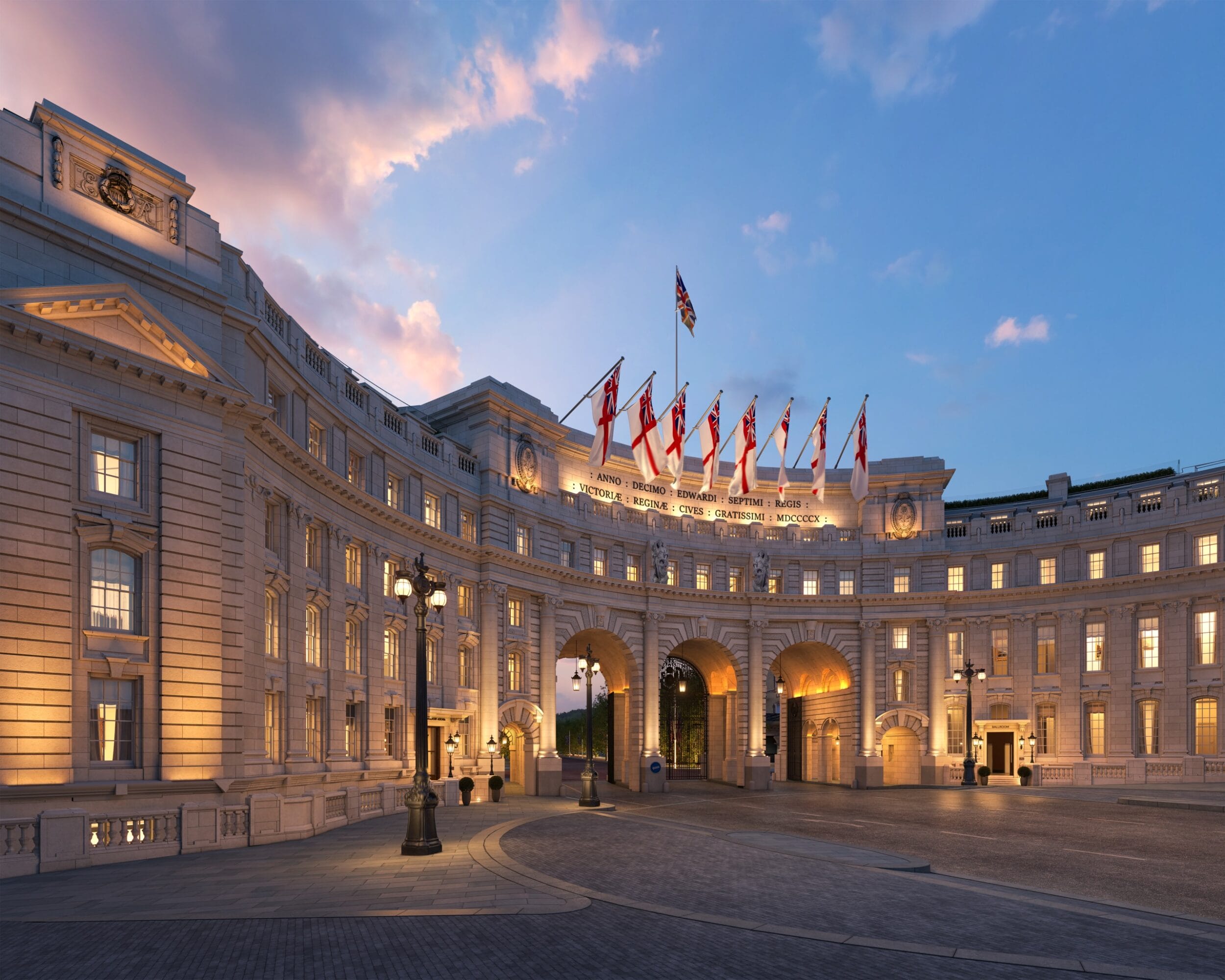
What the judges said: “John Truscott’s influence is evident in this front-of-house refresh, particularly his use of embellishment to elevate the luxe factor. The designer and artistic director, renowned for his interiors at the Melbourne Arts Centre, inspired the choice of navy as the dominant hue for the painted surfaces and it certainly creates depth and drama to this entry sequence.”

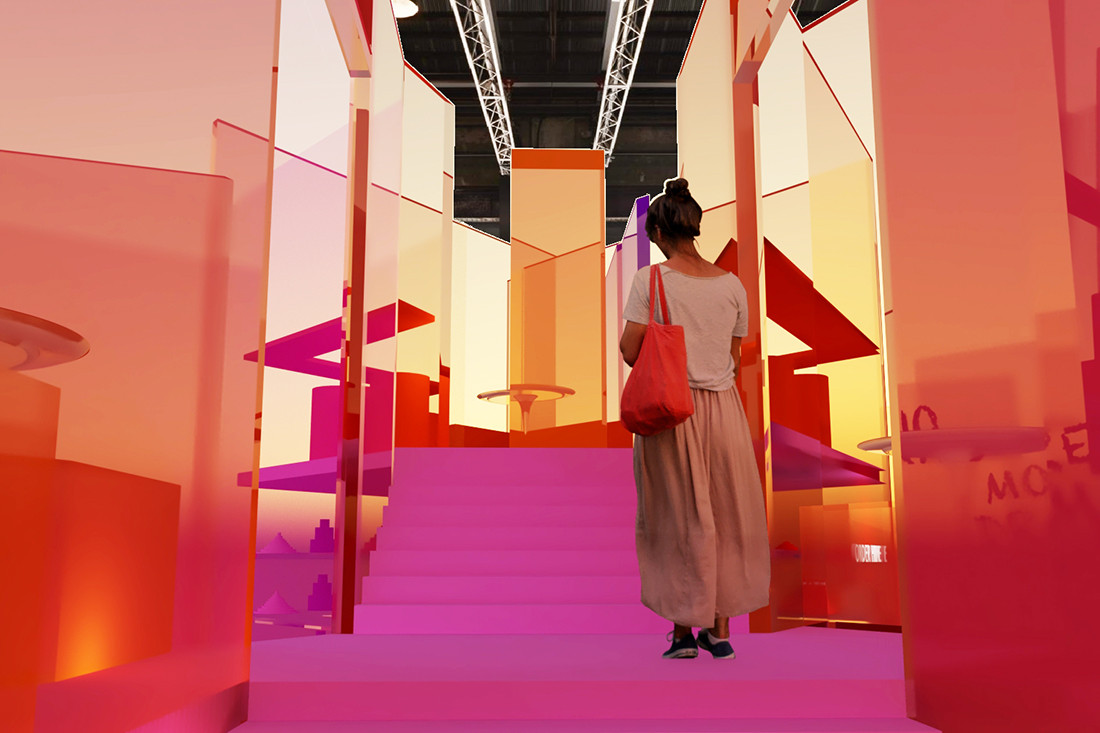
What the judges said: “Hugely ambitious in its scope, this vibrant walkway, comprising more than 18,000 painted timber battens in 14 Dulux colours, is truly breathtaking. Its composition is reminiscent of a woven fabric or pixelated screen, equally mesmerising up close as when read as a whole from a distance. The complexity and execution of this extraordinary work distinguish it as the deserving winner.”
What the judges said: “Social housing often has a uniformity or blandness to it, or is otherwise poorly considered and disjointed, but this redevelopment project for individuals over 55 is beautifully executed, even edgy. The colours and materials give residents’ homes their own identity; they are not part of a housing mass but rather a community, at a human scale.”
What the judges said: “The use of a single colour and finish, with the appearance of concrete, on all painted surfaces has a surprisingly warm cocooning effect, which is amplified by the soft curve where walls meet ceilings. It is utilitarian chic at its best – intimate, moody, balanced – and awarded for its simplicity and singularity.”

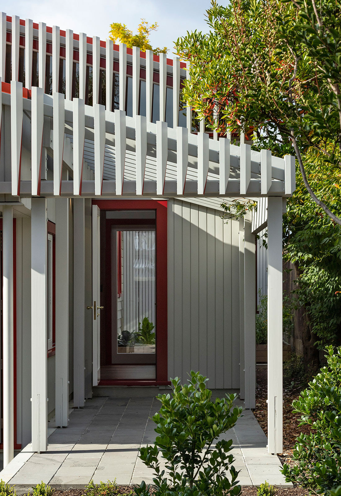
What the judges said: “At first sight, the unashamed distinction between old and new in this period-home refurbishment and new addition is striking for its balance. Upon closer inspection, the embrace of individuality and its expression in saturated colour are equally remarkable elements of this project.”
What the judges said: “Impactful in its simplicity, this new family home responds to its coastal setting by promoting an outdoor lifestyle and facilitating an easy flow between inside and out. Its Capsicum Red-painted external timbers and the sandy brickwork and masonry elements are perfectly balanced and contrast strikingly with the native foliage.”
What the judges said: “This heritage villa in Auckland has been enlivened with colour in playful yet deliberate fashion. Here, the strategy has been to paint only the cut face of the vertical timbers, creating an optical illusion or sequence of disclosure as one moves across the site. It is an innovative and well-executed play of bold and neutral colour that surprises and delights.”
What the judges said: “In this vibrant pop-up café concept, colour is the essence of the space. Inspired by artist Jean Michel Basquiat, it is designed with layers of transparent colour, eliciting a luminescent quality that would be exciting to experience, especially in the Carriageworks space, which is otherwise neutral. The potential combinations are evocative and joyful.”

What the judges said: “The desert vibe is strong in this sustainable house proposal, with its rammed-earth walls and neutral colours and textures. Beautifully sited in the landscape, its bleached tones mirror the natural material selections and are contrasted occasionally with copper and a pop of Marrakesh Red. It is strong and serene.”
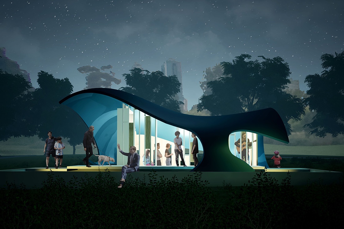
What the judges said: “A nod to the Queen Victoria M Pavilion, this free-standing pod incorporates a VR engine designed to simulate colour’s effects on a person. Its reflective blue chromatic exterior sits well with its surroundings while cocooning those within. It is a sophisticated high-tech concept, in which the student has considered the effects of colour across a whole day, and its execution could be quite magical.”
INDESIGN is on instagram
Follow @indesignlive
A searchable and comprehensive guide for specifying leading products and their suppliers
Keep up to date with the latest and greatest from our industry BFF's!
The internet never sleeps! Here's the stuff you might have missed