Representing the most creative, bold and colour-filled projects of the past year, the 2021 Dulux Colour Awards have been announced.

September 13th, 2021
Australia and New Zealand’s premier awards ceremony for incorporating colour in design, the Dulux Colour Awards have set a new bar for distinctive, bold and considered use of colour in the architecture and design industry. Celebrating its 35th year, the awards saw 437 entries from the region and was witness to “new levels of innovation with colour,” according to Dulux colour and communication manager Andrea Lucena-Orr.
Ahead of the pack, SJB’s 22 William took out both the Australian Grand Prix Prize and the Commercial Exterior Prize and was commended for its bold and confident use of a singular colour – Dulux Spinach Green. “Hugely ambitious and brilliantly conceived, we credit SJB for committing to a single colour and so artfully executing its use in such an impactful way,” say the judges.
The New Zealand Grand Prix Prize was awarded to Undercurrent for the Central Hotel of Naumi Hotels. Given a brief to avoid white, the designers created a varied palette with depth and playful saturation.
Sibling Architecture also came through with one win and one commendation, while Bergman & Co received two commendations.
Grand Prix
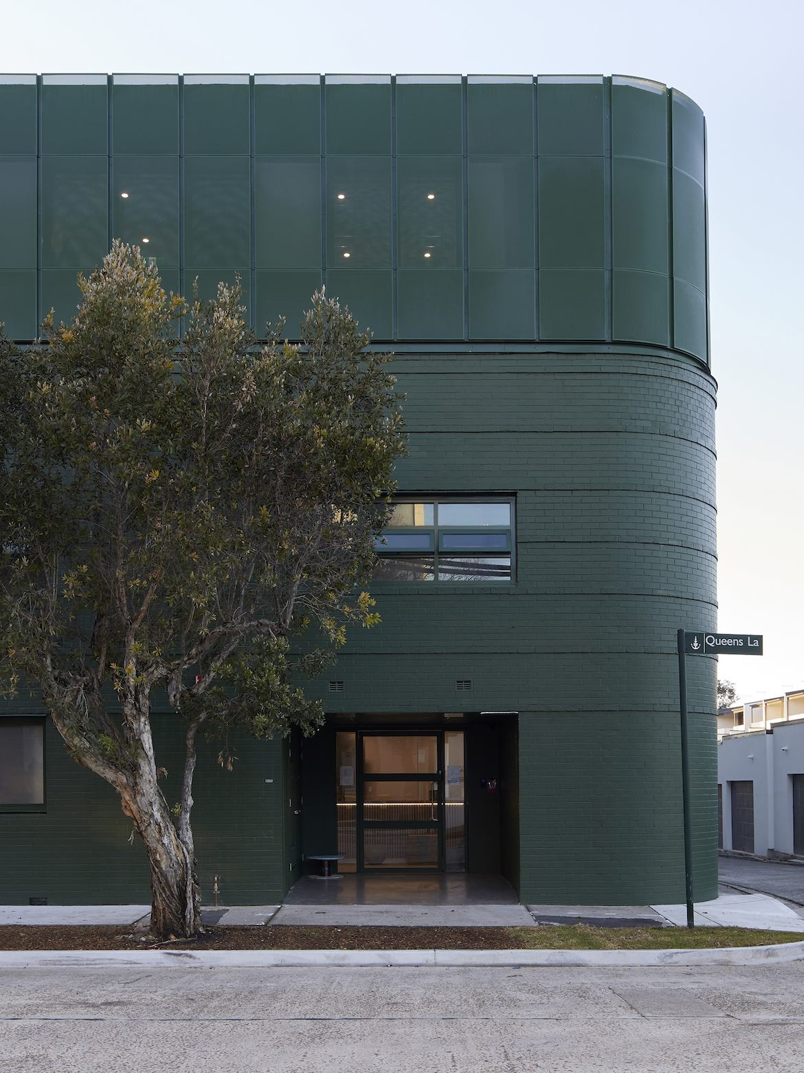

What the judges say: “22 William epitomises the power of doing one thing exceptionally well and we commend the architects for their commitment to the vision. Quietly confident in its leafy context and highly convincing in its execution, this is a standout winner in its category and the overall prize as a result.”


What the judges say: “Specially curated colour palettes result in each floor being typified by a distinct hue while each room is purposefully different. The depth of colour saturation is profound, with comprehensive application, across surfaces and furnishings throughout. Memorably original and wonderfully playful, this is a project with vast attributes.”
Commercial interior: Workplace and retail


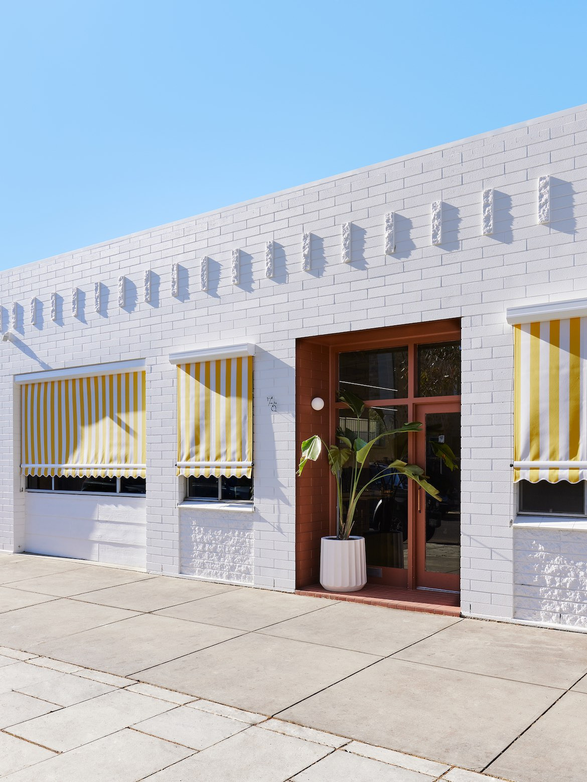
“Colour single-handedly transforms the bland, back- of-house carpark of a 1980s commercial building into a dynamic arrival point,” says judge, Patrick Loo from Common Space.
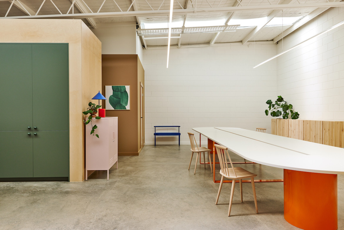
“The unlikely combination of hues coexisting in this studio space is surprisingly successful. Experienced together, they gently coalesce against a backdrop of a creamy white, specified for its warmth and what the designers describe as ‘fluffiness’,” says Loo.
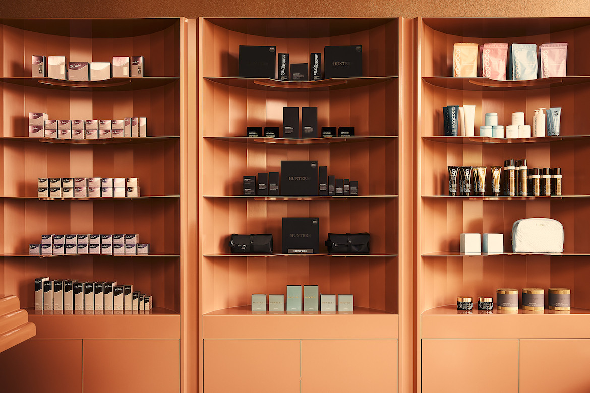
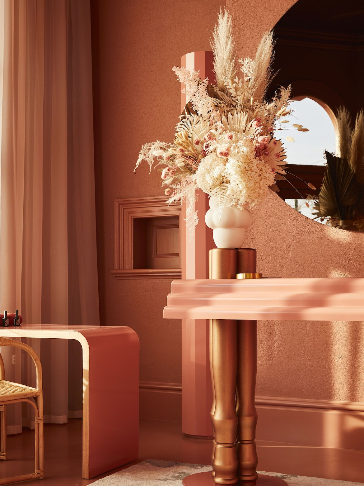
“Committing to one colour is bold, brave and somewhat risky. The skill and finesse in execution in this finely wrought retail space, however, is convincing. From the ornate period façade, distinguished so effectively from its neighbours in the shopping strip, to the scallop-edged bespoke cabinetry and high-gloss lacquered surfaces of the interior, the singular colour treatment reflects the up-scale offering of prestige beauty products,” says Loo.
Commercial interior: Public and hospitality
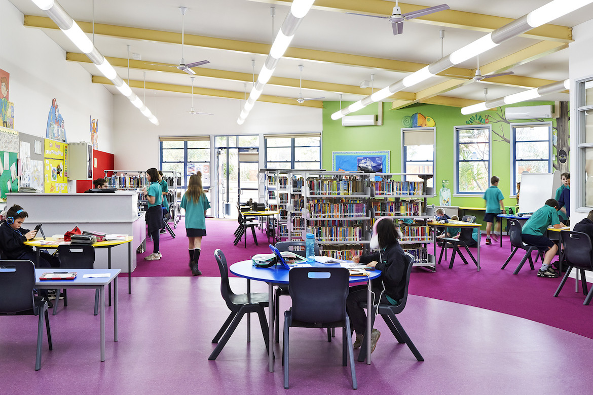
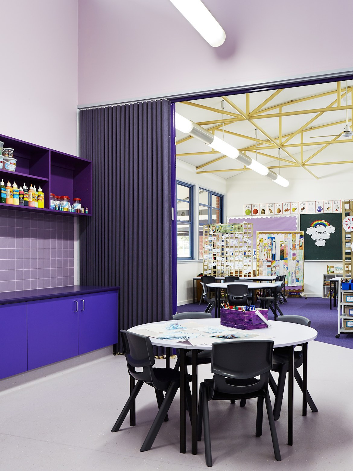
“In the educational genre, primary colours often become the default, employed in simplistic, obvious ways, so we commend the architects for breaking the mould in such considered fashion to refurbish and revitalise a tired, disorientating school building,” says judge, Suzannah Waldron from Searle x Waldron.
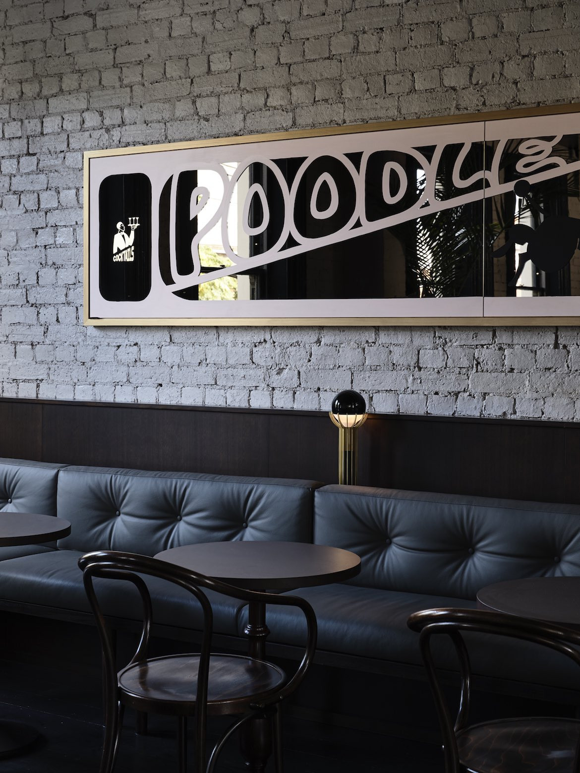

“Described by the designers as ‘a classic bistro with playful inflections’ and a blend of ‘European design with kitsch Aussie-Italian suburbia’,this inner-city Melbourne bar piqued our interest and fulfilled its promise… Each space and its intended experience is defined by a distinct hue, in combination they coalesce in a lush, unified and timeless whole,” says Waldron.
Commercial and multi residential exterior

“We were enthralled by the bold Spinach Green exterior and the colour-blocking effect across the façade – the result of this single hue reading differently upon each material. As the name suggests, this green has depth, richness and vibrancy suited both to the leafy inner-urban context and the semi-industrial building genre,” says judge Jefa Greenaway from Greenaway Architects.

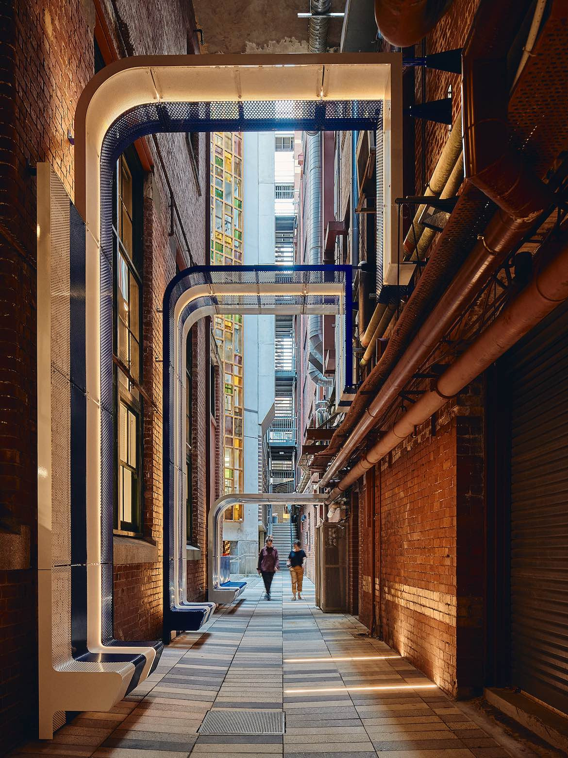
“The primary colours, particularly the predominant blue – a nod to the bluestone of Melbourne’s lanes – are emblematic of the locale and reference the lineage of this city’s architecture… Other parts of the new structure elevate what already existed, such as the yellow underside of stairs, which, in turn, complements surrounding structures. It is a joyful response and lovely in its simplicity,” says Greenaway.
INDESIGN is on instagram
Follow @indesignlive
A searchable and comprehensive guide for specifying leading products and their suppliers
Keep up to date with the latest and greatest from our industry BFF's!
Natural stone shapes the interiors of Billyard Avenue, a luxury apartment development in Sydney’s Elizabeth Bay designed by architecture and design practice SJB. Here, a curated selection of stone from Anterior XL sets the backdrop for the project’s material language.
Blending versatile cooking with smart performance, Bosch AccentLine appliances bring a quieter sense of order and simplicity to the modern kitchen.

In a tightly held heritage pocket of Woollahra, a reworked Neo-Georgian house reveals the power of restraint. Designed by Tobias Partners, this compact home demonstrates how a reduced material palette, thoughtful appliance selection and enduring craftsmanship can create a space designed for generations to come.
From Aesop’s light-filled installation by Australian architect Rodney Eggleston to Molteni&C’s immersive garden worlds, these are the exhibitions, launches and interventions shaping Milan Design Week so far — with more to come.
Woods Bagot has completed the refurbishment of its Sydney studio, delivering a purpose-built creative environment designed to reflect a collaborative culture and signature design thinking.
The internet never sleeps! Here's the stuff you might have missed
AIM Architecture reimagines HARMAY’s Beijing flagship as a gallery-like environment, where products are archived, displayed and experienced rather than simply sold.

Allison Pye, co-founder of Lindblom Pye Interiors, shares her philosophy of quiet, considered design in this SpeakingOut! interview for the 2026 INDE.Awards.
Sydney-based Klaro Industrial Design launches Volume 6 featuring five locally manufactured pieces and two of dual origin, that bring warmth to commercial interiors while championing longevity and craftsmanship.

In this SpeakingOut! episode, Andrew Tu’inukuafe, Warren and Mahoney, explores the importance of Indigenous knowledge, design rooted in place, and the power of collective thinking in shaping meaningful, enduring projects.