The home of architecture and design in the Asia-Pacific
Get the latest design news direct to your inbox!

Get the latest design news direct to your inbox!
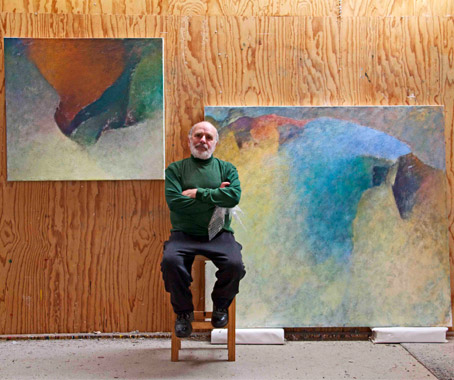
Geoffrey de Groen is one of Australia’s most outstanding painters. In his new exhibition he shows why.
April 26th, 2012
Now in his early 70s, Geoffrey de Groen is one of Australia’s finest and most exhibited painters. At a time when painting has been reduced more often than not to illustration, de Groen’s work is a reminder that there is a whole tradition of painting going back many hundreds of years.
For painters of de Groen’s generation it was obligatory to fully understand this tradition. And the results are embedded in his work. But you need to look hard and long.
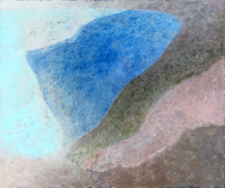
His current exhibition in Canberra shows just one series of work – for de Groen works in series and within this wide scope of activity there is lots of variety.
Many years ago he gave up painting in order to start all over again, beginning with black and white drawings, then on to colour drawing, then to black and white paintings before finally returning to colour.
In the process he developed new techniques which involved working the paint into the surface. The result was a perfect unity, so that the viewer cannot tell where the surface ends and where the painting begins.
In this series he exploits the texture of the canvas to explore his ongoing themes of paradox and illusion. In other series there are figurative elements. In this show, the ectoplasmic forms hint at the world we know (landscapes?), but remain essentially abstract.
Still there is a kind of light which illuminates the pictures. And the longer we look at these luminous but tactile objects, the more we seem to be led into some sublime, cosmic place.
At the end of the day, all good painting helps us to see more clearly. Sight becomes insight, perception becomes vision. And illusion becomes reality.
Paul McGillick is Editorial Director at Indesign Publishing.
Geoffrey de Groen: New Paintings
Chapman Gallery
chapmangallery.com.au
Until May 9.
INDESIGN is on instagram
Follow @indesignlive
A searchable and comprehensive guide for specifying leading products and their suppliers
Keep up to date with the latest and greatest from our industry BFF's!
The internet never sleeps! Here's the stuff you might have missed