So what does the colour ‘Greenery’ (Pantone 150343) represent? As Pantone’s creative colourist team states, “Greenery is symbolic of new beginnings. It is nature’s neutral. The more submerged people are in modern life, the greater their innate craving to immerse themselves in the physical beauty of the natural world. A life-affirming shade, Greenery is emblematic of the pursuit of personal passions and vitality.”
Fresh, zesty, renewing and restorative, Greenery is more than just a colour, it’s an attitude.
Good question! Well, a recent University of Texas study says ‘yes’ – and especially for the commercial sector. The study found that grey, beige and white offices often induce states of listlessness and depression, especially amongst women in the workforce. Such studies, however, have yielded some very surprising results because, it would seem, colour doesn’t just affect mood, it affects levels of productivity too. Similar studies have illustrated that low-wavelength colours such as green and blue actively go a long way to improve levels of wellbeing, creativity, efficiency and focus.
Many workplaces have taken note and begun to incorporate low-wavelength colours into their office spaces, thanks to the pioneering effort of our local A+D suppliers in this space. The Team at Krost is among the few frontrunners in this space, developing a range of furniture and accessories that allow for a personalization of the workplace, creating heightened employee wellbeing and productivity.
At the Indesign Office, we’ve been eye-ing off the latest Krost catalogue for 2017, finding an abundance of green-geared design solutions to fill our workstations, waiting areas, collaborative zones … simply every nook and cranny of our workplace! And, while it was impossible for us to decide on a consensual wishlist, there’s a handful of Krost designs we all agreed we could no longer live without:
Benchwork Trak Workstation System
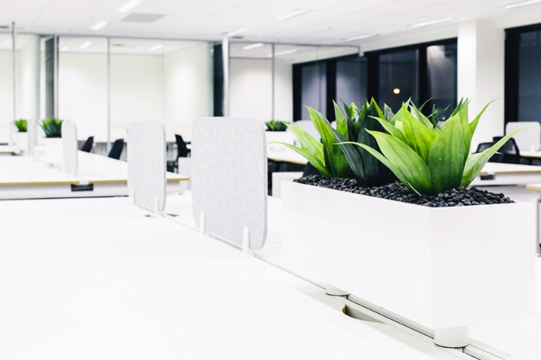
The Benchwork Trak Workstation System is a personalization system that makes bringing a pop of colour into your office easy. With its accessories rail, perspex panels, shelves and planters, acoustic panels and handy storage boxes, the Benchwork Trak Workstation is perfect for incorporating low-wavelength colours into the functional space.
Flap Acoustic Screens
Sick of not being able to concentrate at work due to loud co-workers? Unable to hear your phone calls properly? The Krost Flap Acoustic Screens, made from efficient sound absorption material, provide an efficient option for both sound absorption and the inclusion of colour within the workplace. The ultra thin panel can be wall mounted or hung from a ceiling to accommodate a range of different spaces. The material is 100% recyclable and comes in a range of different colours (including green!)
Globe Planter
When one thinks of greenery, nature is the first thing to come to mind. So why not be literal and bring nature into the workplace? Krost’s Globe Planters make incorporating plants into the workplace easy. With its steel construction, which is able to be perfectly fitted to tambour doors and sliding door units, the Globe Planter is not only aesthetically pleasing but small-space effective. Studies have found that plants in the workplace help to improve the quality of the air, reduce the levels of noise in an open-plan office and alleviate stress.
Each year since 2000, Pantone has selected a single colour to represent the current cultural and political climate. And, while this year’s selection has always held an enormous sway over the full spectrum of the design world – from fashion to interiors, architecture to food design – this particular shade is especially redolent of the ‘Green Movement’ that, while definitely not revolutionary today, has nonetheless reached a resounding crescendo in 2017. With a vast majority of design firms, studios, creative practitioners all opting to commit their visionary efforts to help save our environment, this pledge has trickled through to our clients as well. With nearly every possible brand and company vouchsafing their promise to alleviate the disastrous effect we’ve had on the environment, this year’s selection for Pantone Colour of the Year represents a new era of hope for us all.