The home of architecture and design in the Asia-Pacific
Get the latest design news direct to your inbox!
Get the latest design news direct to your inbox!
Adelaide’s most curiously named café is given a new visual identity by local brand and communications agency Parallax Design. Leanne Amodeo talks to the studio’s Creative Director about his ideas behind the branding.
November 18th, 2015
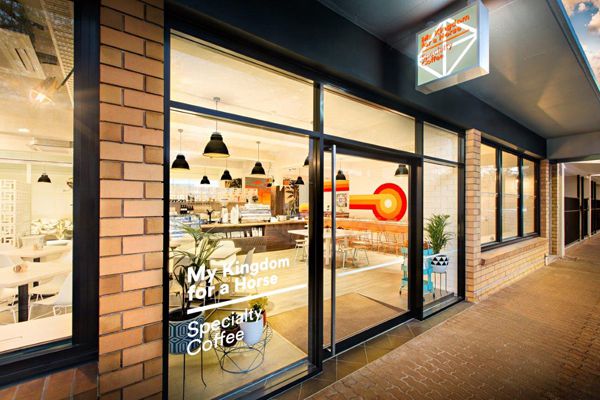
In South Australia, one of the most appealing visual identities to come out of Adelaide in the past few months, is for café My Kingdom For A Horse. Conceived by Creative Director Matthew Remphrey and the team at Parallax Design, the new hospitality venue’s branding is an effortless study in modern visual communication. But most significantly, it extends the cafe’s stylishly casual aesthetic to neatly interconnect across all areas of the business.
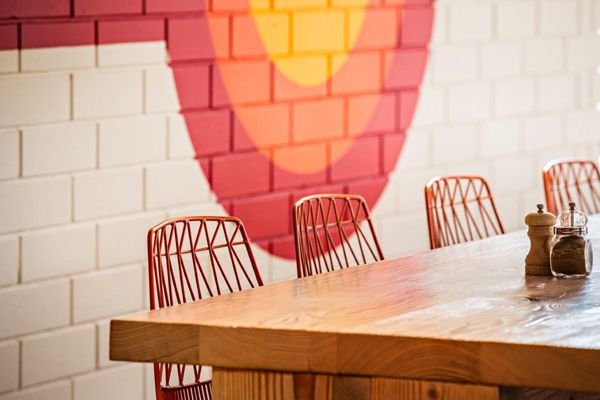
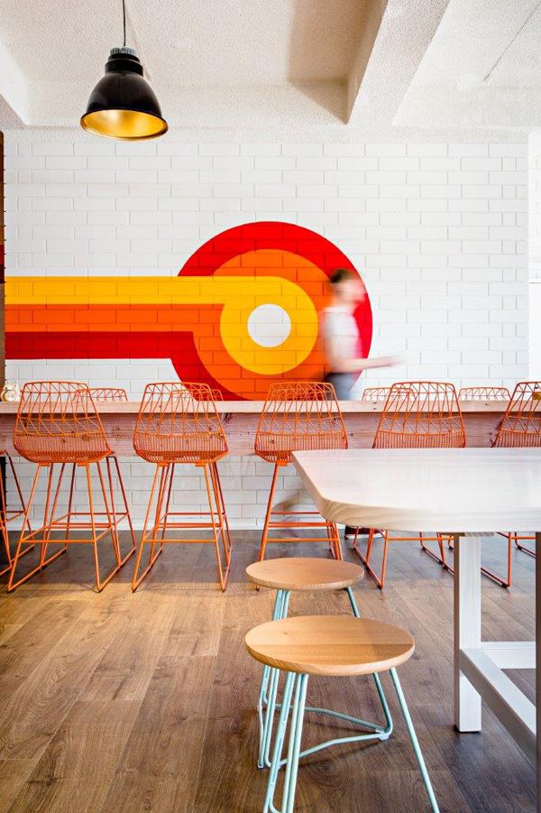
Remphrey took his lead from interior designer Samantha Agostino’s driving concept, which was informed by the building’s 1970s heritage. She captured the era’s flavour through a bold colour palette and distinct features, including a breezeblock screen utilised to divide the dining area from back-of-house. Furniture pieces are timeless in form however, including Thonet’s No 14 chairs in yellow and oak tables by A&B (Agostino’s furniture studio in partnership with Gareth Brown).
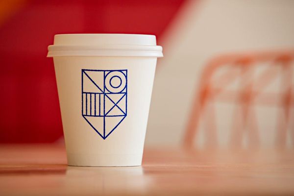
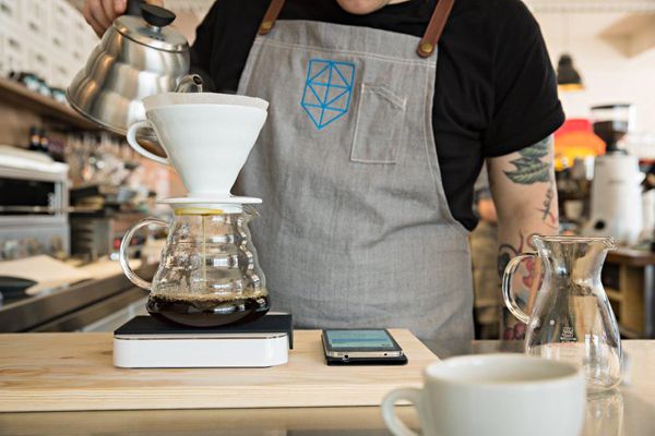
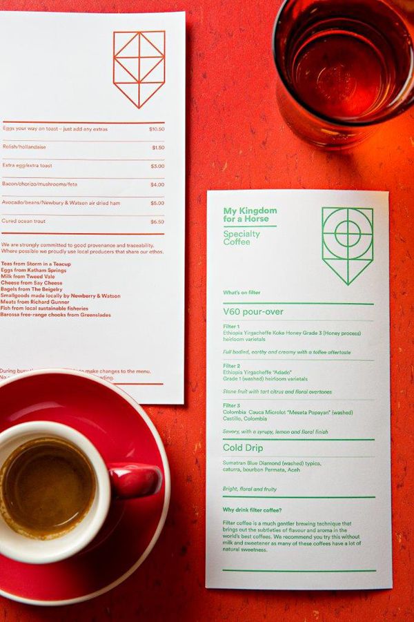
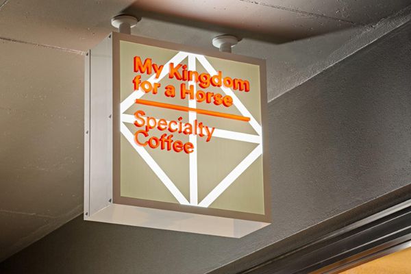
It was important My Kingdom For A Horse’s identity show its influences, instead of ape an era. As Remphrey explains, “The branding we developed had to look contemporary, not like a pastiche of another time.” His colour palette is therefore restrained, borrowing bright red and orange from the interior’s graphic mural and applying them across print collateral and signage respectively. Blue and green is also incorporated into the scheme and used on aprons, coffee cups and business cards.
Shakespeare’s Richard lll was another point of reference for Remphrey during the branding’s development stage. After all, the venue takes its name from the king’s famous lament. For co-owner and former chef Emily Raven it was the perfect moniker, symbolising the café as her leap of faith and chance to address missed opportunity. Remphrey’s research, on the other hand, further led him to investigate medieval heraldry, which influenced his thinking behind the brand’s logo.
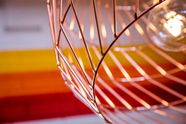
“Heraldry was a very early form of branding because it communicated to which house the wearer belonged,” he says. “So we developed a series of shields with different patterns for the café’s logo. I like the idea of customers becoming part of My Kingdom For A Horse.” This logo is especially effective embossed on the business cards and printed in the brand’s colours on the menu. Its clean lines also reflect the interior’s lighting fixtures and the mural’s hard edge.
Raven and co-owner Rachel Mead were smart to get Remphrey on board earlier rather than later. He was able to not only collaborate with them, but with Agostino as well, making for a heightened design outcome. Achieving that sense of cohesion was pertinent to the brand’s definition, which is what ultimately helps any business stand out from the crowd.
Photography by Dan Schultz
My Kingdom For A Horse
mykingdomforahorse.com.au

INDESIGN is on instagram
Follow @indesignlive
A searchable and comprehensive guide for specifying leading products and their suppliers
Keep up to date with the latest and greatest from our industry BFF's!
The internet never sleeps! Here's the stuff you might have missed