The Hindmarsh Shire Council Centre doesn’t really follow the typical design formula for civic buildings. Throughout Australia, most town halls and council chambers are threatening brutalist structures made of menacing heavy concrete. Others are lofty and formal Victorian-style halls with ornate gold chandeliers and plush carpet.
When conceiving a new design scheme for Hindmarsh Shire Council, k20 Architects felt the standard approach was dated, and worse—distanced and blocked off from the local community that the new building would inhabit, and hopefully enrich.
A conversation between the council CEO and k20 Architects’ director Theodore Kerlidis on the positioning of the front entryway became a decisive turning point in the design process. “They’d had a masterplan scheme created already, and [the CEO] turned to me and said, ‘I don’t even know where the front door on this scheme is’,” explains Kerlidis. “All of our discussions revolved around how the building was going to be culturally positioned; the purpose of the project and its community identity. This highlighted to me that the council project wasn’t really about just responding to a brief, or putting lines on paper. There was a need to create something culturally significant.”
Located in Nhill, somewhere between Melbourne and Adelaide, the completed site is a seriously sustainably focused precinct that’s purposefully reused the original 1960s building. “Part of the brief was to deliver within fixed budget parametres,” says Kerlidis. Unlike other local government projects, Hindmarsh’s new administration offices were not additionally funded by any State or Federal Government grant. “We really needed to think and provide a design solution that wasn’t programmatically driven but that allowed the end vision to be one that they could afford.”
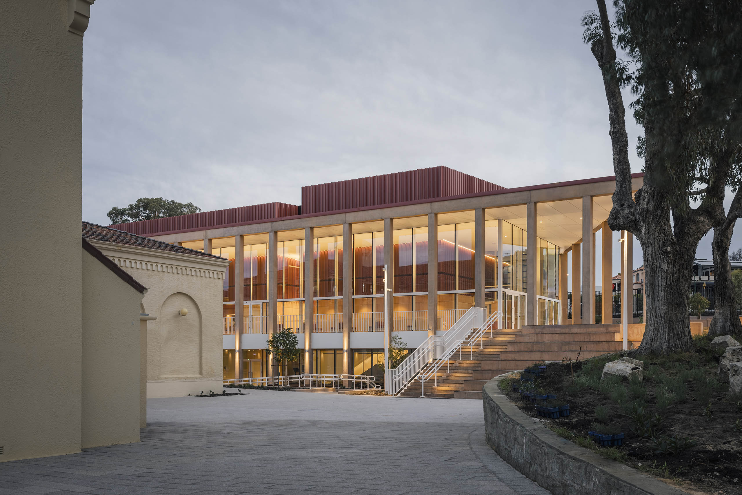
The curved arch line of the building takes its cues from the shapes, spires and industry of local area. “There’s a lot of context in this area—though it can be the dullest of experiences,” says Kerlidis of the locale, which is known as a hub for wheat production. “You can really tune out, there’s flat land everywhere. The predominant image on the journey into the town is the smooth curved wall of wheat silos, as well as the pitched roof of the adjoining shed.” Kerlidis chose this local rural vernacular as his design inspiration for the shire offices. “There’s something really powerful and stable with that image,” he adds.
ESD principals were at the very heart of the building’s design intent. The design uses locally sourced materials, including folded sheet metal in steel and zinc manufactured for wheat silos, and a glulam Victorian ash timber primary structure to minimise the use of steelwork. Although double the size of the building it replaces, the centre uses 60 per cent less energy through a series of advanced and ingenuous innovations.
Transparency and accountability were also key for the new building. As well as the main building’s impressive glass façade, there are many open entryways (or front doors) and interconnecting pathways to create a relaxed and welcoming atmosphere. “A lot of council facilities are set up as corporate spaces, there is a lot of borrowed design methodology such as open plan work spaces or communal reading rooms. However, these tend to operate in isolation to what is actually in the public domain,” Kerlidis says. “The permeability of this building is as important as its discreet functionality.”