The home of architecture and design in the Asia-Pacific
Get the latest design news direct to your inbox!
Get the latest design news direct to your inbox!
SPARK’s director Wenhui Lim demonstrates how Brutalist building interiors can be successful upgraded into a colourful, light-filled home for creative self-expression and freedom.


August 3rd, 2023
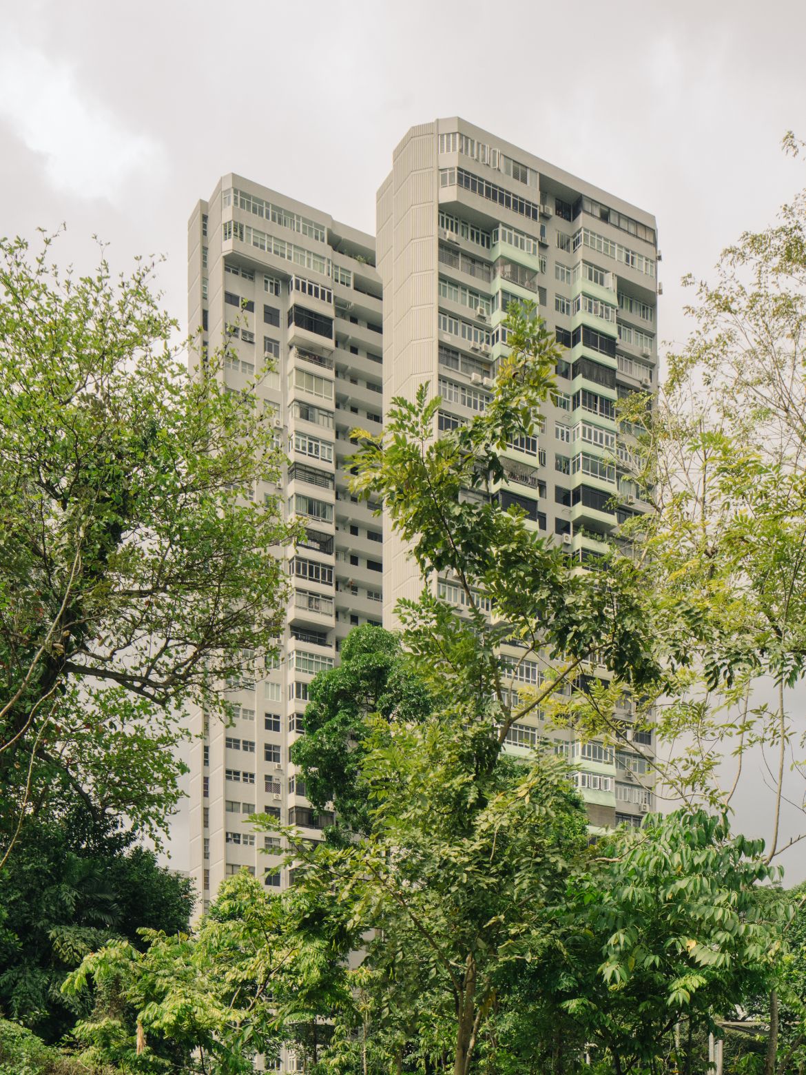
Transforming a brutalist space within Sherwood Towers into a light and colour filled kaleidoscope of excellence, SPARK has completed the conversion of a 132-square-metre three-bedroom apartment as a showcase for the owner’s creative self- expression.
Referencing Le Corbusier’s L’Esprit nouveau of aesthetic of refinement, the redesign of the apartment physically pares back excess in favour of visual and physical clarity. In doing so, the interior is now focused on the extraordinary exterior views which bring the outside world into the interior, visually enhancing spaciousness, ventilation, natural light and a sense of spatial fluidity.

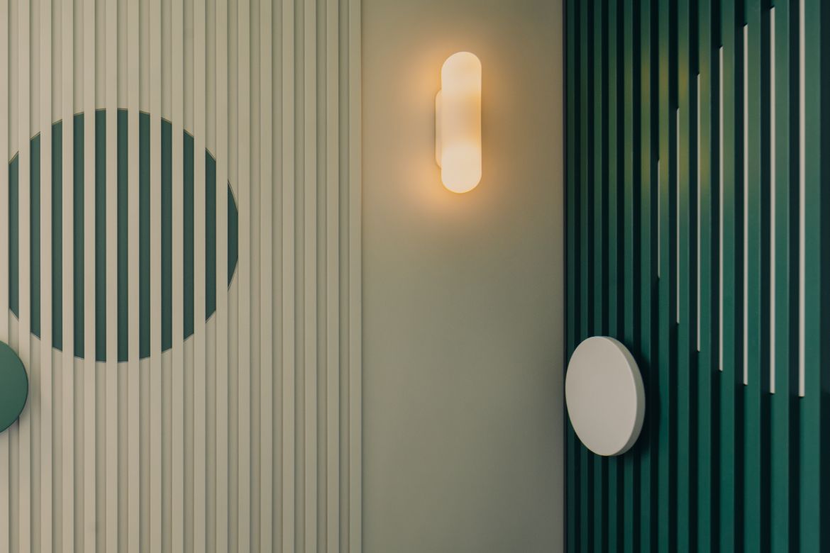
In keeping with this stance, Corbusier’s Universal Style is quoted through colour and form, delineating spatial use without truncating circulation or flow. As such, colour is essential to this project with coloured portals framing views, as well as layered colours used to shift perspective and direct the eye through the space to the views. Geometric and line motifs provide additional scope for the introduction of colour in a playful manner that counters the buildings’ brutalist form with whimsy. Moreover, what was once a series of dark spaces, is now opened through the centre to read as an enfilade of sequential open living spaces focused towards the panoramic views.
In Singapore, where Brutalist architecture has lately been seen as the poor cousin of more conventional Colonial architecture, there has been a reticence to restore these spectacular buildings. “Singapore’s Brutalist buildings compared to the meticulously restored colonial shophouses often fall into disrepair given the issues of shared ownership of common facilities with many owners thinking that selling their units collectively is a better financial bet than investing in upgrading,” say SPARK’s director Wenhui Lim, who’s also the owner of this home. “While most may believe that Brutalist buildings may not be as conventionally pretty as shophouses, we at SPARK feel they are a better expression of Singaporean identity because they embody a true socially collective architecture.”

As such, it was important to create a living interior that celebrated the building’s form while creating a space that would mirror the Lim’s love of colour and design. With sliding doors that switch wall aspect from artwork to television, the apartment has a gallery ambiance suited to the her collection of art, design objects and iconic furnishings. It should be noted that the photographer chosen to record this project, Khoo Guo Jie, is a celebrated Singaporean artist.
Bringing light into the home was paramount and cleverly realised with a wall of glass bricks replacing what was a solid wall of utility space beyond the threshold. In making this change, filtered light floods the home during the day and the space transforms into a soft glowing ‘lantern’ in the evening.


A wall of white square tiles with a curved tile format used for edges of kitchen bench and island, frames the kitchen of luminous, bench long, orange drawers to the inner side and canary yellow square drawers to the outside. It is breathtakingly striking and speaks directly to the Corbusier use of colour blocks.
This is compounded by the position of the island falling short of the kitchen bench, so that both colour blocks are seen when viewed from the lounge and dining areas. In the open plan arrangement, the client’s contemporary and mid century furniture is well balanced by a red batten screen overlaying utility walls and Teressa Moorhouse’s Polar Bear Rug for MUM’s.


“Loose furniture and rugs are favoured over traditional sofas and ‘typical’ living space arrangements for flexibility and constant adjustments, consistent with the my view that a home is a space for creative self-expression and freedom,” say Lim.
As such, a selection of large colourful rugs are playfully rotated through the home. These include a large semi-circle of yellow which is occasionally placed to meet the yellow drawers of the kitchen island. A large orange geometric rug is particularly striking in the lounge, where its vibrancy changes the mood exponentially.

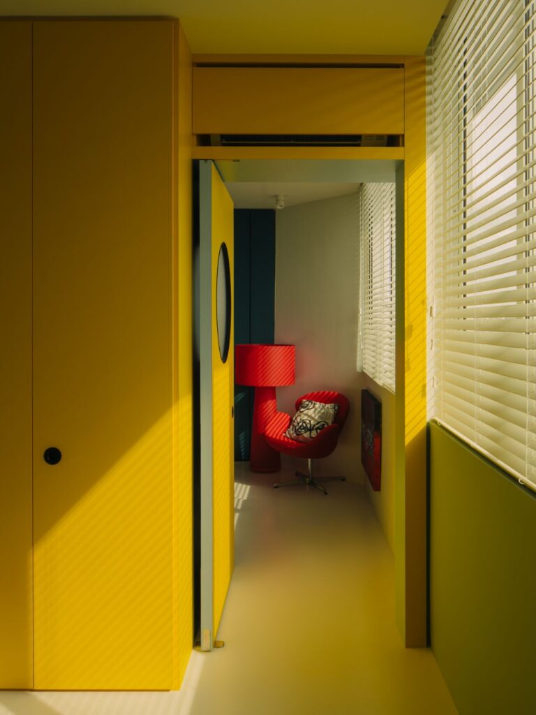
Colour blocked gallery walls slide to reveal new colour blocks. The walls of mint green and sage in the lounge area, for example, separate (right to right) to reveal the canary yellow wall of cabinetry in the bedroom. Conversely, when separated left to left, a corridor is revealed with a wall of yellow laminate framing a door with a porthole, in the same hue (laminates throughout are by WilsonArt, Panaplast and EDL) When both are opened, the entirety of the bedroom is revealed to be faced with a wall of yellow punctuated by doors and cabinetry.


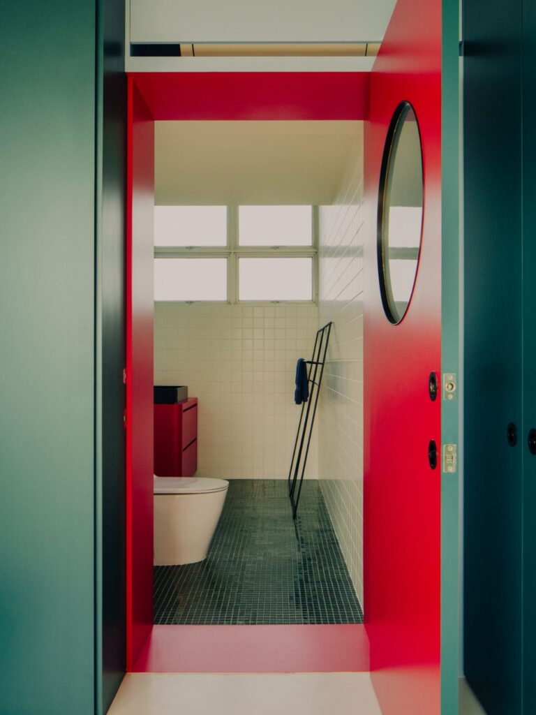
The bedroom layout is exceedingly clever with the door to the right leading to the walk-in robe – colour blocked in deep teal green – with red furniture to the entrance side and a single purple chair within. A port-holed door in the cabinetry opens to reveal a bright red inner side and a large cuff of red framing the entrance to the ensuite.

The square tiles are used here from floor to ceiling for left and right walls, with smaller square tiles in deep green used for the floor and end wall (Hafary + Unlimited Enterprises). A red lacquered pedestal with a suspended round and lit mirror and black basin is countered by a long red lined aperture stretching along the length of the double shower. A second bedroom is colour blocked in pale blue and Kelly green.


This is an exceptional apartment design that entirely meets its owners needs. The colours are outlandishly good with strength and scale considered, and delivered without truncating space. In reshaping the interior architecture, the designers have aligned the apartment to contemporary living in a way that reinforces the architectural ethos of the building. Just brilliant.


INDESIGN is on instagram
Follow @indesignlive
A searchable and comprehensive guide for specifying leading products and their suppliers
Keep up to date with the latest and greatest from our industry BFF's!
The internet never sleeps! Here's the stuff you might have missed