The home of architecture and design in the Asia-Pacific
Get the latest design news direct to your inbox!
Get the latest design news direct to your inbox!
JARKEN elevates an aesthetic centre’s identity by thoughtfully infusing the brand’s signature elements into the design of its flagship facility, writes Olha Romaniuk.
January 1st, 2015
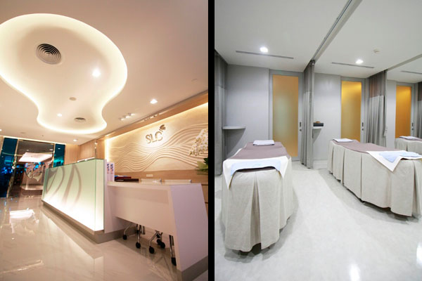
To refresh the corporate brand of SLC, one of the top beauty clinics specialising in cosmetic surgeries in Thailand, the design team at JARKEN took a holistic approach to the design challenge, creating total brand awareness by incorporating SLC’s signature identity within the aesthetic centre’s flagship branch at its location in Central Department Store, Chidlom.
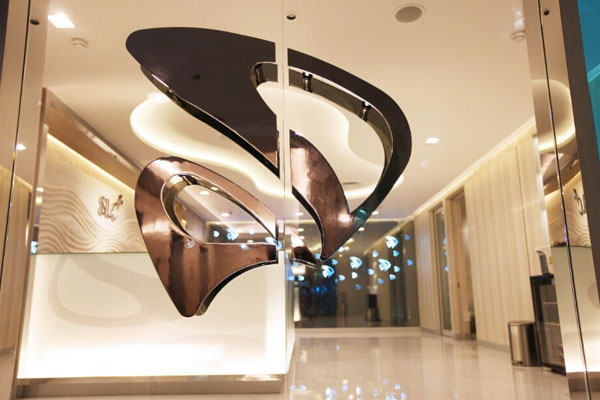
To update the brand while remaining true to its original identity, the design team, consisting of Design Principal Sasivimol Sinthawanarong and Senior Designer Sirikhwanthiwat Preesam, took inspiration from SLC’s existing branding element – an iconic butterfly that symbolises the transformative process that evolves in stages to achieve the ultimate desired aesthetic result. The morphing of a caterpillar into a butterfly became an important element in the overall design of the space, communicating a metaphor of the transformations of various brands that represent SLC (originally Siam Laser Clinic) into one corporate umbrella brand SLC.
“SLC already had the butterfly and the colour blue as part of its brand identity, as suggested by a Feng Shui master,” says Sasivimol Sinthawanarong, “We sort of “blew [that idea] up” and developed the look and colour of the brand into an interior design concept.”
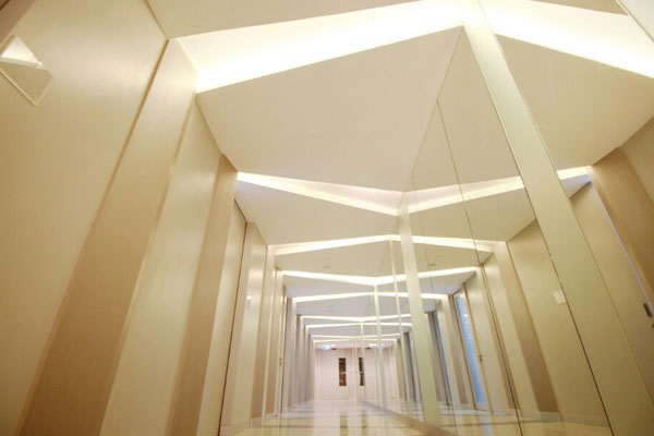
With a tight deadline of only one month to work out the main idea for the interior concept and a four-week project delivery timeline, the JARKEN design team faced a challenge of conveying the brand’s presence in subtle but impactful ways throughout the 300 square metre flagship facility before the rebranding of all of SLC’s eleven branches in February, 2015. Drawing from the essence of the brand itself, the design team distilled their approach into three main thematic concepts – nature, seclusion and artisanship – that, in turn, dictated the qualities and material choices within the centre.
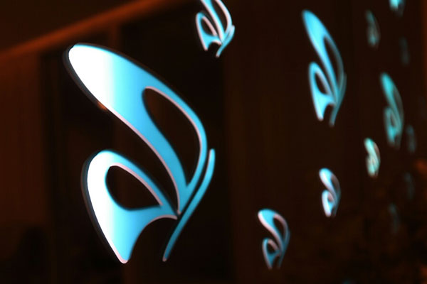
From the moment the visitor arrives in the reception area, the sensual qualities of the brand reveal themselves through the fluid curvatures of the main ceiling element and iconic images of butterflies sweeping across the glass feature wall and reflecting onto the floor below. “We wanted to infuse the main design concept into material itself to create an inner sense of brand awareness within the interior space. We have achieved this by creating one ‘masterpiece’ material that is double-layered dark tinted glass with engraved, handcrafted butterfly laminate backed with blue frosted glass. This so-called ‘masterpiece’ will be a main brand identity feature in all SLC branches,” says Sinthawanarong.
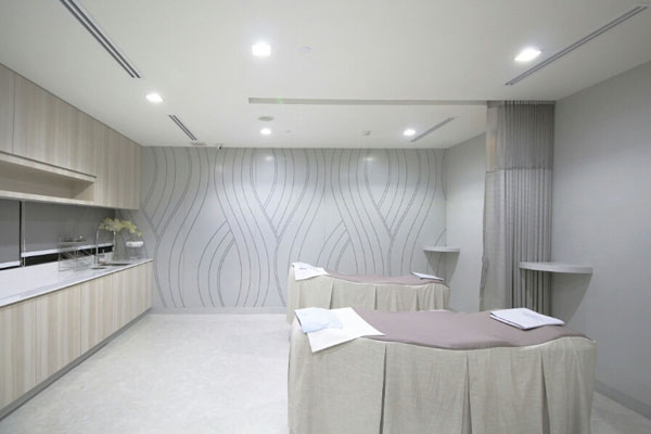
Within other zones, the brand reveals itself in subtler but effective ways: through mood lighting, colour and material treatment inspired by the brand. “To be precise, the colour palette was developed from the spectrum of colour within the butterfly’s wings. The client wished to represent ‘beauty’ from inside out, just like the beauty of a butterfly,” explains Sinthawanarong. The form of a butterfly also inspired the treatment of the wall behind the reception counter, where grained dust stone was crafted and shaped carefully to achieve the desired undulating effect.
With the unveiling of its flagship’s new facilities in Chidlom, SLC’s revamp of its brand is paving the way for a much bigger project that is reaching its last stages of completion. In early 2015, JARKEN is due to conclude an architectural and interior design and delivery of a 4,000 square metre SLC Aesthetic Hospital in the heart of Bangkok. With that, the brand aims to solidify its reputation as the top aesthetic medical facility in Thailand.
JARKEN
jarken.net
INDESIGN is on instagram
Follow @indesignlive
A searchable and comprehensive guide for specifying leading products and their suppliers
Keep up to date with the latest and greatest from our industry BFF's!
The internet never sleeps! Here's the stuff you might have missed