The home of architecture and design in the Asia-Pacific
Get the latest design news direct to your inbox!

Get the latest design news direct to your inbox!
When Nick Statham and David Trubridge spent time in the Pilbara during a 2011 FORM residency each responded to that magnificent place in a different way. Leanne Amodeo reports.
August 13th, 2013
Statham was enamoured of the various components that make up the landscape, while Trubridge felt completely and utterly at home. What a joyful exercise it must have been for both designers to translate their experiences into objects intended for exhibition.
It so easily could have resulted in some clichéd attempt to literally recreate the region’s sublime beauty, as Paul McGillick so eloquently suggests in his accompanying essay. Instead the designers tackle the complicated question of place through works that are abstract and sculptural. Do they immediately scream Pilbara? No, and herein lies their implicit appeal.
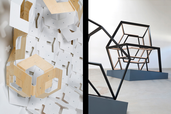
Geo Series – Nick Statham
Without prior knowledge of their genesis these works still stand up as strong objects in their own right. They are curious and engaging because they are well crafted and rigorously resolved. On first impression they may hint at the concept of place because of the way they deliberately inhabit the space; hugging the wall, rising from the floor. But what is striking about each work is the way they relate to each other, which is dramatic in effect.
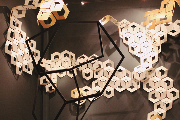
Geo Series – Nick Statham
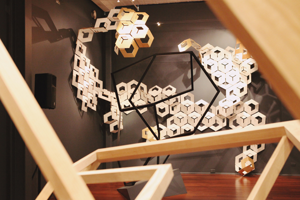
Statham’s Geo Series: Untitled creeps and crawls its way up the wall; a series of abstracted plywood blocks that merge and interlock. The designer’s fascination with the Pilbara’s different components is on show here. As is his understanding of the region’s natural evolution and erosion. It is represented in Untitled’s geometric composition in a way so subtle it almost belies how conceptually complex the work actually is.
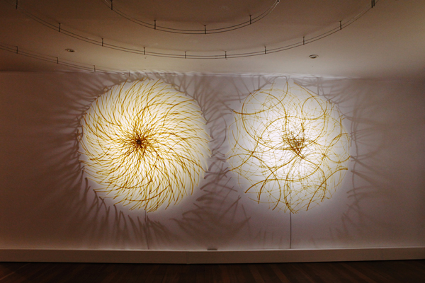
Tipu – David Trubridge
Statham’s wall installation may be a highlight of the Faultlines exhibition but Trubridge’s mighty Tipu wall lights refuse to be overshadowed. They are large in scale and hard to ignore because of it. What fascinates, however, is Trubridge’s mastery with materials. His use of PLA plastic and New Zealand flax fibre is appealing because of the delicate pattern it lends each work.
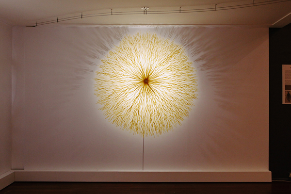
Tipu – David Trubridge
It is a gentle nod to Trubridge’s Pilbara experience that he uses a material native to his own home. That Tipu’s form is based on a prototype the designer made of the scorched acacia bush skeletons found in the region reveals a poetic interplay in his practice. The inclusion of the Acacia prototype in the exhibition alongside Statham’s Geo Series prototypes is a generosity on the part of the designers and a welcome insight into the works’ making.
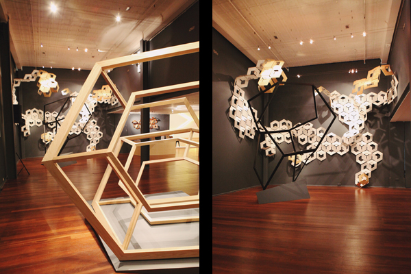
Geo Series – Nick Statham
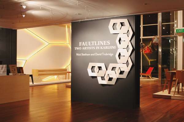
Faultlines is part of the Midland Atelier’s fifth anniversary celebrations. It sits in a suite of three exhibitions that each focus on a particular aspect of the Atelier’s programming. As an argument for the importance of residencies to FORM’s creative programs the exhibition is undeniably persuasive. Seeing work by Nick Statham and David Trubridge side by side makes Faultlines well worth visiting.
Faultlines: Two artists in Karijini
357 Murray Street, Perth
Until 14 September 2013
FORM Gallery
(Images © Matt Biocich, David Trubridge and Eva Fernandez)
INDESIGN is on instagram
Follow @indesignlive
A searchable and comprehensive guide for specifying leading products and their suppliers
Keep up to date with the latest and greatest from our industry BFF's!
The Australian Institute of Architects NSW Houses Tours continue in November with ’Seidler and Rickard’ on November 29 2008.
The full day tour will feature work from two of Sydney’s most renowned architects – Harry Seidler and Bruce Rickard. While the locations are yet to be confirmed the tour is likely to take in Rose Seidler House, the McCartney house at Clontarf and the Whale Beach House.
Lunch will be at the popular Moby’s Restaurant. Bound to be a popular tour, you should book early.
Lee Baker-Louis – 0418 606 367
leeanne.baker-louis@raia.com.au
The internet never sleeps! Here's the stuff you might have missed