The home of architecture and design in the Asia-Pacific
Get the latest design news direct to your inbox!
Get the latest design news direct to your inbox!
Frost* Design has created a signage and graphics system that fosters innovation and collaboration within the redevelopment of Qantas’ HQ in Sydney. Anna Guerrero reports.
June 18th, 2014
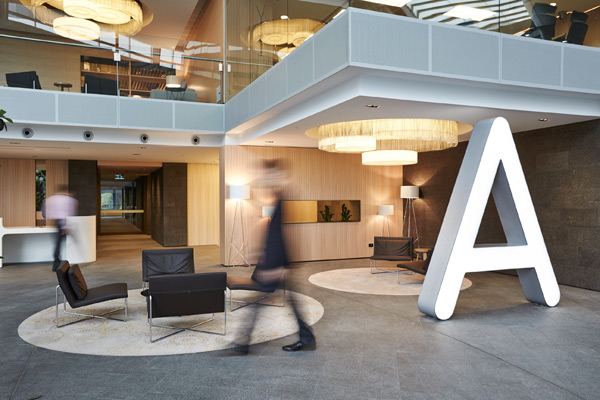
The newly launched redevelopment of Qantas’ HQ in Sydney’s Mascot is a feat on several fronts. Most significantly, the project’s consolidation of space not only accommodates for increased communication between staff, but creates a platform for the company to proudly engage with clients and visitors. This is achieved through the combination of seven disparate buildings across many addresses into one campus style workplace made up of four buildings and connected by a new external spine.
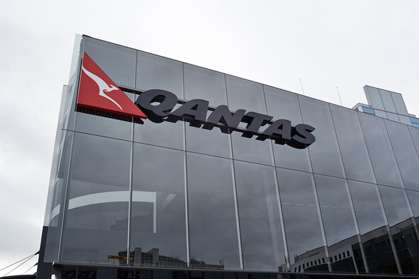
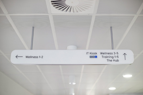
On a more subtle front, the ‘devil is in the detail’ certainly reigns true for the success of signage within the two year project. Branded by Frost*, the design firm has created a signage and environmental graphics system which aims to create a connected workplace that fosters innovation and collaboration and empowers the people that operate within it.
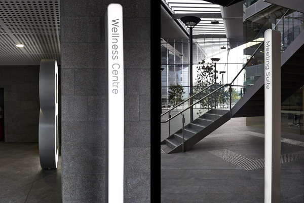
According to Frost*’s, Head of Environments’ Carlo Giannasca, it’s a technique which transforms the space into a community. “Each of the buildings becomes street addresses; with precincts along the street, such as the reception lounge, theatre and bistro,” he explains. “We developed a Signage and Graphics Strategy for the whole campus, creating concept designs for key sign types; and staging detailed design, documentation and construction to align with the building works.”
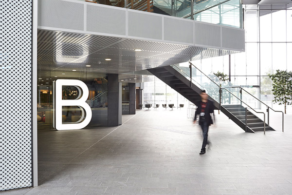
The basic construction of the signs includes an aluminium frame that encases a frosted acrylic sheet which in-turn is illuminated by a matrix of LEDs that sit below the surface. The result is signage that literally shines like a beacon, guiding users around the building. The graphics are applied vinyl die-cut lettering rendered in two shades of grey, designed to facilitate changeability.
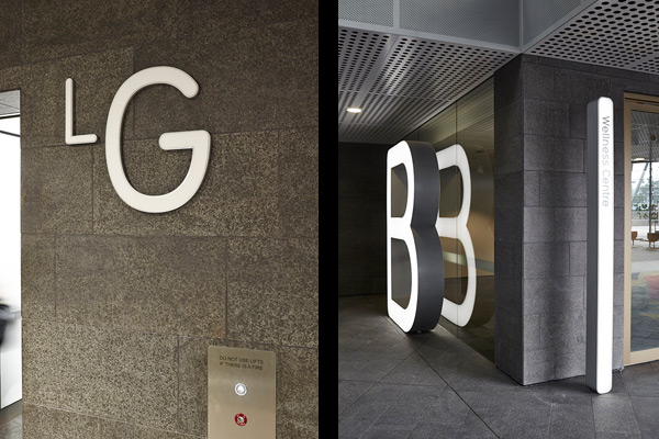
In collaboration with the layout strategy which paves way for new methods of communication, the application of signage fulfills Qantas’ brand values by utilising a contemporary approach, a refined aesthetic, and high functionality.
Frost* Design
frostdesign.com.au
Photography: Ant Geernaert
anthonygeernaert.com
INDESIGN is on instagram
Follow @indesignlive
A searchable and comprehensive guide for specifying leading products and their suppliers
Keep up to date with the latest and greatest from our industry BFF's!
Australian designer Marc Newson has become an international superstar, best known for his extraordinary piece of furniture, the Lockheed Lounge, as well as his Ikepod watches and the interior of Qantas’ Airbus A380. In Australia for the launch of the sensational new limited edition book Marc Newson: works, by author Alison Castle, (published by Taschen) […]
The internet never sleeps! Here's the stuff you might have missed