The home of architecture and design in the Asia-Pacific
Get the latest design news direct to your inbox!
Get the latest design news direct to your inbox!
A tight turnaround did not hamper creativity on this positively electric retail pop-up designed by Christopher Elliott Design.


When you’re working to an incredibly tight timeline, something’s gotta give, right? Phare Shoes, designed by Christopher Elliott Design, was conceived and documented in just two weeks! But the quick turnaround didn’t hamper creativity, Elliott says. In fact, the shortened time frame was something that worked in his favour.

“The good thing about the short deadline is it gave us an insight into how we can simplify some of our services. We had to look at the way we achieve our deliverables, and go, ‘Okay, what’s the most efficient way we can get there?’ Because there just wasn’t time for any fluff.”
Eye-catching in its aesthetic, the Phare Shoes pop-up features strong angles and geometries, which collide with peach tones and pops of magenta and blue. The outcome is what Elliot himself describes as a “feminine but powerful space”.
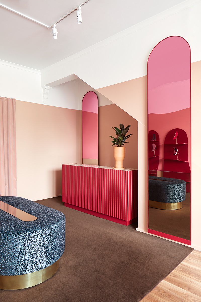
The concept for the space came from wanting to reflect the brand itself, but also the “courage that the owner shows in the design of her products”. These elements were infused into the design, not simply through the colour palette, but with some of the design choices – such as a blue capsule-shaped, leopard print bench seat.
Elliott says he “was immediately excited by the opportunity” of the project, which came to him via the owner – also a friend. Right from the get-go it was apparent that they both had similar ideas for how the small, short-lived space could come to life, all in an incredibly short amount of time.

It could be easy to think that the pressures to turn the project around so quickly would leave an opening for lack of attention or lack of details. This was certainly not the case, however, as part of the project’s success can be attributed to the acute level of detailing and polished execution.

This is no mistake and forms the backbone of Elliott’s approach to design. “My design philosophy is about detail and execution. To me, quality comes through in the way something is executed, which is just as important as the design itself. I would rather have less of everything, but all of good quality, than a whole lot of stuff that just isn’t up to scratch,” he states.
See other work by Christopher Elliott Design here. And get design inspiration each week, sign up for
INDESIGN is on instagram
Follow @indesignlive
A searchable and comprehensive guide for specifying leading products and their suppliers
Keep up to date with the latest and greatest from our industry BFF's!
The internet never sleeps! Here's the stuff you might have missed