The home of architecture and design in the Asia-Pacific
Get the latest design news direct to your inbox!
Get the latest design news direct to your inbox!
Getting a glimpse into the inner workings, and design, of an architecture practice, fulfils a voyeurism for many in the industry. Brooke Lloyd, director – head of interior design at Cox Brisbane, opens up about the process taken when redoing the practice’s own office. And as you can imagine, it’s all about diplomacy and democracy meeting design.


Brooke Lloyd: The process itself was quite difficult actually, which is surprising because we’re a bunch of architects. It was really all about collaboration. There are five directors in the practice so we managed most of the reviewing, along with a lot of collaborative sessions where all the staff threw in ideas.
Cox has got a flat structure, so the process that we undertook for our own workplace was the same we would do for any work project. You really have to take the time to listen to staff, even if some of the suggestions are strange. There was a certain staff member that suggested we put a golden egg in the middle of the space!
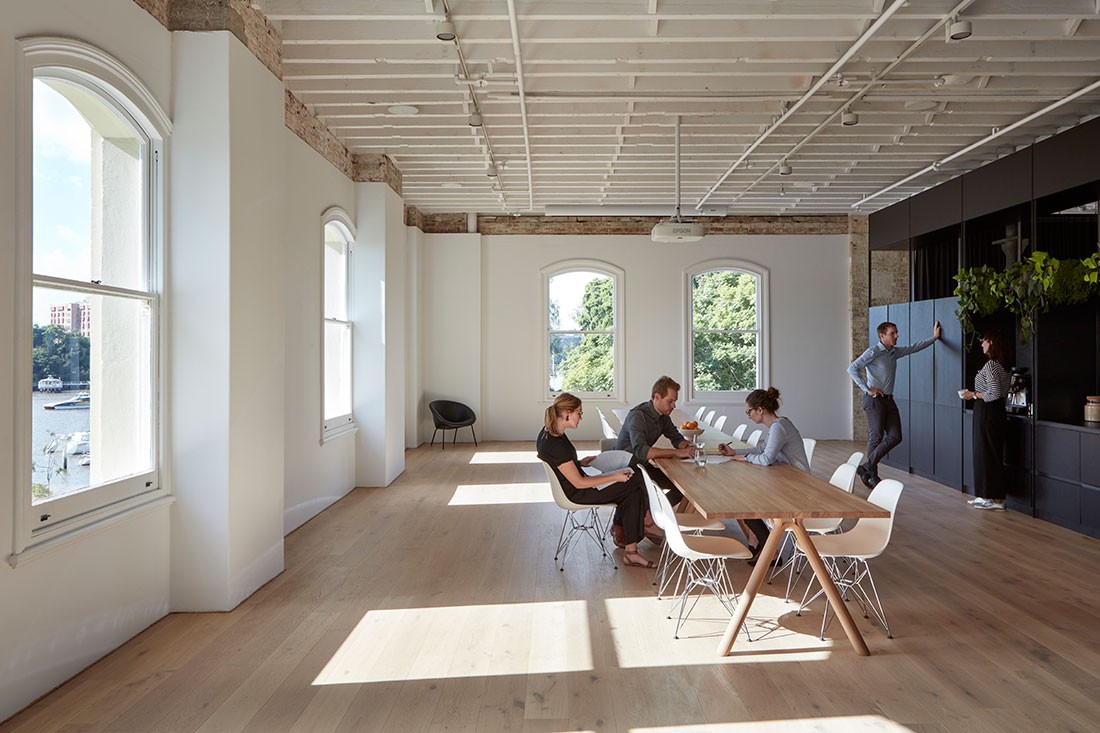
The heart of the studio is our town hall space, and that was a really important move for us in repositioning how we work and providing a gathering space for everyone to come together.
We wanted a flexible space that we could engage with clients in a really casual way because that’s the personality of Cox, we’re not formal at all.
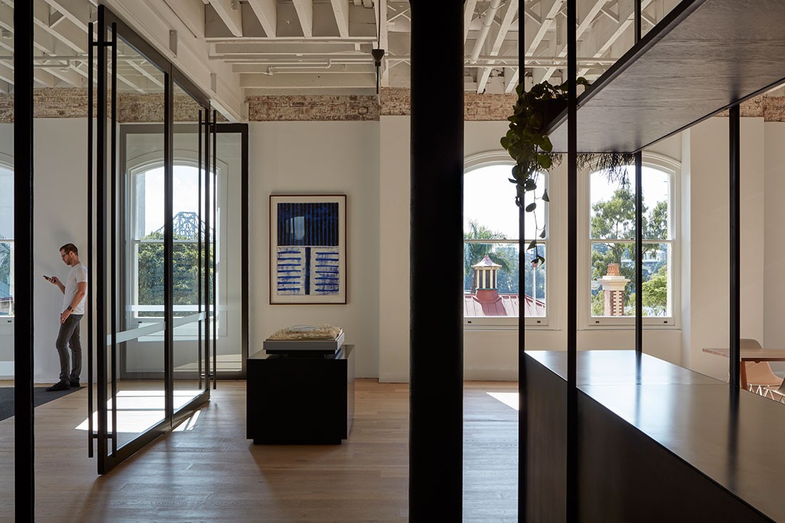
Our kitchen table is right in the centre. It’s also where our clients sit and wait and interact with the team. So that town hall space, which connects up with our boardroom space, is the heart of the studio. The boardroom is purposely transparent as well, because again, that’s really important to us – having a sense of transparency.
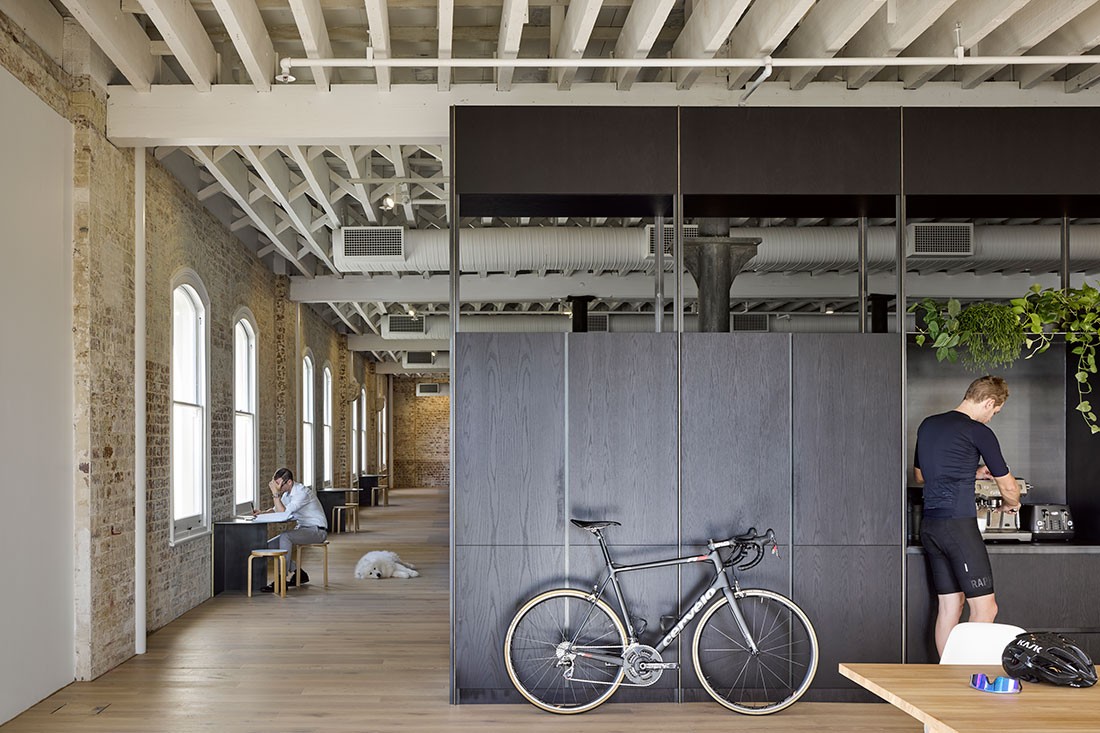
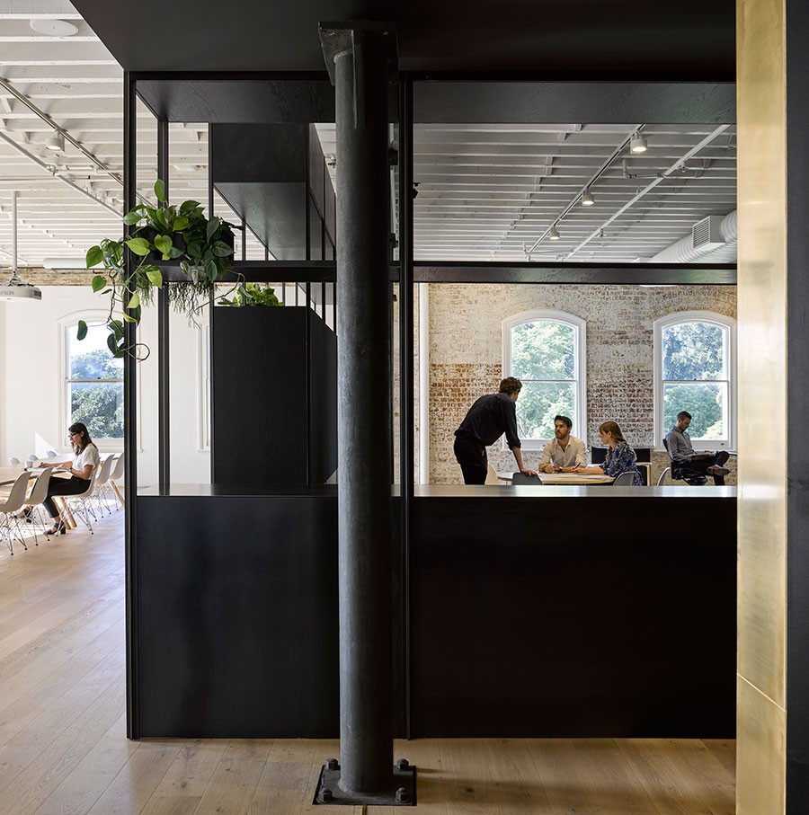
Another key move was to create a review spine that goes down the length of the studio. It’s essentially a pinup wall, which really puts the design review process at the centre of our working space. This is exactly how we work on all projects, there is constant reviewing and appraisal, it’s never just moving forward in a pure linear line. It is quite important to the way we work.
We always have a lot of projects up on that wall. We look at our work in a really transparent way and allow that design to sit and have the opportunity for the team to come back and review and keep tinkering away.

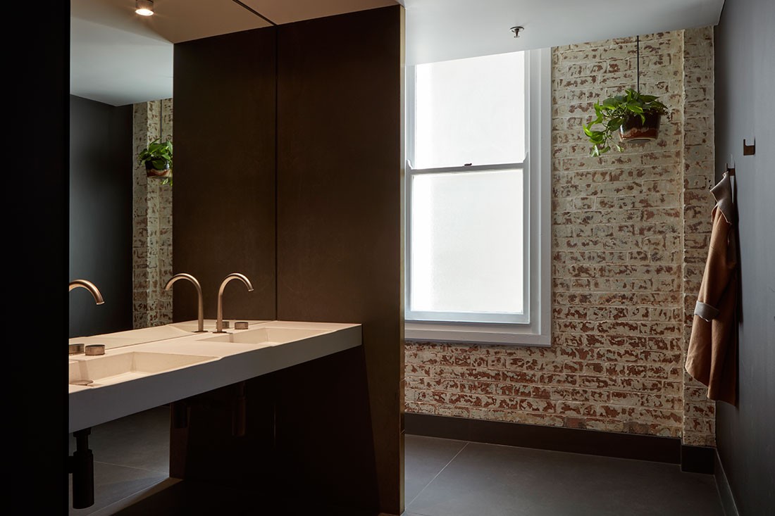
We wanted the materials to be secondary to the arrangement of the space and the heritage. For many years the design was covered by years of different conversions, layers of ceiling tiles, paint and carpet tiles.
One of the most delightful parts of the process was peeling back and revealing those existing materials. Some of the material choices we didn’t make until we had stripped back and we’d seen what the patina of the brick was and what the colour of the steel was.
We always had in mind that the palette would be quite neutral and it would also reference the industrial heritage. We’ve got these amazing, original cast iron columns that were also stripped back. We wanted to reference that in a lot of the detailing, so there’s a lot of black and steel detailing in the joinery and the kitchen is designed with sheets of black and steel, and little bits of brass as well.
So that metal heritage and original warehouse function were really important, while we wanted the rest of it to disappear. There’s also a beautiful ceiling structure that we wanted to highlight.
Another thing that is the secondary hero of the actual heritage is the view. By having a black core, light penetrates through the whole space and creates a light-filled perimeter.
I think my favourite thing from the whole project was the peeling back and the reveal of these layers of paint on the brick. It was such a slow, careful process so we didn’t damage any of the heritage fabric.
It was fascinating to see the layers revealed over time. There were lavenders then magnolia paint colours, and you could see the history being revealed bit by bit.
We also had a very interesting moment where we saw that a fire had broken out in the ceiling. This whole process has probably had the most transformative effect on the space, just the additional volume and height.
It has really surprised us how it changed the way we work. We thought that it would have a positive impact, but we’ve been pleasantly surprised at just how positively it has affected Cox in Brisbane.
Going through such a big change has also allowed us to review some of our internal processes. We’re pushing a more sustainable agenda. It might only be a little thing, but instead of printing out reams of paper for reports and doing hand markups, we now do it all on screens.
Everyone is moving towards being more paperless and doing things online, which may sound simple, but architects can be very traditional in the way they work.
There are also lots of screens for collaboration, so we’re trying to pull people away from their desk when they’re having group discussions.
Take a look back at the Cox Architecture archives.
–
Keep up to date with the industry. Sign up for our newsletter.
INDESIGN is on instagram
Follow @indesignlive
A searchable and comprehensive guide for specifying leading products and their suppliers
Keep up to date with the latest and greatest from our industry BFF's!
The internet never sleeps! Here's the stuff you might have missed