The home of architecture and design in the Asia-Pacific
Get the latest design news direct to your inbox!
Get the latest design news direct to your inbox!
Prada unveils their new Miu Miu store with a bold palette, balanced by a homely set up that offers respite amidst a busy district, as intended by long-term collaborators, Herzog & de Meuron. Joanna Kawecki has the story.
June 16th, 2015
Images: Nacása & Partners
The new Miu Miu store sits on the renowned luxury boutique strip of Miyuki Street, diagonally across the street from the iconic all-glass Prada store – an architectural landmark in it’s own right – both designed by long-term collaborators Swiss architects, Herzog & de Meuron.
Within a district known for luxury and designer boutiques in a low-rise setting, the destination is a more casual and relaxed approached than sister luxury destination Ginza, located amongst high risers and department stores.
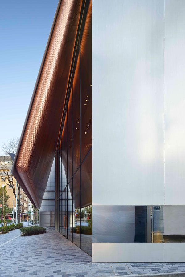
The two-storey boutique holds an unobtrusive and humble demeanour. Warm polished copper, wood and sophisticated solid panels complement a homely feel. It is an intimate design decision compromised by Tokyo’s zoning regulations, yet one that has provided a perfect fit for the building’s composed approach, and a stark contrast to it’s older sister Prada stores, which hail a louder architectural voice and stature. Yet the store’s minimalism is not to be undermined, as the architects explain, “This was how we directed our ideas. More like a home than a department store, more hidden than open, more understated than extravagant, more opaque than transparent.”
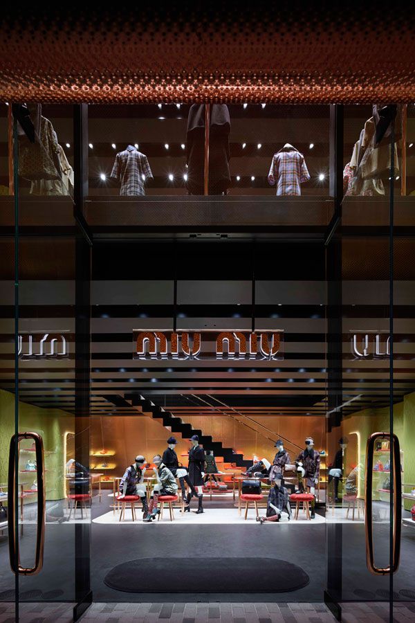
As a 720 metre-square building, it is a simple yet underestimated design, with an overturned box-like structure and a front exterior primarily covered by a resilient, striking steel facade. When approaching the building from its side Miyuki Street, visitors come across an unexpected reflective surface. Pleasantly surprising, the metallic façade intentionally acts like a mirror, warmly ricocheting the street and images of the passersby. Rather than traditionally featuring a transparent storefront, the solid design instead holds an additional function of resisting sunlight to create its own controlled environment inside.
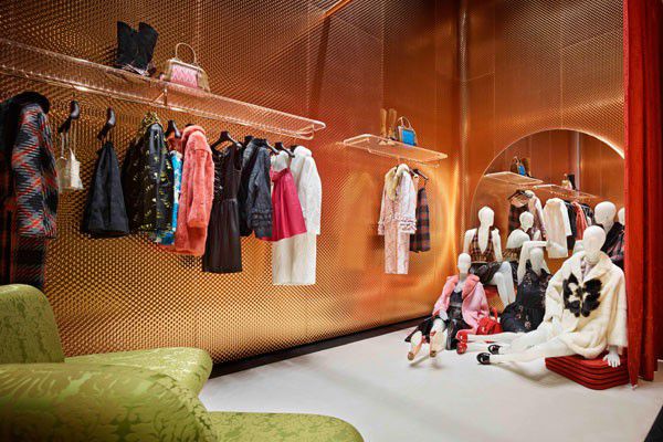
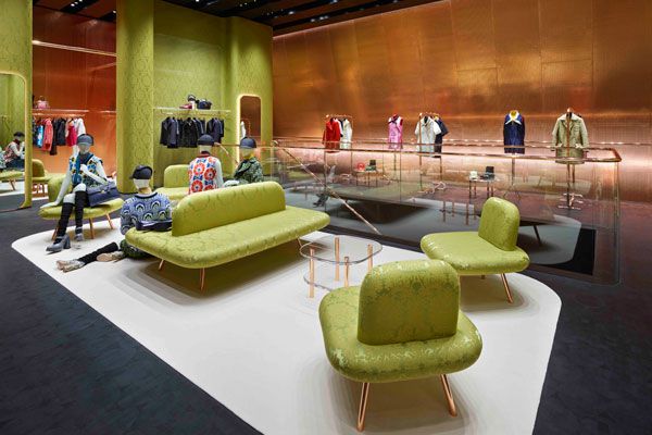
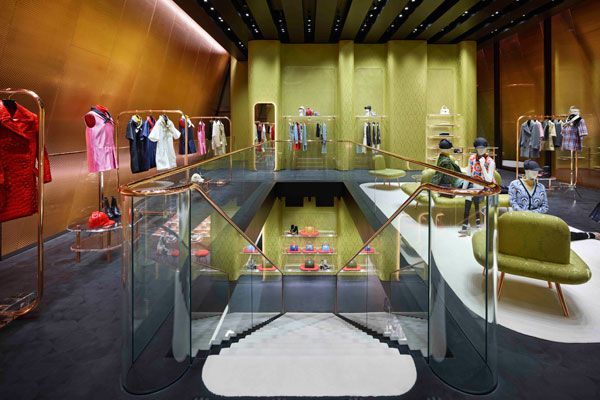
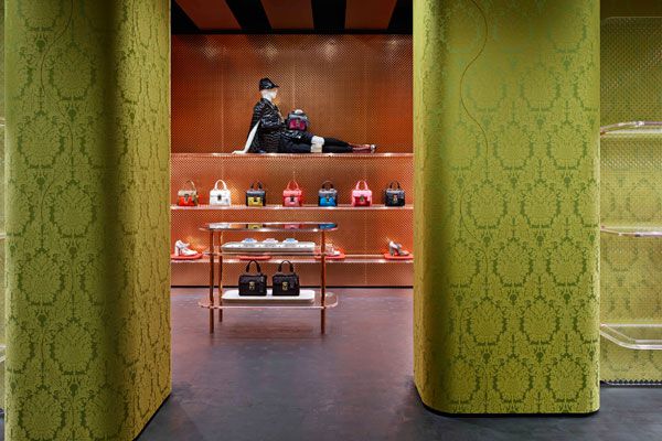
Like a gift box, the building invites you through two central doors to an array of colours and textures, with the staircase barrier providing an uninterrupted transition between both floors. Brightly lit, colours such as burnt orange and olive are complemented with bronze detailing in the furniture and surrounding interior walls.
The furniture exudes a retro atmosphere, with rounded seating, mirrors and prominent olive Damask wallpaper print that is also repeated in the upholstery and amongst the classic Miu Miu brocade. Garments, accessories and shoes are displayed personally, just as an intimate wardrobe. Surprisingly, the in-store mannequins relax alongside the curved furniture, encouraging guests to do the same – an unusual display yet refreshing approach.
Miu Miu Aoyama is a bold and minimalist feat in design. The top-heavy and canopy-like design embodies a protective shelter-like space, perhaps one you could safely spend hours inside – exactly what the architects intended. Leading the project, head architect Jacques Herzog explains, “Tokyo is quintessential city, its territory is fully exploited with absolutely no accommodation for the individuality that we take for granted in European cities. While the street is not a place that encourages lingering, the building extends an invitation to come inside…and stay.”
Spacious and warmly-lit, the high ceiling and open design reflect an intimate and comfortable space, both for the garment collections and as an example of stellar architecture and interior design by Herzog & de Meuron.
Herzog & de Meuron
herzogdemeuron.com
INDESIGN is on instagram
Follow @indesignlive
A searchable and comprehensive guide for specifying leading products and their suppliers
Keep up to date with the latest and greatest from our industry BFF's!
The internet never sleeps! Here's the stuff you might have missed