Kingsleys by Richards Stanisich (formely SJB Interiors Sydney).
If your business was a person, who would it be? Kingsleys in Sydney had already workshopped its brand strategy and came to SJB with an intriguing brief: to personify Liam Neeson. Looking beyond the Hollywood glamour, SJB has translated this quirky concept into a fit-out that speaks to both its locality and Liam using an interior palette filled with character quirks.
If you ask most people to describe Liam Neeson, chances are they’d use words like rugged, handsome, reliable, thoughtful and intelligent. His public persona is undeniably appealing. So much so, that when Australian Venue Co approached Richards Stanisich (formerly SJB Interiors Sydney) to renovate Kingsleys – a much-loved, highly regarded Woolloomooloo institution – they asked the practice’s Sydney-based team to design a new interior that personifies the Hollywood actor.
Story continues below advertisement
It’s a fun, open brief, but it required a very serious outcome and rigorous thinking around how to translate it. The challenge was distilling those qualities associated with Neeson to deliver an on-brand identity that didn’t resemble a themed restaurant. For Richards Stanisich’s Kirsten Stanisich, formerly SJB Interiors Sydney, it was important to not take the client’s direction too literally. Rather, use it as a conceptual springboard for exploring ideas around character and personality with a view to creating an experiential design that’s memorable.
Story continues below advertisement
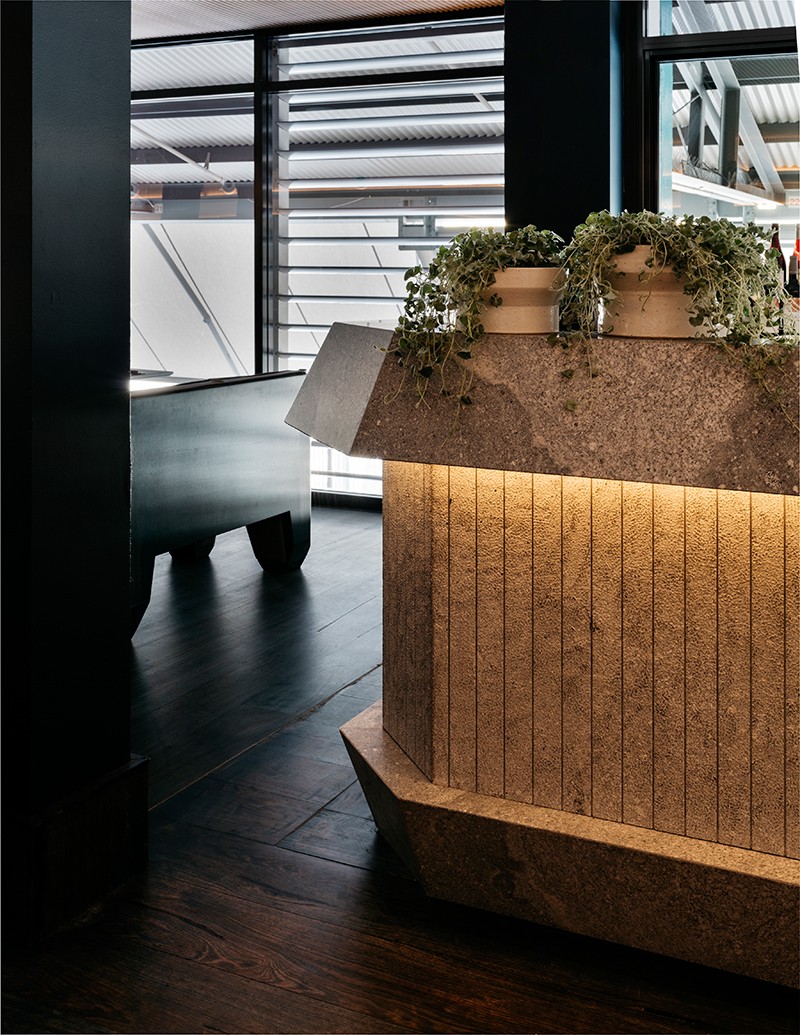
The starting point was materiality as robust as it is elegant and a colour palette that’s nothing short of delicious in its degree of sophistication. “There’s a great masculine quality to Liam Neeson, as well as a fairness and charm and I can imagine him being a very practical person too,” says Stanisich. “Based on that we decided to use woody blue tones throughout the interior and utilitarian finishes that can still evoke a sense of softness.”
Story continues below advertisement
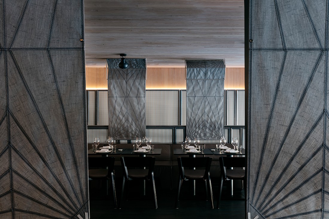
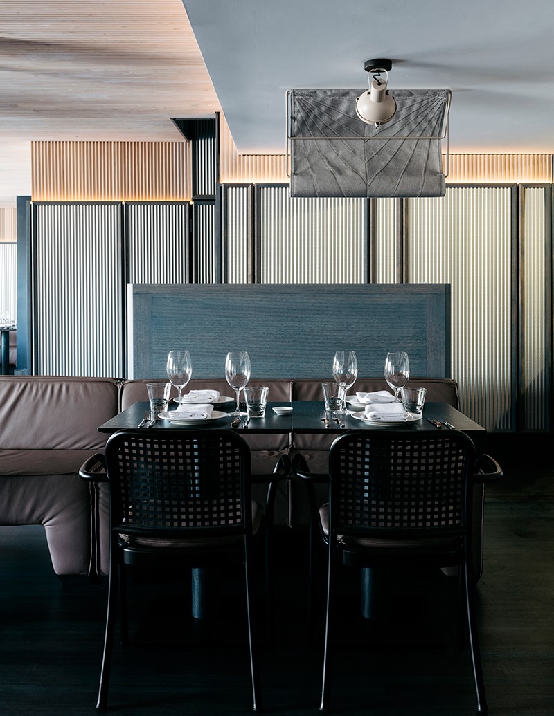
Kingsleys has long been popular with businessmen for lunchtime meetings and the design respects that, while being totally inclusive and not alienating any other demographic. Timber frames, supports and recesses are stained different shades of blue, a thoughtfully nuanced gesture that complements the dusty mauve leather upholstery and dove grey fabric room dividers.
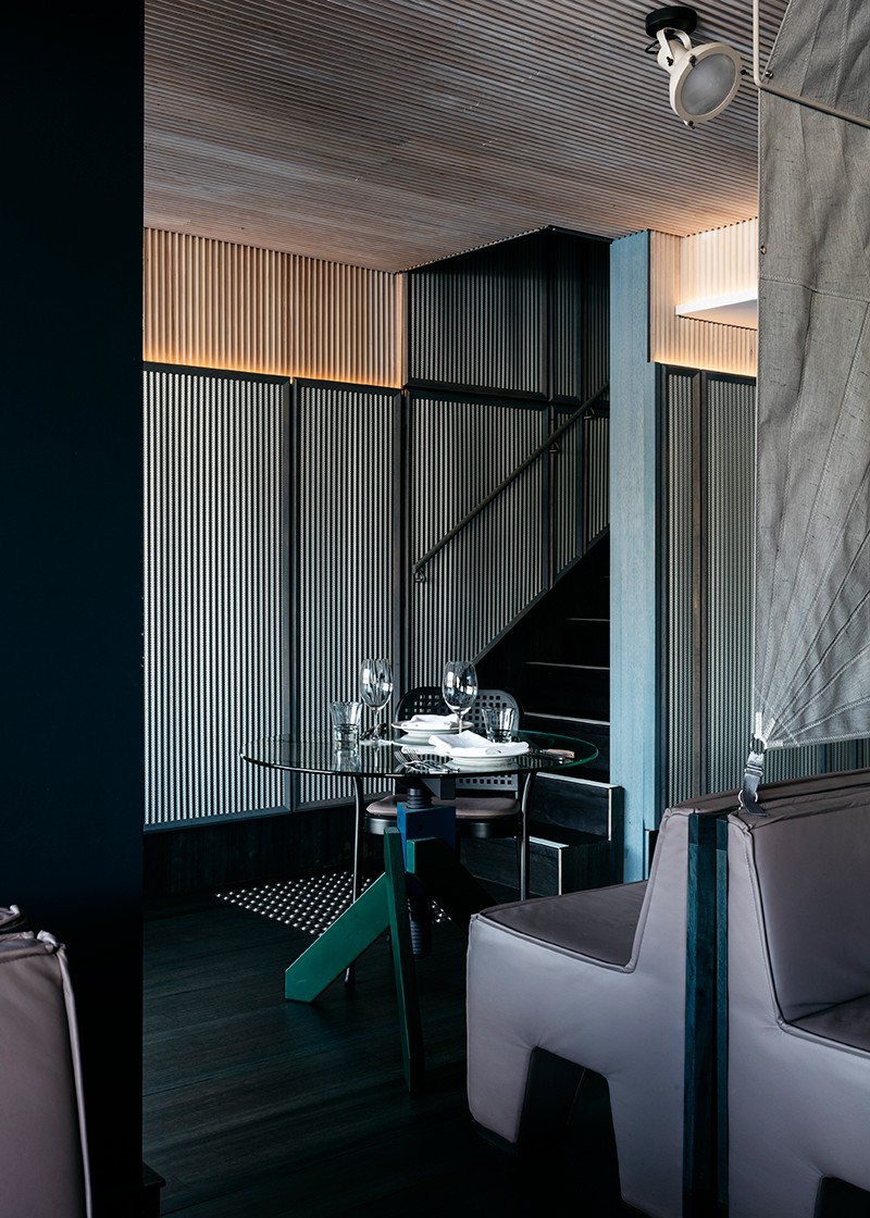
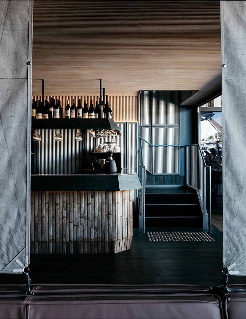
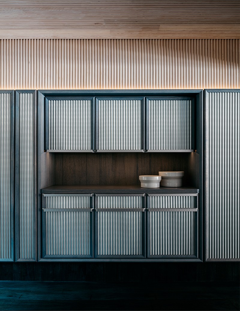
These details all work particularly well against the perforated Mini Orb that’s applied to the walls across both levels of the restaurant as a base finish. Selecting an exterior grade product for an internal application may seem curious, but it resounds strongly within the overall scheme as a deliberate placemaking device.
“As with all SJB interiors, it was essential Kingsleys had a really good connection to place so there’s some sort of grounding behind all our design decisions,” explains Stanisich. “In this instance, the restaurant’s building sits on a heritage wharf that has a real industrial warehouse feel to it. So, by using a technically refined modern version of corrugated iron, we ensured the interior is visually connected to the waterfront building that houses it.”
A corrugated Mini Orb material has been applied all throughout the interior, including the waiter station.
Understated nautical references also abound, from the room dividers, which are actually made from sailcloth, to ribbed timber that wraps the tops of the walls and ceilings. It feels reminiscent of a boat’s cabin, especially because the restaurant’s ceiling height is relatively low. Interestingly, the ribbed timber extends the profile of both the Mini Orb and the private dining room’s glass doors, making the fit-out all the more cohesive and smart.
Subtle nautical detailing and sailcloths speak to the surrounding context.
It’s highly unlikely anyone would walk into Kingsleys and think, ‘Oh my goodness, Liam Neeson!’ The more probable scenario is that people would feel comfortable in the space because they respond positively to the handsome detailing, thoughtful colour palette and intelligent use of materials. If they found out the design was inspired by the Hollywood actor, it might raise a smile or an eyebrow, but wouldn’t necessarily change their experience, which was Stanisich’s intention.
Various corrugated finishes line the space, adding cohesiveness.
This project’s deftly rationalised concept manifests as an exquisitely beautiful interior design and therein lies its success.
This article originally appeared in issue #74 of Indesign magazine, the ‘Design Relish’ issue.
–
Always be inspired by design. Sign up for our newsletter.