The home of architecture and design in the Asia-Pacific
Get the latest design news direct to your inbox!
Get the latest design news direct to your inbox!
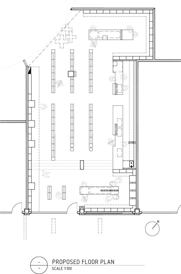
For the rebranding of Whites Dispensary in South Melbourne, Studio Equator took the opportunity to discuss the business of the pharmaceuticals industry. Through a strategic approach, the space brings an industry built on tradition into the current market, in turn increasing business opportunities.
January 5th, 2015
From the Designers:
“It is health that is real wealth and not pieces of gold and silver.” ~ Mahatma Gandhi
In our design for Whites Dispensary, Studio Equator wanted to achieve a distinctly different look in an industry that is deeply rooted in a traditional and unchanging aesthetic.
The aim was to design an interior and visual identity to increase the dispensary income whilst maintaining steady growth in the beauty, health and luxury goods sections, presented through an environment that emphasises personal service and a trustworthy brand.
The ultimate goal is to reposition the brand to better service the market, and in doing so, change the way companies behave in an industry that hasn’t changed in decades. With this refreshed concept, Studio Equator has allowed the visual identity to grow with the ability to change quickly and keep up with customer demands and challenges.
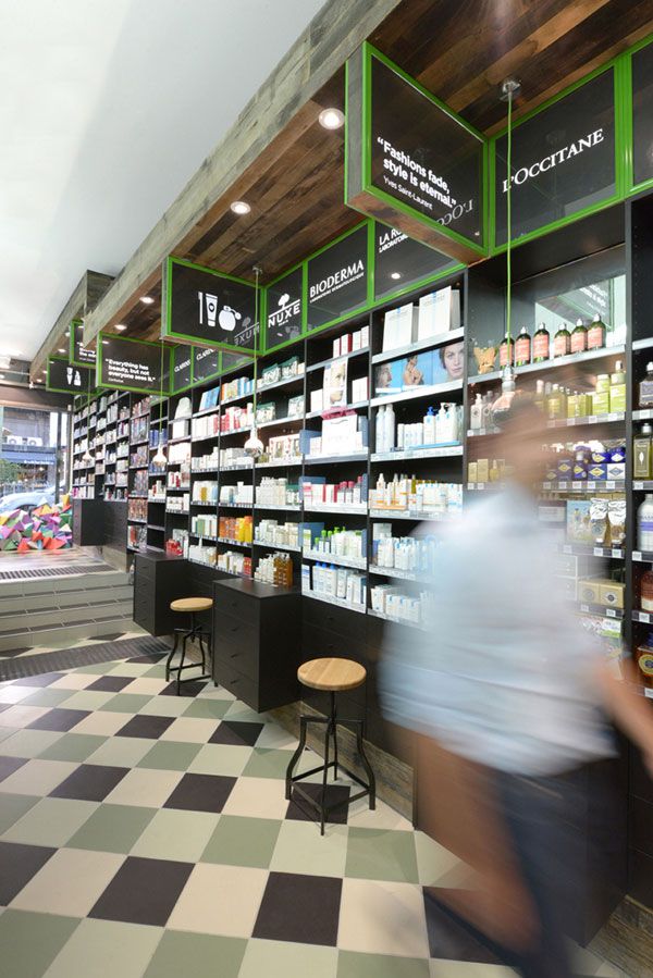
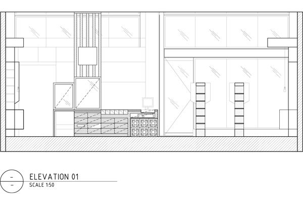
Reclaimed wooden horizontal panelling cloaks the façade of the shop, and showcases the new logo. An organic use of materials and authentic chemist and medicinal symbols support the overall design.
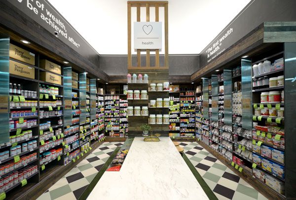
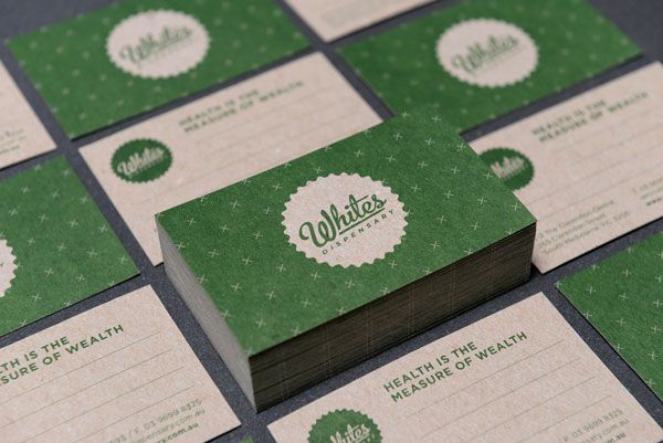
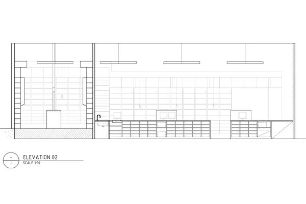
Large-scale graphics pinpoint the Whites philosophy that “Health is the measure of wealth” with well-known sayings from some of the worlds most influential spiritualists. Colour, Materials and a finishes scheme of raw timber, green, white, black and gold separate each section – Health, Wellbeing, and Beauty.

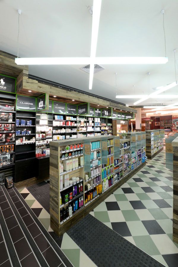
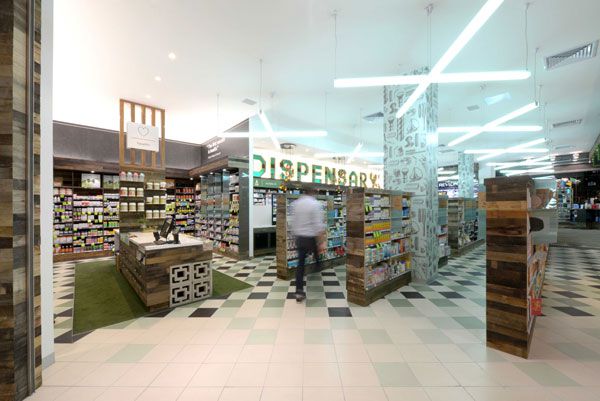
The interiors reflect a contemporary look & feel often showcased in the fashion and hospitality sectors. The checkerboard tiled floor, custom joinery, reclaimed grey skin aged timber, decorative concrete bricks, green carpet, cross-shaped large scale lights and industrial furniture create a sense of warmth framing the products and allowing them to stand out. The beauty products contrast with the natural feeling of the dispensary proposition and thus stand out in its earthy luxurious approach.
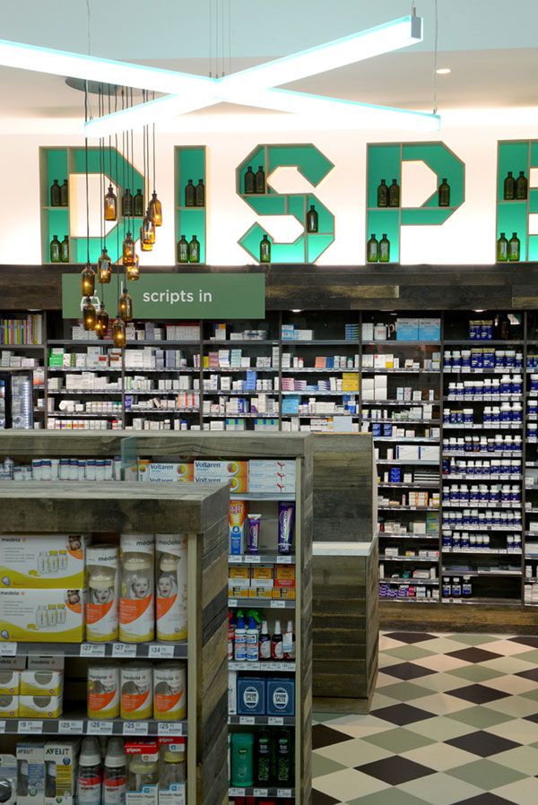
A custom set of icons with reference from original medical symbols was created to promote White’s services and products, reflect the brand typography and enhance the pharmacy’s way finding.

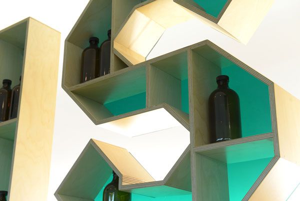
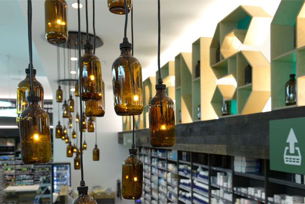
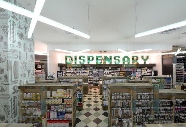
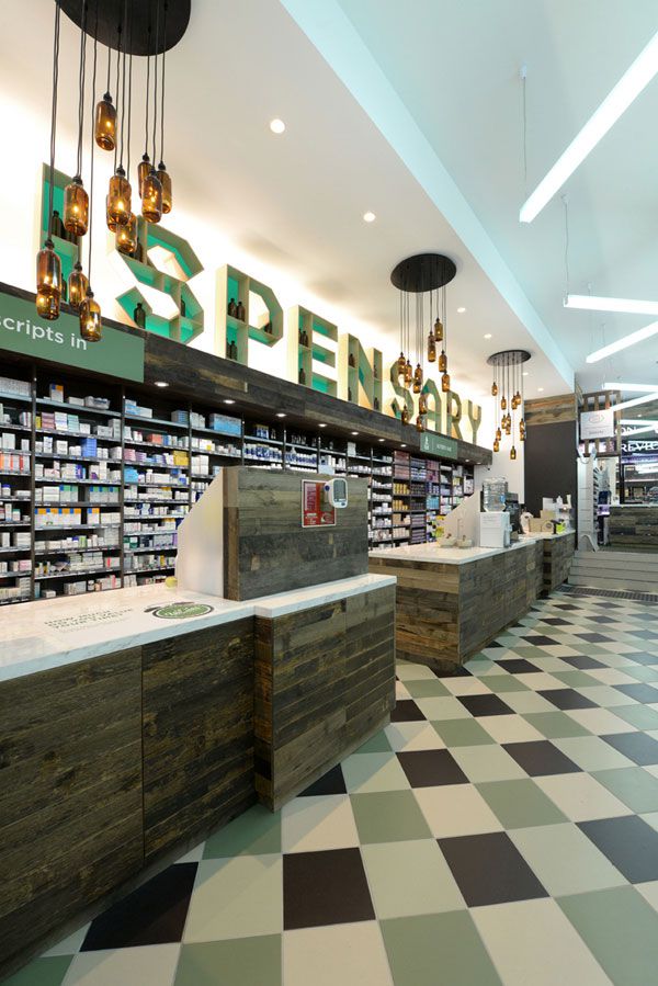
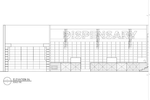
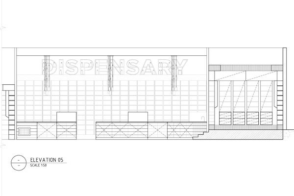
Bespoke large-scale 3-dimensional typographical forms were designed and hand-made as a central visual point serving as both signage and shelving. These feature shelf-letters are softly back illuminated, and positioned above the dispensary area, with medical bottles sitting on the shelves as decorative props.
The sculptural letterforms are supported by custom medical bottle LED chandeliers, which are now a Studio Equator signature piece.

Photography by Anne-Sophie Poirier
DESIGN FIRM: Studio Equator
DESIGNERS: Carlos Flores, Benjamin Fretard
LOCATION: 265 Clarendon Street, South Melbourne VIC 3205
DIMENSION: 180 m2
YEAR COMPLETED: 2013
Studio Equator
studioequator.com
INDESIGN is on instagram
Follow @indesignlive
A searchable and comprehensive guide for specifying leading products and their suppliers
Keep up to date with the latest and greatest from our industry BFF's!
The internet never sleeps! Here's the stuff you might have missed