UK based designer Gonçalo Campos turned to his homeland’s major export to realise his latest piece, the Rolha Table
March 11th, 2013
Home to 50% of the worlds cork production, Portugal has a proud and long standing affiliation with the natural resource.
Both sustainably and practically, it is a material that lends itself to myriad applications from clothing and car parts to durable interior finishes.
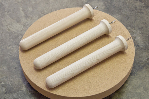
Translated, ‘Rolha’ means wine bottle cork stopper, the leading source of inspiration in this charming tripodic design.

“This is a project that uses cork for its physical and aesthetic properties, in a way that respects the history, traditions and rituals associated to the material.” explains Campos

Addressing the process of wine bottle opening, Campos presents a side table that in a moment of whimsy delivers something quite practical and beautiful.

Unique in its tactile qualities and weight-to-strength ratio, the pure cork table-top is teamed with three turned timber legs that screw familiarly into the softer material.

Gonçalo Campos
INDESIGN is on instagram
Follow @indesignlive
A searchable and comprehensive guide for specifying leading products and their suppliers
Keep up to date with the latest and greatest from our industry BFF's!
As Woven Image celebrates 40 years, it introduces a new collection developed in collaboration with Australian artist Ben Goss, inspired by his original artwork Where the Kookaburra Sits into a vibrant collection of digitally printed EchoPanel® murals and patterns.
The magnetic pull of certain spaces comes down to how seamlessly they work and, more importantly, how they feel. Recognising this, Kettal Workplace draws on the uplifting codes of other sectors to deliver contemporary workplace design.
Developed by bangdesign for Stylecraft, Kinn is an Australian-made collection of seating and occasional tables, shaped by modest proportions, practical detail and the changing demands of shared interiors.
Aeron Chair’s new shades, Nightfall and Jasper, arrive with a sense of quiet cohesion – no bells and whistles, no loud technicolour; just two timeless, perfectly versatile near-neutrals. But the new hues aren’t just about colour – and their significance is much more profound than their surface-level subtlety might suggest.
Set within hallowed architectural surroundings amidst the ghosts of Harry Seidler and Pier Luigi Nervi, fjcstudio’s new Sydney home brings geometric clarity and a spirit of creative exchange to a challenging workplace fit-out.
Sophie Lanigan, organiser of a new event centring on Sydney’s relationship to water, tells us what the event’s all about, who it’s for and why it matters today.
The magnetic pull of certain spaces comes down to how seamlessly they work and, more importantly, how they feel. Recognising this, Kettal Workplace draws on the uplifting codes of other sectors to deliver contemporary workplace design.
The internet never sleeps! Here's the stuff you might have missed

With an in-your-face campaign from the Design Institute of Australia, Write DESIGNER urges every design professional to identify themselves in the upcoming census.
At dedece Sydney, Anna Lenti introduced the Chromatic Alphabet, a new design tool intended to make architects and designers less hesitant about working with colour.