The home of architecture and design in the Asia-Pacific
Get the latest design news direct to your inbox!

Get the latest design news direct to your inbox!
Handmade elegance combined with German precision available exclusively in Australia from Special Lights.
April 15th, 2010
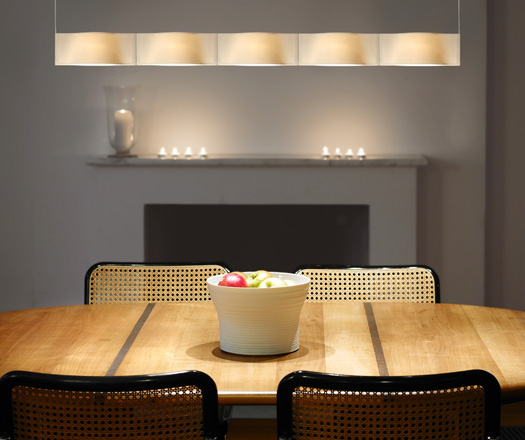
Available in a range of fittings, from micro pendants to table lamps, the Hering range represents a distinctive combination of modern technology, traditional materials and skilled craftsmanship.
Each light is unique with the natural irregularities of bisque porcelain, and designs that are perfectly matched to the material’s texture.
Careful application of patterns, allow blending with room themes, whilst the unpatterned options allow the true nature of the material and craft to be seen. The end result is a range of beautiful contemporary classics.
Designed to be seen….and then not seen.
Simplicity of form results in the pendants blending into the background when turned off, so as to not hinder any lines of sight or spectacular views.
Yet when turned on, the delicate porous surface springs to life and bathes the room in a soft, warm glow.
“These products are amazingly unique. The combination of porus surface and soft white colour when off, means that the products compliment natural surfaces beautifully. The elegance of form means that they are equally at home in both modern and classical settings,” says Scott Fuller, Design Services Manager, Special Lights
For nearly 100 years, the German company Steng has been at the forefront of lighting innovation, quality and suburb design.
Their design style is one of simplicity of form and understated style, with the Hering range of porcelain lights a perfect addition to the Steng portfolio in recent years.
Behind the seemingly filigree character of the Hering porcelain range, a refined lighting system made by Steng-Licht Germany is hidden.
Special Lights
speciallights.com.au
INDESIGN is on instagram
Follow @indesignlive
A searchable and comprehensive guide for specifying leading products and their suppliers
Keep up to date with the latest and greatest from our industry BFF's!
The internet never sleeps! Here's the stuff you might have missed