The home of architecture and design in the Asia-Pacific
Get the latest design news direct to your inbox!
Get the latest design news direct to your inbox!
Inventive, purposeful and beautiful design is timeless when it has the human experience as its basis. It’s something that Louis Poulsen has proven since the 1920s.

PH50

Drawings of PH lamps from the Louis Poulsen archives

PH5

Drawings of PH lamps from the Louis Poulsen archives

Poul Henningsen

PH5

PH Artichoke

Øivind Slaatto

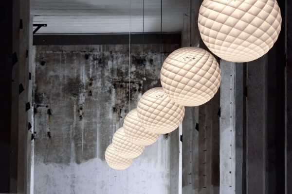
Patera
Put down your smartphone, switch off your fluorescent ceiling lights, and try to picture yourself in a room prior to the introduction of electric power to homes. That would place you sometime before the 1880s, which is when this transformational energy source began its march into the domestic world and Thomas Edison created a long-lasting incandescent bulb.
For many years, the light in your pre-electric room would most likely have come from a candle, a fireplace, or a kerosene lamp. Whichever of these sources you had, your illumination would have been gentle – soft and warm, creating a cosy ambience at key locations within the home. This type of light drew people together, and it’s what we had known since the first campfires.
If you were keen to keep up with the technology of the times, perhaps you tried gas lamps, risking toxic fumes and even explosions for brighter illumination. But not surprisingly, this form of lighting was short lived due to the successful commercialisation of the incandescent light bulb by Edison from 1879 onwards.
This was the start of a new world for light – and a new chapter in our relationship with it. The incandescent bulb brought with it incredible convenience and safety, and it was widely adopted for good reason. But it created a new problem: uncomfortable glare. It caused a dramatic shift in the atmosphere and ambience in our homes – something that users of bright gas lighting had previously grappled with.
Denmark built its first electric power station in 1891 and shortly after, a Danish company that would become known as Louis Poulsen began selling tools and electrical supplies. As electric light became the norm in Danish households over the subsequent three decades, a young designer named Poul Henningsen began to focus on its drawbacks. The problem of glare troubled him to no end. And ever inventive as he was, the way he tackled it was unheard of at the time.
Henningsen was the first person to pursue a scientific approach to light. His realisation was that rather than simply shielding the bulb with a translucent material to cut back on glare, he could actually control the direction of the light, and therefore create a gentle ambience and mediated shadows. His solution? A carefully choreographed and calibrated series of curved shades.
He applied the genius of nature to industrial design via the logarithmic (equiangular) spiral that we recognise from the nautilus shell and the Mandelbrot set. With the curved shades of various diameters stacked at different distances from the bulb, Henningsen found that he could achieve an even distribution of light over the entire inner surface of each shade. Light was reflected and directed downwards, with the glary bulb itself concealed from view.
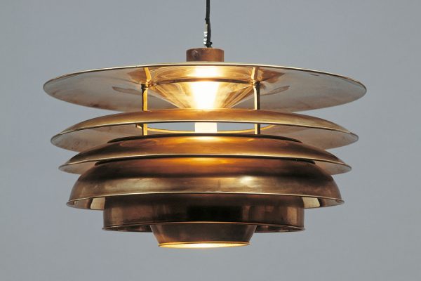
The first result of his exploration was the Paris Lamp (now highly sought after at auctions), which he developed with Louis Poulsen and exhibited in Denmark’s pavilion at the Paris World Exhibition in 1925. It was awarded a gold medal and became the precursor for the groundbreaking three-shade system that we now know as the Louis Poulsen PH lamp. The significance of the Paris Lamp and PH can’t be overstated. The elegant, inventive blend of form and function that underpins them – where every detail in the design has a purpose – was the origin of Louis Poulsen’s enduring DNA: design to shape light.
Henningsen went on to design a substantial number of variants of the PH lamp, as well as the enduringly popular Artichoke and other equally sculptural lights, each encapsulating a novel approach to optimising the quality of the light and the ambience of a space. No glare, no harsh shadows, nothing superfluous. Henningsen’s approach to light was at once both functional and human-centric, and this has been the core of every product released by Louis Poulsen since.
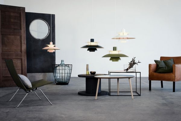
For today’s designers, who have an altogether new set of considerations to take into account with regard to LED light sources, upholding the Louis Poulsen legacy requires equally inventive thinking and mastery over lumens. Still, no matter the type of light source it has, the design of every product begins and ends with the quality of light it emits. And equally important, in the tradition of PH and Artichoke, the beauty of the fixture must match the beauty of the atmosphere it creates. And what a wide variety of forms have been created.
Two years ago, and 90 years after the Paris Lamp was unveiled to the world, a young Danish designer by the name of Øivind Slaatto created for Louis Poulsen what might be called the twenty-first century offspring of the PH lamp. The Patera pendant, like PH, was inspired by the mathematics of nature – in this case the Fibonacci sequence (the set of numbers that form the basis of the logarithmic spiral).
Slaatto’s asymmetrical composition of intricately interwoven PVC spiral visors, like Henningsen’s curved trio of shades, shapes light for a human-centric ambience. To prevent glare, Patera directs light through small diamond-shaped cells that sit at various angles to the light source. Just like PH, Patera emits a soft, pleasant light but also presents a visually engaging form – this time with a contemporary asymmetrical character. Not surprisingly, Slaatto considers Henningsen to be his mentor in absentia.
The value of a robust approach to design – an approach that fuses function and form in a way that makes one indivisible from the other – is timeless when it has the human experience at its core. It’s something we too often forget on the dazzling, bright horizon of developing technologies.
INDESIGN is on instagram
Follow @indesignlive
A searchable and comprehensive guide for specifying leading products and their suppliers
Keep up to date with the latest and greatest from our industry BFF's!
The internet never sleeps! Here's the stuff you might have missed