The home of architecture and design in the Asia-Pacific
Get the latest design news direct to your inbox!
Get the latest design news direct to your inbox!
Øivind Slaatto’s new silver-foil version of his Louis Poulsen Patera lamp brings new dimensions to his modern take on the chandelier.

Perhaps no form of light fixture throughout the history of interior design has had a more transformative effect on the way a space is likely to be perceived than the traditional chandelier. “Classic chandeliers can turn any space into a ballroom,” says Danish designer Øivind Slaatto. So aligned have chandeliers become with impressions of status and luxury that their presence in a space is a visual code for important and exclusive undertakings.
While formality and reverence still has its place in certain spaces today (and traditional chandeliers are often still found in them), modernism has visually attuned us to reading prestige in designs that veer far from the classic. A spectacular lighting effect tied to a non-traditional chandelier form can evoke the same sense of luxury.
The signifier of that status is the experience of a glistening and theatrical expression of light as much as the chandelier form itself. Dripping crystal is beside the point in an era when many modes of formal elaboration can be enjoyed. More significantly, a mesmerising light effect is the indicator of time and attention – of value – invested in the light fitting.
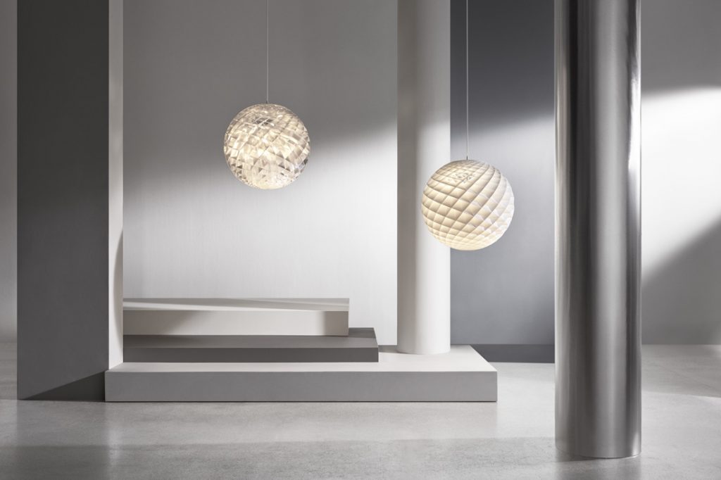
Patera Silver (2018, left) and Patera (2015, right)
This was in Slaatto’s mind when he created his Patera lamp for Louis Poulsen back in 2015 – a modern take on the classic chandelier. Patera is a glowing sphere of small diamond-shaped cells in a mesmerising form based on the spiral of the Fibonacci sequence. Its lighting effect (a constellation of glowing prisms of glare-free light) and its intricate form override the fact that it is made with humble, lightweight white PVC rather than gilded metal or crystal. The pleasure of Patera is its intricate composition of light and shadow, surface and depth.
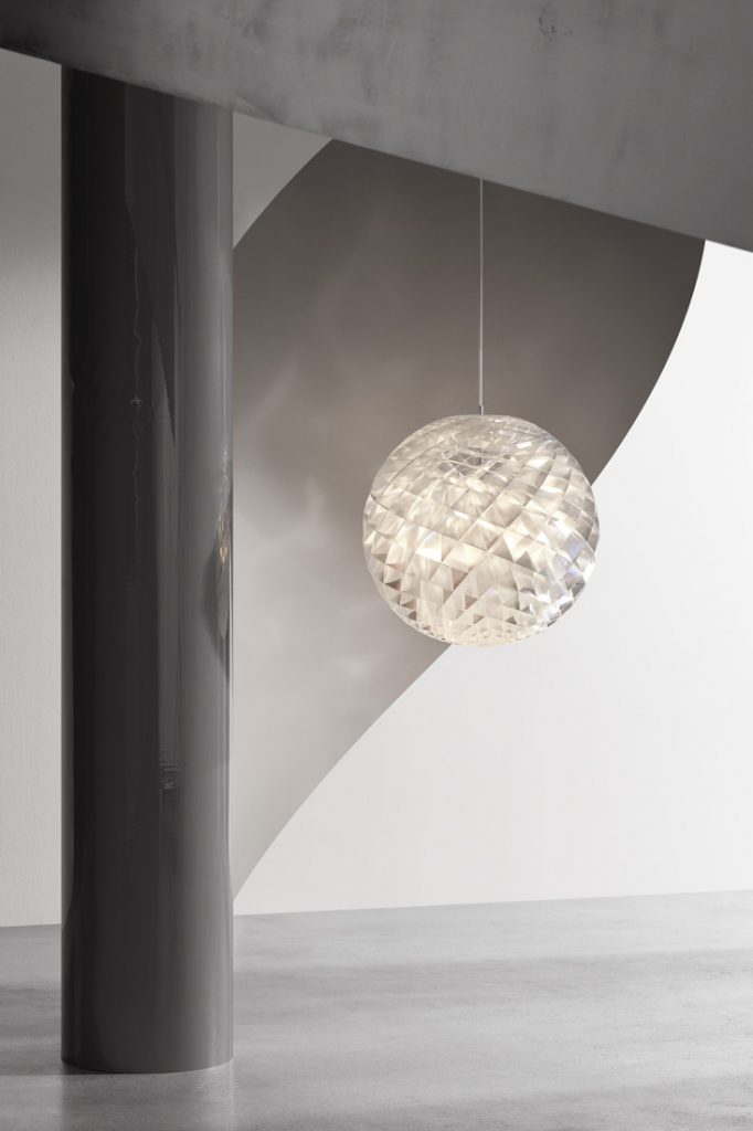
And now, adding a new dimension to its lighting effect, Louis Poulsen has released Patera in a silver-foil material. Patera Silver has a reflective profile that instantly catches the eye whether or not the lamp is lit. When it is lit, it calls to mind the light play of classic chandeliers – glistening with an interplay of brightness and darkness, like the gentle dappled light through a tree canopy. Even when it is not lit, Patera Silver is an irresistible focal point in a space.
Like its white counterpart, Patera Silver is assembled by hand in three diameters: 450, 600 or 900mm. The Fibonacci sequence-based structure provides a different impression from every vantage point. The design’s soft, glare-free, 360-degree illumination is the result of its intricate composition of differently positioned cells. This, in combination with the reflective, brilliant silver foil, results in a light fitting that makes a statement without compromising the experience of people.
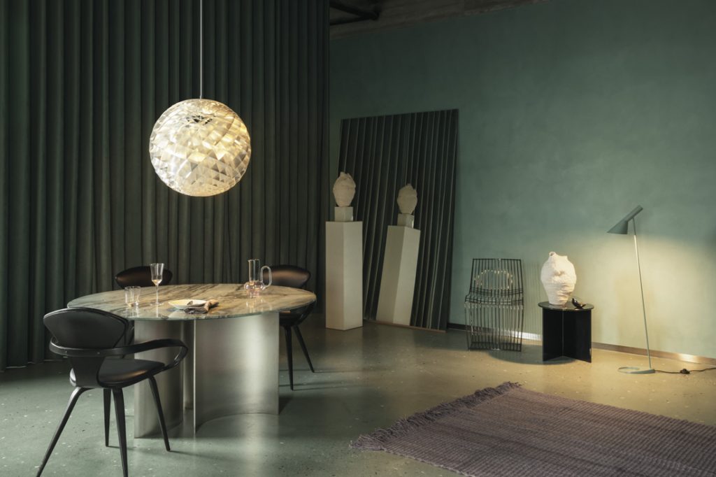
“The light from the silver Patera is more playful compared to the classic white version,” says Slaatto. “But this is still a Louis Poulsen lamp, so it’s free of glare and characterised by the comfort, ambience and function Louis Poulsen is known for.” Conceived as a timeless addition to interiors, Patera Silver transcends trends with its universal appeal. Says Slaatto, “I try to design for generations, not for trends.”
INDESIGN is on instagram
Follow @indesignlive
A searchable and comprehensive guide for specifying leading products and their suppliers
Keep up to date with the latest and greatest from our industry BFF's!
The internet never sleeps! Here's the stuff you might have missed