The home of architecture and design in the Asia-Pacific
Get the latest design news direct to your inbox!

Get the latest design news direct to your inbox!
They gave Huxtaburger its visual zing, and The Kettle Black its signature cool – we hang with the Melbourne-based graphic design studio behind some of the city’s slickest branding.


What’s the story behind Pop & Pac – the origins of your partnership, and the name?
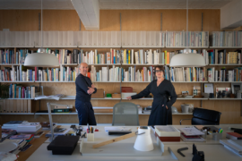
The two of us (Mauris and David) met over 12 years ago at another creative agency, and we crossed paths again after David returned from a two year stint in London four years ago. We collaborated on a few projects and the business has grown organically over the last three and a half years.
About the name – ‘Pop’ comes from Popov which is David’s last name and ‘Pac’ is Mauris’ Chinese name. Before we became Pop & Pac we were running individual businesses called ‘Design by Pop’ and ‘Design by Pac’, and the synergy of Pop & Pac just worked well when we decided to merge.
Can you give us some insight into your experience designing abroad, and how that is reflected in your work?
The experience abroad really opened our eyes to what’s possible. In the UK you have so many more resources at your disposal. The industry is also a lot bigger, the studios are bigger and the jobs are bigger. Work flows in from all over Europe due to its close proximity, so you’re dealing with many different cultures which was also really exciting and greatly broadened our perspective.
Since returning, I guess this experience has given us the confidence to work with overseas clients. The UK market in particular is one that we are starting to get a foot hold in, and the value of Melbourne graphic design seems to be really high at the moment, specifically in the hospitality space. I guess this is reflective of our strong café/coffee culture.
How do you define Melbourne’s design culture and aesthetic?
I like to think it’s quite eclectic, culturally and visually. Studios seem to be quite creatively aware of what is going on around the world, plus our melting pot of cultural, creative and artistic events means we are being exposed to new and exciting views on a regular basis.
What are your design pet peeves?
We could probably go on forever haha… a few key ones below:
– Designing to a set style or trend without consideration of the client’s goals, market, aspirations etc.
– A lack of attention to detail or a lack of investment in quality finishing.
– Designers designing for designers.
– Not getting paid.
Graphic design is so expressive of society’s current views. What are the big shifts in approach or thinking that you’ve seen in your time in the industry?
The biggest one we’ve noticed recently centres on our core offering of Brand Identity development. There was a time where designers actively tried to hide their clients’ logos. Now, logos are becoming more of a key feature in all communications of the brand. The expectation is that the identities/logos are more flexible and ‘clever’, where by the supporting visual identity is able to seamlessly evolve and grow with the business.
The other one is obvious…Social Media. We won’t go too far into this, but social media presence is key in generating a buzz about anything these days. Brands can prosper and fail based on the strength of their social media.
What have been the most memorable achievements for Pop & Pac?
– The fact we are still going after almost four years. Lots of lessons learnt.
– Putting on our first staff member was a big mental leap, but one we are happy we made.
– Our first project as Pop & Pac that put us on the map: The Kettle Black.
How do you keep your studio culture creatively bold?
We actively engage with clients who believe in our creative process.
We advocate positioning our clients and their products/brands in ways that disrupt and that go against the stereotype and what their industries expect. There are obvious parameters in all briefs, but I think all our designers know that there’s the opportunity to create something great with every project.
We also encourage all our designers to have a world view of design, and look for designers that lead creative lives. If design is just a job for them, then they are not the right fit for us.
INDESIGN is on instagram
Follow @indesignlive
A searchable and comprehensive guide for specifying leading products and their suppliers
Keep up to date with the latest and greatest from our industry BFF's!
The internet never sleeps! Here's the stuff you might have missed