The home of architecture and design in the Asia-Pacific
Get the latest design news direct to your inbox!
Get the latest design news direct to your inbox!
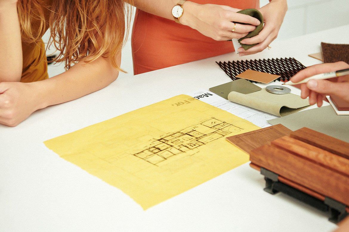
Co-founder and design director of interior design studio Made For., Cara Stizza shares her insights into how colour can shape mood, motivation and better productivity.

May 5th, 2022
“Our emotional connection to colour is significant,” says Cara Stizza. “Research shows that while colours can’t necessarily dictate our behaviour, they can influence our decisions and affect our mood.” In this quick-fire Q&A with Cara Stizza, design director at Made For., we discuss the power of colour to evoke specific physiological responses and, in turn, psychological reactions.
Indesignlive: Can you unpack for us, the power of colour to influence our mood?
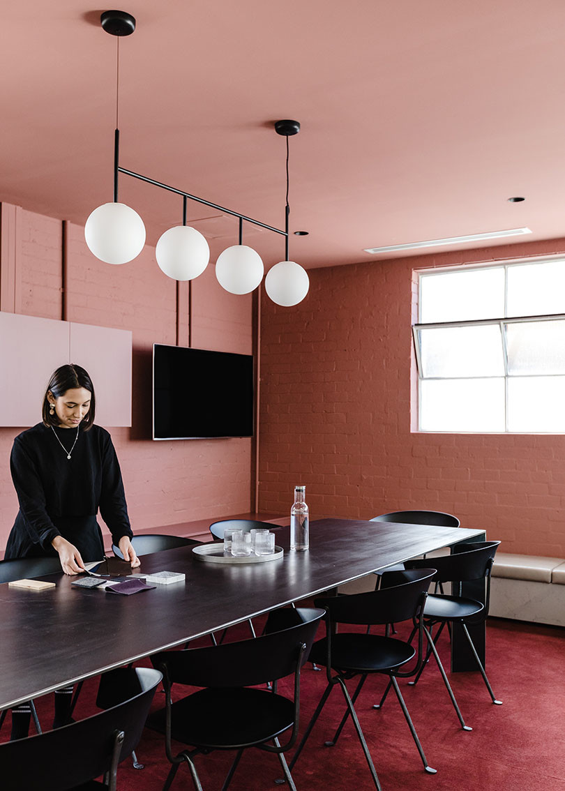
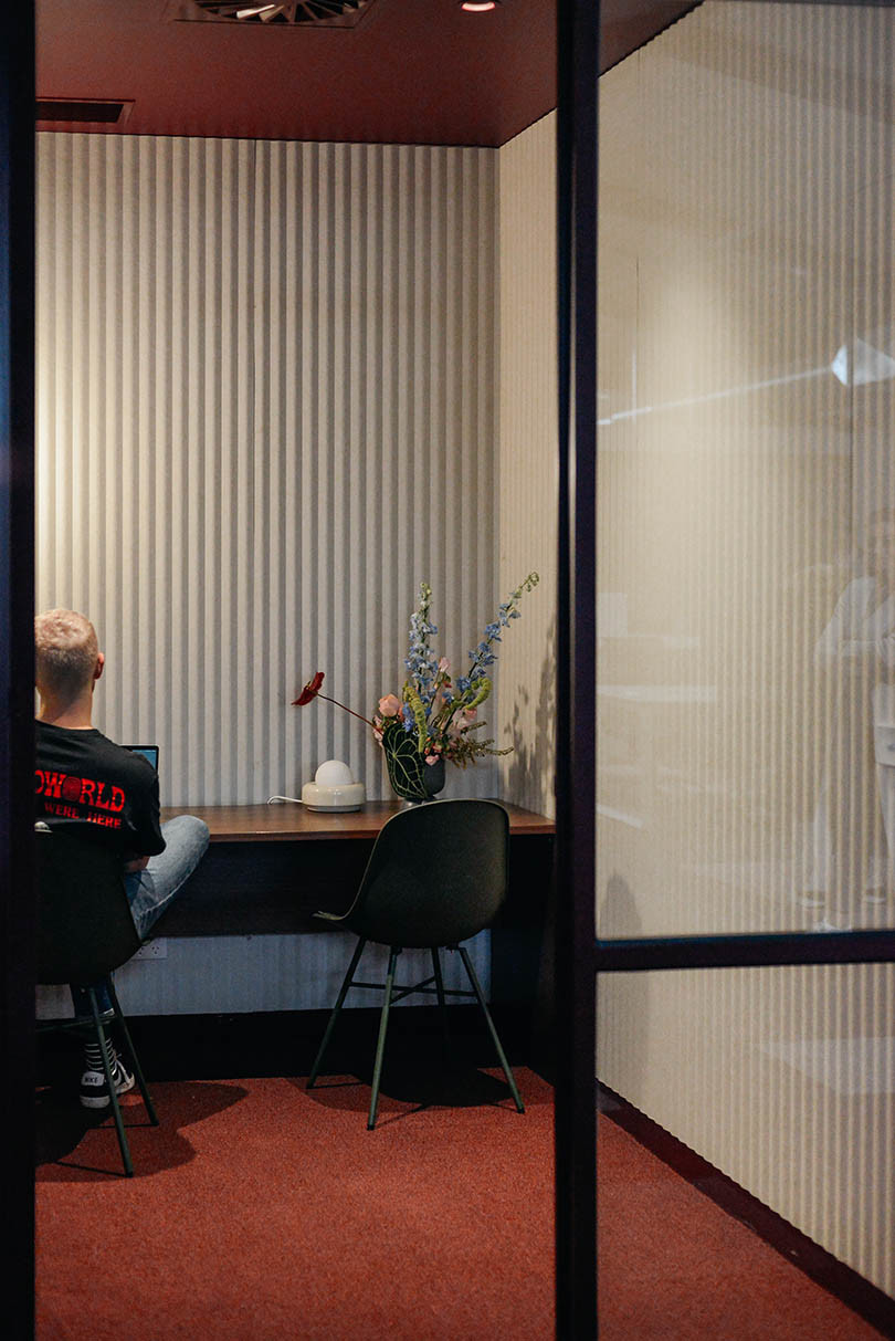
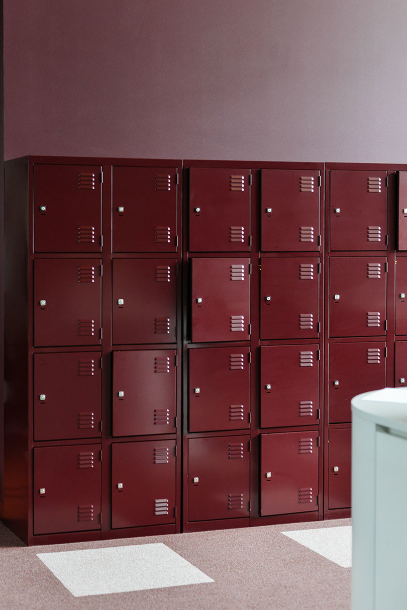
Cara Stizza: I think we all recognise the energising properties of red, for example, or the calming effect of blue. But where it gets really interesting is in the shades – grey can signal neutrality, green speaks to balance and passiveness, cream can evoke warmer feelings than white.
Getting to know colour on a more nuanced level means we can design for balance; to feel calm, not sleepy, is my number one goal always! This is why I work from a natural white room with lots of natural light. The neutral backdrop means I can introduce new moods to the space with colourful art and furniture to suit. The result is a sense of composed energy.

In what ways can colour incite productivity?
Generally speaking, productivity tends to flow from a clear headspace. Most of us will find that neutral shades are the most conducive to stimulating feelings of clarity, but I think an even more important factor than specific colours is tone and palette.
A layered tonal palette, regardless of the colour, feels balanced and cohesive. A tonal palette also allows you to play with pops of more highly saturated colours that can inject a dose of energy into a space. A lot of people are afraid of using bolder colours – burgundy, forest green, even black – but these can be really powerful and vital shades for fuelling our productivity too.
Related: How to pick the perfect shade for your interior scheme
What are some ways that people can use colour to make a home office?
A beautiful, personal piece of art can energise a room, and make for a great Zoom backdrop too. Likewise, an armchair is a great way to bring in a personal favourite colour or texture – and it offers up a nice way to break up the day to take a comfy seat if you’re on a call.
Why are you drawn to colour psychology and theory?
I’m really drawn to people and learning what works for them. I feel like we learn a lot about people when we do our initial discovery sessions with clients. In residential design, we want to match the family’s or the individual’s mood.
When it comes to commercial offices, we aren’t thinking ‘red logo means red walls’, we’re thinking, what colours best match the DNA of this business and its people? Colour is endlessly tailorable. It’s one of the most potent elements in our design toolkit.
Made For
made-for.com.au
We think you might like this article about Ash Keating’s full-house artwork in Moama and Echuca.
INDESIGN is on instagram
Follow @indesignlive
A searchable and comprehensive guide for specifying leading products and their suppliers
Keep up to date with the latest and greatest from our industry BFF's!
The internet never sleeps! Here's the stuff you might have missed