The home of architecture and design in the Asia-Pacific
Get the latest design news direct to your inbox!
Get the latest design news direct to your inbox!
With a versatile combination of tile designs, Aimee Munro of Gray Puksand has emerged as the winner of the KAZA Tile Design Competition by Academy Tiles.

Aimee Munroe of Gray Puksand had the winning design.
August 30th, 2018
Earlier this year, we reported on the partnership of Academy Tiles and KAZA for the Academy KAZA Tile Design Competition. Fast-forward five months and 105 entries later, and we’re pleased to announce … we have a winner!
“Designed as a collection of tiles that celebrate movement, geometry and colour,” says Munro, “Diverge aims to create a versatile and playful three-dimensional wall graphic. With each tile a unique pattern in itself, Diverge is designed to work alone or together in an eye-catching tapestry of movement.”

Now on the eve of seeing her design brought to life, as the winner for this year’s competition, Munro receives the opportunity to put her tile into production to be manufactured and promoted worldwide. And thanks to KAZA Concrete and Academy Tiles, Munro will receive royalties for all units of Diverge sold throughout the globe. But to celebrate her win, Munro is currently packing her luggage here in Australia to head over to Budapest, Hungary, to tour the KAZA Concrete production facility (and not to mention living it up in the Four Seasons Hotel Gresham Palace!). It’s a rest well-deserved for Munro, who has worked tirelessly on Diverge’s design resolution for months on end and is now preparing for the design’s official launch as part of the KAZA Concrete collection early next year.
With designers invited to respond to KAZA’s virtually unlimited technological capabilities and Academy Tiles’ ethos of fearless creativity by designing their own decorative 3D concrete tile, this year’s competition asked designers to look at the age-old adage of ‘form before function’ in a different light. Tasked with creating new formal expressions with concrete – rather than the more common tile materials of porcelain or clay – all 105 entries pushed the materiality further than ever before.
But whittling down 105 impressive entries from across Australia is no easy feat. With the likes of our country’s top architects on the jury, however, we always knew that we’re in confident hands: Angela Ferguson, Managing Director of Futurespace Design, Colin Bell, Creative Director of Red Design Group, Greg Natale, Director of Greg Natale Design, Kirsten Stanisich, Director of SJB and NSW President of the Design Institute of Australia, Philip Chia, Founder and Director of The Uncarved Block, and Sue Fenton, Senior Associate of Woods Bagot.

Inspiring this lineup of architecture and design luminaries, all 105 entries nonetheless shared very similar characteristics – a sure-fire indication of the future of tile design in the years ahead. Dynamism, texture, movement and sculptural form coloured an enormous majority of the entries for this year’s competition, with Munro’s ‘Diverge’ this tetrapartite focus was taken one step further to truly bring an element of lightness and levity to the design – something, admittedly, which we do not commonly see in the world of tiles and concrete. Mastering the material manipulation in this way, Munro’s Diverge allows for limitless configurations and graphic expressions. The lightness in form is mirrored by the versatility of organic and geometric linework: here, referencing the visual traditions of Art Deco; there, giving a nod to the design imagination of the 1980s; and elsewhere whispered evocations of the Mediterranean coalesce with that of contemporary Asia. Arranged in a different configuration and this world of references and inspirations opens up again to yield very surprising – and always stirring – results.

According to the Academy KAZA Tile Design Competition Jury, this sheer degree of versatility in application underwrote Munro’s successful design. Particularly, the design’s five core components – each with an individual expression entirely unto its own – offer architects and designers very flexible and ultimately very workable building blocks to make their own mark on their next project with Diverge.
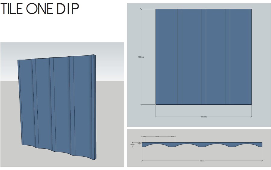
With shallowly fluted scalloping, DIP brings a heightened awareness of the design possibilities for planes expressing either verticality or horizontality. Bringing a sense of continuity (when laid in parallel to one another), DIP is sure to bring style to projects bridging both the residential and commercial divides.
Graphic. Geometric. Bold. The aspect ratio of STRIKE’s diagonal forms allows for the tiles to be laid in continuity, or in reverse configurations – and even herringbone patterns – to make more creative use of light hitting the form of the tile. Celebrating movement above all else, STRIKE lends Diverge this coveted sense of lightness that will have you asking “surely, that’s not concrete?!”

REACH’s succession of arches is the perhaps the most contemporary expression of Diverge’s five components. Responding to the current love for the arched form in contemporary design – be that architecture, furniture, and even fashion – REACH takes one of the ancient world’s most prevalent graphic treatments, and reinterprets it for the Twenty-First Century. Laid in succession (or in mirroring configurations to create closed loops across two tiles), REACH brings a sense of depth and animation to Diverge.

It’s an old joke, but architects really do love squares. And MEET understands this. Knowing that the interplay of scale and pattern holds the potential to create big statements in the interior space, MEET takes the humble square and amplifies its quiet geometries on a massive scale. Arranged in conjunction with other Diverge components, or simply on its own, MEET brings a sense of timelessness and familiarity to the range.

But for all their love of squares, who can really look past a circle? Also one of the world’s most ancient symbols, the circle invokes the sun, the eye, togetherness and safety. This sense of serenity, however, is cleverly reimagined to instead bring about a sense of drama and rhythm. Laid in a running bond or in seamless continuity, FIND punctuates a space, adding visual beats to the interior design scheme.

INDESIGN is on instagram
Follow @indesignlive
A searchable and comprehensive guide for specifying leading products and their suppliers
Keep up to date with the latest and greatest from our industry BFF's!
The internet never sleeps! Here's the stuff you might have missed