Bidding farewell to mundane and uninspired office spaces, colour has transformed our workplaces into layered and engaging environments. So we sit down with Karina Simpson, Hot Black’s Workplace Lead, to talk about the influence colour has on the workspace landscape through the prism of Herman Miller’s progressive colour philosophy.

December 9th, 2022
When I ask Karina Simpson about her favourite colour, she looks out of the window, thinks for a second, and decides on blue. “I am surrounded by it a lot of the time, and I think it connects with so many things. I definitely gravitate towards the different shades of blue,” she admits. But when it comes to her design practice, the palette certainly doesn’t stop with cobalt, indigo or sapphire. She says that colour is absolutely fundamental to how Hot Black’s highly-coveted practice approaches design. After all, black is considered to be the sum of all the colours.
“In the briefing stages of any project, we explore our clients’ aspirations to ensure that through the use of colour, materials and textures we can create interiors that relate back to their brand narrative and express what they are trying to prioritise or achieve in the space,” Karina explains.
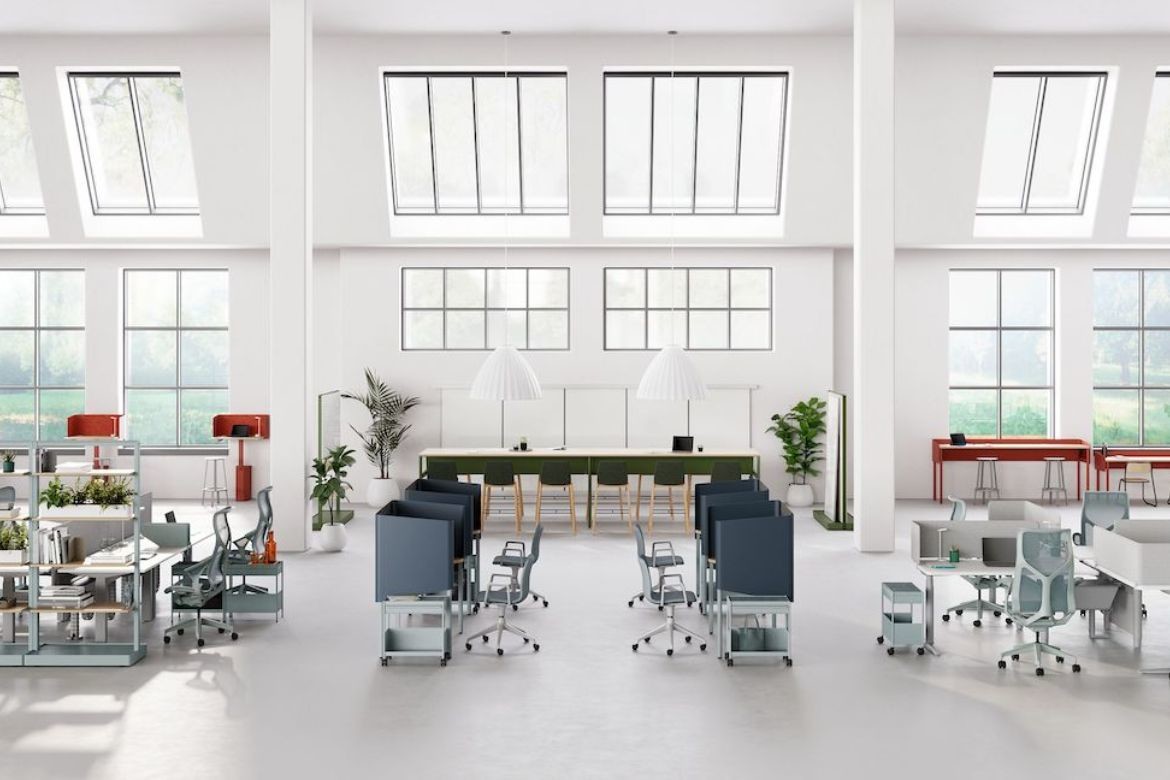
A powerful tool for any architectural and design project, colour has been a crucial cog in the evolution of the modern workplace. The collective realisation of the impact it can have on our mood, wellbeing, comfort and productivity has burst a broader range of hues into commercial spaces and offices. “People want to break out of the kind of monotone or monolithic type of workplace interior we were used to in the past,” Karina explains. “Especially now, organisations want to inject personality into the workplace, and try to make it their own.”
Herman Miller is exceptionally attuned not only to how the way we work is changing, but also just how pivotal colour is to creating a vibrant workplace – and curating desirable experiences within it. This unique point of view, backed by years of extensive research, has resulted in a dazzling kaleidoscope of commercial and workplace designs that enable designers to create vibrant interiors where people feel compelled to do their best work.
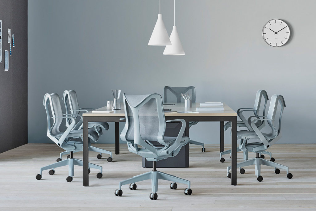
The brand’s adventure with colour commenced with one of their most coveted performance chairs: Cosm. The introduction of a warm, intense and wonderfully vibrant Canyon, a light, icy blue Glacier and a cool, refined Nightfall forever augmented the design potential of an office chair – and its unique ability to engage and inspire the end user.
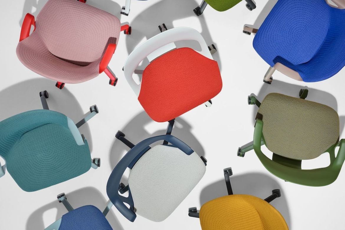
But Herman Miller’s venture into the world of colour was even more considerable. Alongside Cosm, the brand launched the Dipped in Colour capability, an industry-altering colouring technique created in collaboration between Studio 7.5 and Herman Miller’s textiles team. A key expression of the manufacturer’s colour philosophy, this signature process allows the design to have one hue, all throughout from top to bottom, in a way dematerialising the object.
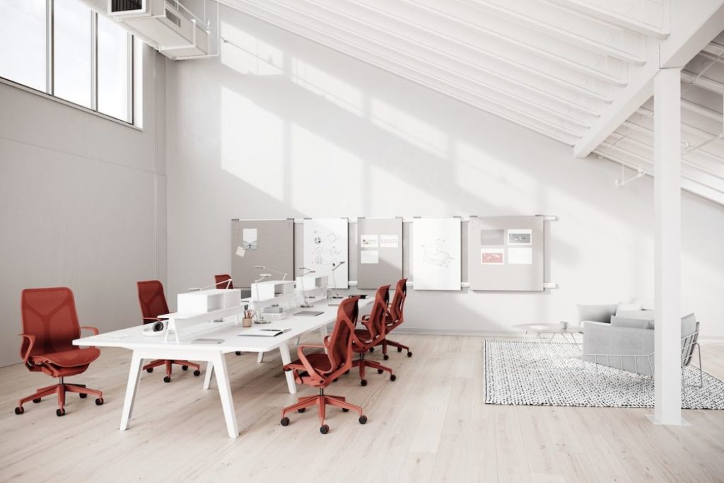
The seamless and cohesive character of the colouring process pioneered a strikingly monochromatic volume that has since redefined the perception of natural colour, and brought an invigorating quality to the modern workplace. “Herman Miller’s distinct colour philosophy has really enhanced the ability to create vibrant, dynamic workplaces,” Karina says. “Being able to go all out – and head-to-toe – with colour is a really fun and exciting opportunity.”
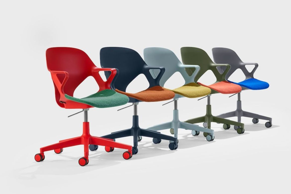
Zeph is yet another streamlined task chair that embodies this sense of exciting playfulness with a range of hues that draw inspiration from the undeniable optimism of mid-century design. The selection of “crayon-box” shades, like the fiery Blaze or warm Cocoa, are compounded by the same, Dipped in Colour process. The colours highlight Zeph’s iconic silhouette, while the ability to incorporate seat pads in contrasting colours further elevates the delightful expression of the design.
Being able to use colour to create workplaces that engage, allure and invite has never been more relevant, too. “Since COVID, it’s been even more important to enhance work spaces to make them more enticing to staff – we’re trying to inject as much colour and personality into our workplaces to make them different from what they were before the pandemic,” Karina highlights.
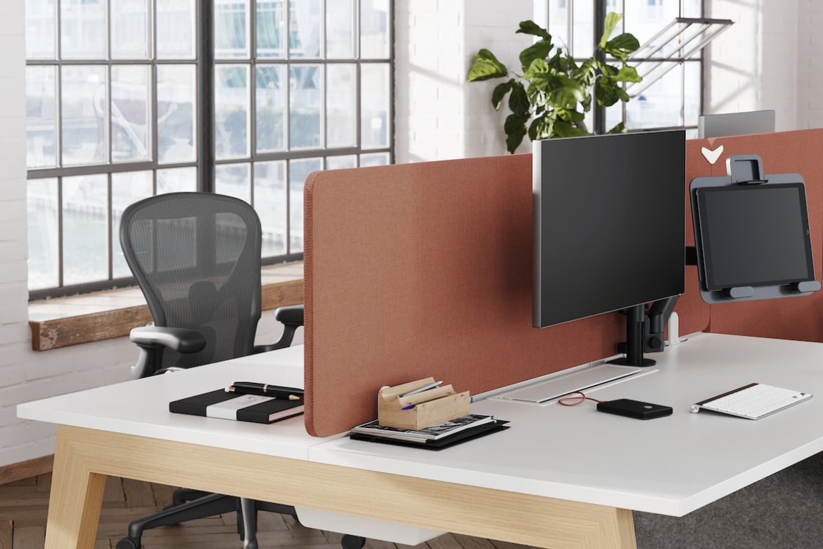
In that respect, Herman Miller’s workplace offering is a direct product of this intricate need for alluring personality and responsive way of working. Systems like Ratio or Byne have been specifically designed to offer staff interactive and engaging tools they might not be able to benefit from in a home office setting, while giving the employees the option to augment the office’s individuality through outstanding flexibility and use of colour.
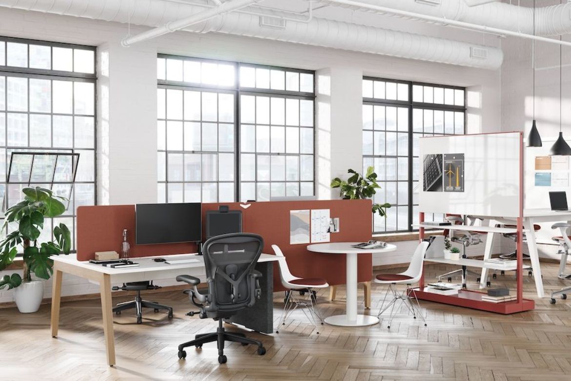
The Byne system offers a choice of five different legs, a range of finishes and a rainbow of colour combinations across elements like dividers or desk surfaces. Ratio, Herman Miller’s signature stand-to-sit desk, integrates outstanding user flexibility with a choice of nine colourways that can be fused into a staggering number of 41 different combinations. With designs like these, it’s never been easier to harness the potential of colour to create a workplace that is genuinely unique, engaging and purposeful.

“Colour can really enhance the function of a particular design, setting or environment,” Karina adds. “Whether it’s space for individual work or collaborative brain-storming, the use of colour makes it easy to scale up and be dynamic, while still maintaining cohesion throughout,” Karina points out. “And if you can choose if you want to work in the green zone or a blue zone – and whether you’re going to stand or sit – that makes the whole journey that much more unique and pleasant to the end user.”
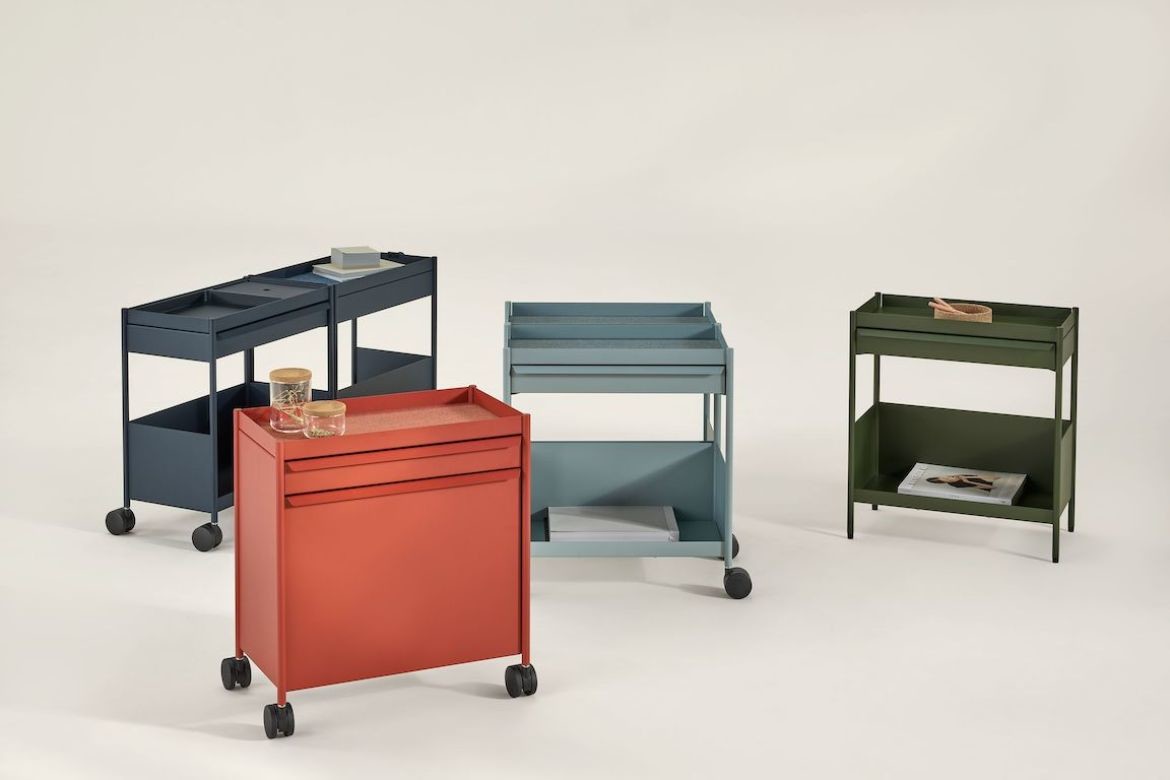
A similar sentiment informed the OE1 Workspace Collection. Made up of modular office essentials, the collection has been designed for individual and organisational freedom. A springboard for one of Herman Miller’s most stunning shades – a rich hue of Olive – OE1 enables designers to incorporate colour as part of staff’s day-to-day individual choices, while enhancing the dynamic character of the workplace.

Access to these flexible elements, available in a plethora of colours and designed to work together, opens up new possibilities for mobility, too. “Before, if you wanted movability, you wanted the furniture to be able to be adaptable into any setting. So the tables would end up being white and chairs black. You would keep them all the same, which made it very traditional and monolithic,” Karina smiles. “Now, with Dipped in Colour ranges, you can go with – let’s say – this beautiful blue, Nightfall, and have it dialled up in one setting which is then connected to others through little details. And then you know that no matter where that furniture is, it will all work and talk to each other.”
But while the use of colour is fundamental to creating spaces that can improve both mood and performance, the whole rainbow won’t do if the design of the furniture isn’t engineered with the same considerations in mind. That’s precisely what sets Herman Miller’s commercial offering apart.
Anchored by an exceptional expertise in the field of ergonomics and workplace comfort, Herman Miller’s colour philosophy enables designers to create vibrant, unique interiors without compromising on the health outcomes. “Herman Miller’s approach is very future-driven,” Karina enthuses. “Being able to create ergonomic settings that boast inspiring colours is absolutely fantastic – for designers and for the end users.”
That’s crucial because, as Karina points out, colour is not going anywhere. “So many workplaces want this kind of enhanced, unique and colour-led experience. It’s wonderful that we have colour saturation at play,” she says. “And Herman Miller’s range enables us to create interiors that are unlike any other, because there are just so many options, capabilities, colours and textures. You can keep it simple and toned down – or saturated, intense and head-to-toe; you can mix different colourways, different textures. The choice really lets us express our design vision.”
And that vision, for her as a designer, is to naturally create dynamic and vibrant work environments by manifesting the brief and the client’s aspirations through the choice of colours, textures and materials. Whether it’s creating connection with the outdoors through the use of more neutral hues, or designing invigorating spaces that feature more intense or brighter kinds of shades, Herman Miller has got the palette to match.
From the darker tones like Carbon and Nightfall, and a plethora of the gentler, neutral shades like Glacier, Cocoa or Tea Rose to the saturated Blaze and striking Bluebell, Herman Miller’s range offers an exceptional level of technicolour precision that can bring any colourful design vision to life. Underscoring the renowned design qualities the brand has been recognised for – like research-backed ergonomics, focus on comfort and intuitive flexibility – Herman Miller paints a picture of a vibrant, purposeful and mood-enhancing workplaces that stimulate, engage and make people feel good.

We think you might also like this story on Herman Miller’s Ratio.
INDESIGN is on instagram
Follow @indesignlive
A searchable and comprehensive guide for specifying leading products and their suppliers
Keep up to date with the latest and greatest from our industry BFF's!
True luxury strikes a balance between glamorous aesthetics and tactile pleasure, creating spaces rich in sensory delights to enhance the experience of daily life.
Natural stone shapes the interiors of Billyard Avenue, a luxury apartment development in Sydney’s Elizabeth Bay designed by architecture and design practice SJB. Here, a curated selection of stone from Anterior XL sets the backdrop for the project’s material language.
Stepping into Intuit’s Sydney workplace certainly doesn’t feel like walking into an office. Why? In this film, we discover that, when joy takes precedence as a design driver, even a high-performing commercial CBD headquarters can feel like an intuitive wonderland that invites employees to choose their own adventure.

In a tightly held heritage pocket of Woollahra, a reworked Neo-Georgian house reveals the power of restraint. Designed by Tobias Partners, this compact home demonstrates how a reduced material palette, thoughtful appliance selection and enduring craftsmanship can create a space designed for generations to come.
In the second instalment of our performance seating three-parter, we turn to DKO’s Michael Drescher and Jacob Olsen to peek behind Sayl’s confident architectural form and explore the ideas of inclusivity, adaptability and freedom to move as hallmarks of what sitting your best actually means.

From Aesop’s light-filled installation by Australian architect Rodney Eggleston to Molteni&C’s immersive garden worlds, these are the exhibitions, launches and interventions shaping Milan Design Week so far — with more to come.

In the first instalment of our three-part series exploring what it means to sit your best, we pose the question to Gray Puksand’s Dale O’Brien, who discusses the importance of ease and majority rule when it comes to sitting and reveals why specifying a task chair is not unlike choosing a Volvo.
The internet never sleeps! Here's the stuff you might have missed
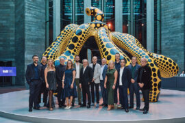
Five SJB directors join STORIESINDESIGN podcast the morning after celebrations at the NGV marking 50 years of practice for the Australian design firm.

Things get a little philosophical on the podcast as Gerald Matthews of Adelaide-based Matthews Architects discusses the state of architectural education, AI and the practice’s 50-year milestone.
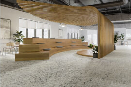
Even when we don’t realise it, we are guided by subtle cues in our environment. Colours, textures and geometries all converge to form an intuitive navigation system for inhabiting interior space.

In this SpeakingOut! episode, Andrew Tu’inukuafe, Warren and Mahoney, explores the importance of Indigenous knowledge, design rooted in place, and the power of collective thinking in shaping meaningful, enduring projects.