The home of architecture and design in the Asia-Pacific
Get the latest design news direct to your inbox!
Get the latest design news direct to your inbox!
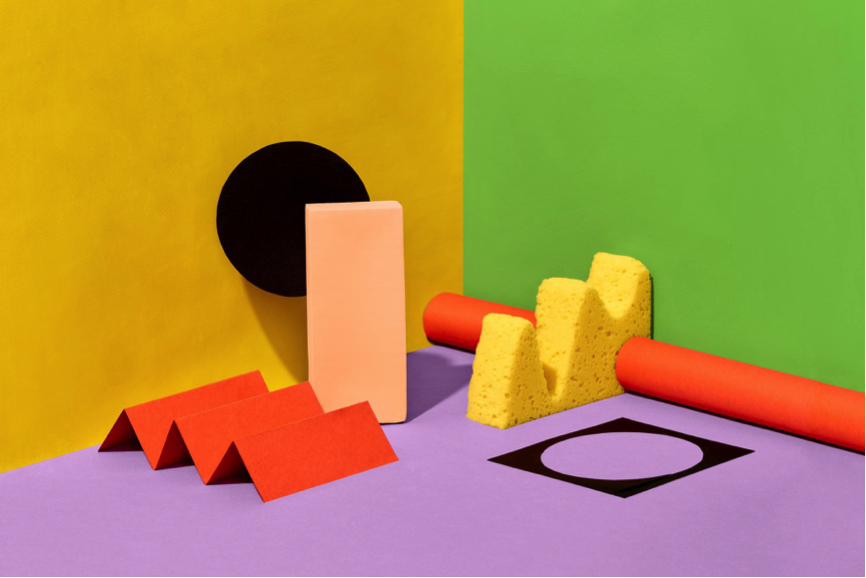
Shaw Contract’s new ColourConnect CPD series explores how colour impacts the built environment and influences interaction within it.

Colours can be transformative. They can induce a specific mood; dictate the culture of a space and even influence how people interact with others in that space.
Inspired by the power of colour, Shaw Contract has come up with ColourConnect, its latest CPD (continuing professional development) series with four distinctive chapters. Titled Self, Earth, Creativity and Community, each of these chapters provides insight into design that connects with the community, earth and the self, all through the creative lens of colour.
Self is an exercise in reflection and reconnection, embracing calmness and tranquillity. The palette feels like a departure from the cacophony of a world that’s always switched on, moving more towards a path of privacy and solitude. What Self is, is design looking inwards, to find happiness, purpose and simplify the world around us.

Bright and lively, the Creativity palette focuses on design that inspires freedom of expression, a culture of participation while also driving meaningful experiences for people in a particular space.
The Community palette imagines design through empathy, resilience and inclusivity. The palette is an exploration of how people connect with others, both locally and at a global level.

This fourth palette embraces connectivity and the relationship of people with the natural world. Earth explores the challenges for design in a swiftly-changing planet.

Today’s architects and interior designers are crunched for time to research trends and materials. And, with the added pressure of maintaining continuing education hours for professional development, there is little opportunity for them to step back and look at the bigger picture. That’s where ColourConnect comes in. Every chapter is intended to reflect a mood or idea and provides an exciting look at how design professionals can use colour to reflect and shape human behaviour, all while gaining the much-needed accreditation points as you learn.
Find out more about ColourConnect here.
INDESIGN is on instagram
Follow @indesignlive
A searchable and comprehensive guide for specifying leading products and their suppliers
Keep up to date with the latest and greatest from our industry BFF's!
The internet never sleeps! Here's the stuff you might have missed