The home of architecture and design in the Asia-Pacific
Get the latest design news direct to your inbox!

Get the latest design news direct to your inbox!
Cakes inspired by the Serpentine Summer Pavilion scoops up the top prize at RIBA’s EAT! event. Christie Lee reports.
March 30th, 2015
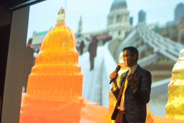
Top image: Keynote speech and presentation by Harry Parr of Bompas and Parr from the UK
Finalist – Dessert Palace by Janice Lee
Spanish architects SelgasCanos’ design for the upcoming Serpertine Summer Pavilion has been making headlines lately, with The Guardian reporting that it looks as if “an exotic caterpillar might have nibbled on a magic mushroom before spinning its chrysalis.” While we wait with bated breath for its completion this summer, some 120 guests were taken on a trip down memory lane of the designs of five of the most memorable Serpertine pavilions that have been erected in the past at the Royal Institute of British Architect (RIBA)’s EAT! event on 24 March. It was an exhibition most unexpected however, as these ‘architectural models’ were conceived of sugar, flour and butter.
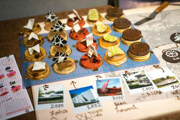
Winner – the Serpentine Gallery Platter by Alan Cheung Kwok-lun and Sarah Mui Sze-wa
Organised in association with the GREAT Britain Campaign and held at the Qube in PMQ, EAT! sought to bridge the architectural and culinary worlds.
The inaugural event saw three confectionary teams offering up their interpretation of an iconic architectural design in Hong Kong or the United Kingdom. Upon careful deliberation by the judging panel, led by Harry Parr of UK’s Bompas and Parr, Alan Cheung Kwok-lun and Sarah Mui Sze-wa struck out with their Serpentine Pavilion Platter. Innovative in concept but relatable in execution, the platter consisted of five mini cakes, each offering a whimsical take on pavilions designed by Zaha Hadid, Toyo Ito, Jean Nouvel, SANAA and Herzog & De Meuron + Ai Wei Wei.

Finalist – Fruit Feast of Yau Ma Tei Wholesale Fruit Market by Yanmin Sun
Prior to the judging session, Chairman of RIBA Hong Kong chapter John Campbell’s opening speech was swiftly followed by one by Jo Hawley, Director of UKTI. Parr also gave quite the sprightly presentation on the edible architecture projects that the company has presented over the years.
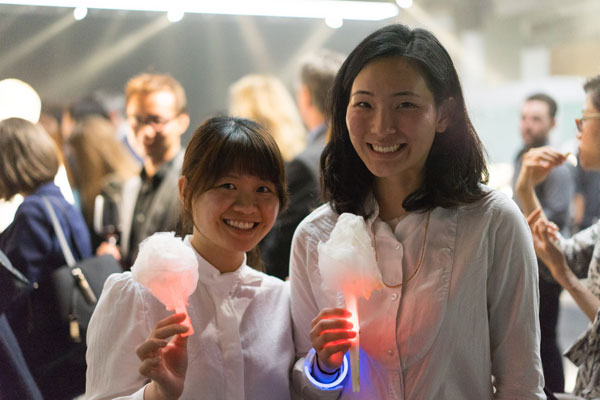
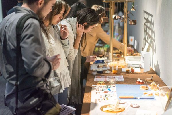
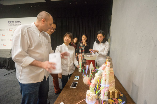
The tasting and judging process
Architects mingled with chefs and members of the press while fuelled by gin and tonic courtesy of Tanqueray no. 10. Parr and his team constructed a ‘Gin and Tonic Cloud’ installation on site, allowing viewers to be ‘drunk on gin’ without ever having to imbibe a single drop of the elixir.
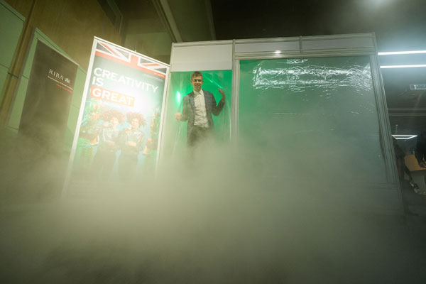
Gin and Tonic Cloud, created by Bompas and Parr
INDESIGN is on instagram
Follow @indesignlive
A searchable and comprehensive guide for specifying leading products and their suppliers
Keep up to date with the latest and greatest from our industry BFF's!
The internet never sleeps! Here's the stuff you might have missed