The home of architecture and design in the Asia-Pacific
Get the latest design news direct to your inbox!
Get the latest design news direct to your inbox!
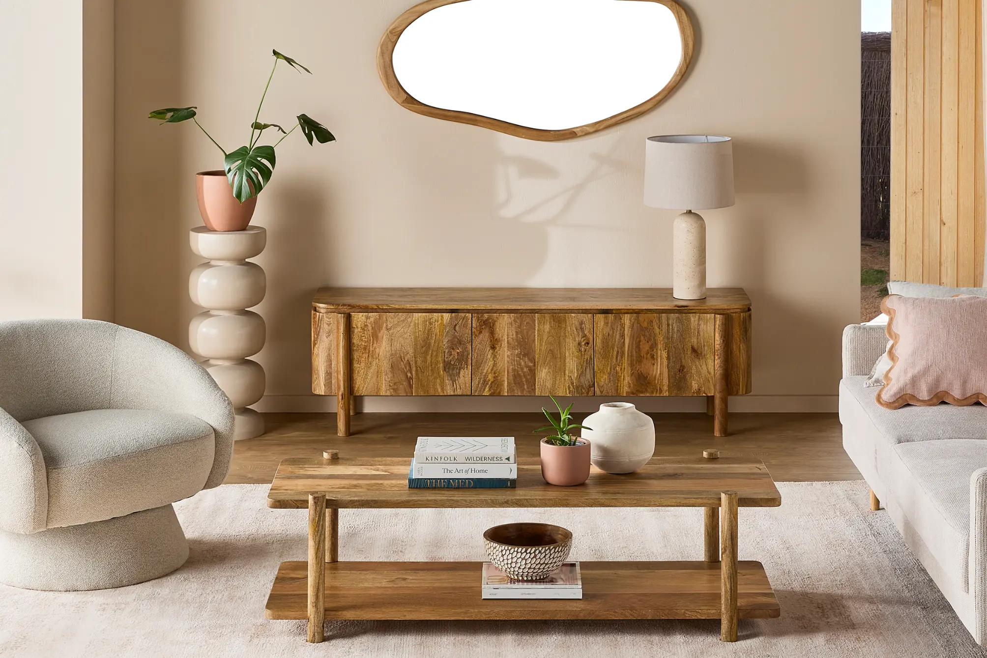
Australian furniture brand, Tait transports you to a dreamy outdoor getaway with the new and refreshing colour palette of Embrace.

August 24th, 2020
For celebrated furniture brand, Tait, the influence of nature and the great outdoors are paramount in the way we live, work and play within our everyday spaces.

This year, Tait introduces us to Embrace: an ethereal new colour palette informed by the Australian landscape. Ingrained in Tait’s DNA is their deep affinity with nature – informing the brand’s distinct designs and colourways that inspire the unique Australian lifestyle.
While we continue to dream of our next overseas vacation, these last few months have allowed us to reconnect with the surrounding that are close to home. To Creative Director, Susan Tait, the Australian outdoors is filled with picturesque landscapes, rich colours and sumptuous textures that make it a destination like no other.

And as we enter the warmer months of spring and summer, the seasonal change invites us to reimagine our outdoor spaces with Embrace.
Embrace takes us on a journey to our ideal getaway through the beauty of nature – embracing warmth, connection, style and substance; all from the comforts of your own home. The release of Embrace features six refreshing, sophisticated and earthy tones: Cerulean, Solis, Mineralis, Terra, Botanica and Arbor. The collection of hues are refined to bring a sense of relaxation and ease to your outdoor spaces.

By combining tactile textures and vivid finishes, Embrace elevates the everyday garden, balcony or deck to the ultimate holiday destination. The range of seasonal colour palettes provide endless opportunities to personalise your outdoor breakout space for the perfect setting to rejuvenate after a long day.
Paying homage to the radiant Australian sunsets is Terra: a palette of earth and fire. The bold colour scheme merges orange, burgundy clay and crisp surfmist together to create a bright and warm atmosphere to relax in. Continuing to illuminate the colour spectrum of Embrace, the Solis range brings a unique energy designed to reinvigorate the experience of the outdoors. Solis’ striking compilation of ochre hues takes us back to the raw purity of the natural lands.
Susan notes, “Eliciting windswept shifting sand dunes dotted with native grasses, Solis radiates with the warmth of the sun.”

To balance the heat of Terra and Solis are the soothing hues of Cerulean and Mineralis with its cool, neutral and calm personality. The combination of greys bring a sense of simplicity and elegance to the outdoors – meticulously crafted to epitomize rejuvenation, formality and practicality. With this in mind, Mineralis creates a base for a colourful, luminous scheme or a pared-back, minimal setting to complement the natural tones of the outside environment.

Tait believes that green symbolises the colour of renewal, reinvigoration, nature and energy: the colours of life. “Botanica evokes the intoxicating scent of the bush, vivid with Banksi and Eucalyptus greens,” Susan adds. Reminiscent of the tones in the Australian bushlands, Botanica is rich with character; reinstating our innate connection to our surroundings.


Arbor elicits a moment of contemplation, inspiration and reflection with a range of statement textures and distinct tobacco brown tones to complete the Embrace collection. Its earthy and natural hues take inspiration from the tree barks of the forests; the subtle hints of orange and yellow in the sand; and the deep, rich shades of the rocky shores.
As we gradually shift, adapt and reimagine the way we interact with our spaces, our yearning for the great outdoors still remains constant. The Embrace colour palette by Tait celebrates the magic of the great Australian landscape – capturing the captivating, colourful soul of the natural, wild world.
Tait.
madebytait.com.au


INDESIGN is on instagram
Follow @indesignlive
A searchable and comprehensive guide for specifying leading products and their suppliers
Keep up to date with the latest and greatest from our industry BFF's!
The internet never sleeps! Here's the stuff you might have missed