The home of architecture and design in the Asia-Pacific
Get the latest design news direct to your inbox!
Get the latest design news direct to your inbox!
The Auckland-based architect speaks to Indesignlive about Auckland’s changing design approach – and why he’s inspired by colour in architecture.
January 20th, 2012
As founding principal of Auckland-based architectural practice Fearon Hay, Jeff Fearon has seen Auckland’s urban fabric and the approach to its design shift and change. Now, especially, the city is experiencing an exciting time in design.
“There is a groundswell of interest in not just the built fabric of Auckland but the open spaces and the networks that make up the experience of the city,” Fearon says.
“There is even more interest growing in how these are put together, and I think the recent initiatives in some of the regenerating areas of the city have meant that the public interest has piqued as to what will happen.
“What the actual built result of that, I think, is still finding its way.
“There’s an excitement for what that might mean for buildings outside the residential sector. You know, I think there’s always been a strong residential body of work coming from NZ architects and we feel that the next few years and the past few are starting to throw up some high quality responses.”
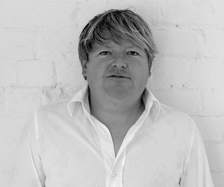
Jeff Fearon
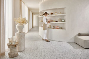
The same can be said of the work of Fearon Hay as a practice. With an extensive portfolio of residential projects under their belt, the firm has also completed built work that has altered the way the urban environment is used – most recently the Imperial Buildings, desribed by Fearon and co-principal Tim Hay as “a reoccupation of heritage buildings” that sit between Queen Street and Fort Lane, previously a minor connection used by service vehicle and now, thanks to Fearon Hay, a pedestrian space offering new circulation strategies and opening up to the surrounding buildings.
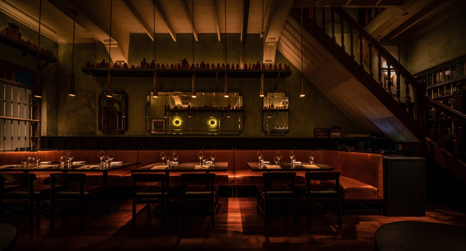
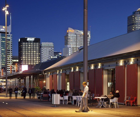
Fearon Hay were also involved in the development of Auckland’s North Wharf, a series of projects seeking to activate the city’s waterfront and encourage its public use.
“We were responsible for the North Wharf buildings, which sit within a range of projects that have gone on to invigorate that area and re-enliven it,” Fearon says.
“There’s a major impetus to create public open space around the water’s edge while maintaining the working wharf for the fishing industry, and these buildings were an initiative that provided restaurants and eateries set right on the wharf edge and allowed people to experience the waterfront in a way that hasn’t been possible in Auckland up until now. It was a very great challenge and we’re extremely happy with the result.”
Fearon is soon set to put on his judge’s hat as he joins the jury of the Dulux Colour Awards, the annual competition that recognises the most creative use of colour in architecture and design (entries close 10 February, with finalists announced 23 February and winners revealed 28 March 2012).
“There has been a reasonable amount of New Zealand entries in the past but no representation in the jury,” Fearon explains.
“When I was asked about what I thought was important for an awards program of this nature, my response was basically that the use of colour in a project or work of any scale is often the thing that creates its ability to endure or not, time-wise, and also creates a significant component of the built environment. So I was very interested to see what was submitted.”
Fearon Hay
fearonhay.com
INDESIGN is on instagram
Follow @indesignlive
A searchable and comprehensive guide for specifying leading products and their suppliers
Keep up to date with the latest and greatest from our industry BFF's!
The internet never sleeps! Here's the stuff you might have missed