Poiesis Architects subtly nestle a church among residences using plenty of abstraction, tactility and other clever devices.

October 9th, 2018
Nestled within a row of terrace houses in Singapore, the Emmanuel Assembly of God (or ‘The People’s Chapel’ as termed by Poiesis Architects) draws curious looks. The corner terrace features all the avant-garde angles and elements of a modern house but a signboard with church service timings suggests its religious function.
Established in the 1950s by a Dutch missionary, the church’s current appearance is a far cry from what was once a former one-storey structure that was so dilapidated the Building & Construction Authority (BCA) questioned its structural integrity. Flooding of the premises in 2010 rendered the place unusable.
The church decided to rebuild. But it was not until seven years later that works were completed due to demanding restrictions. Explains Poeisis Architects’ Founder and Principal Architect Tan Sok Tuan: “The site is situated in a residential area but had to be rezoned to a ‘Place of Worship’. However the authorities were concerned about the possibility of causing disamenity to the surroundings.”
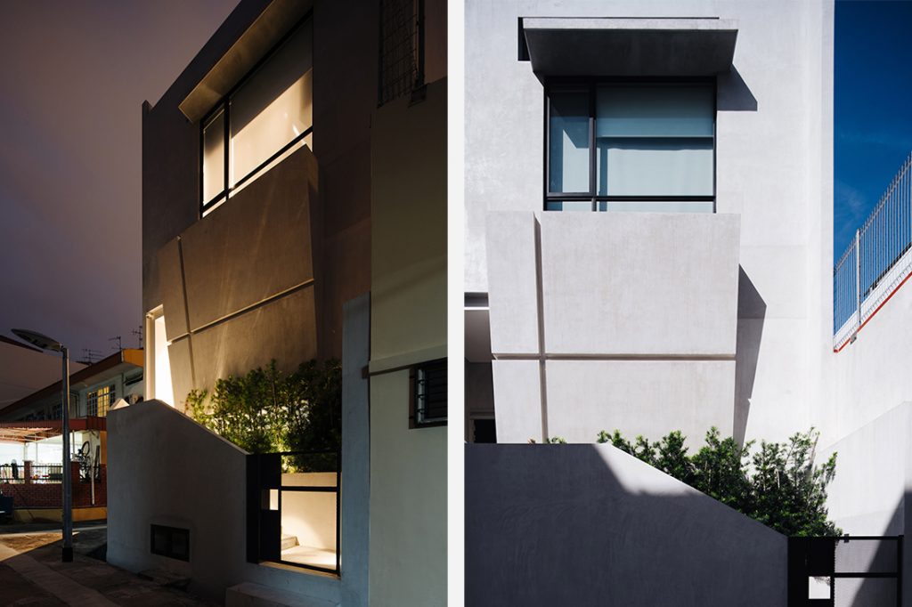
For one thing, the design’s facade could not contain religious symbols. Also, whilst situated in a three-storey landed residential area, the conditions for rezoning stipulated that the new church could not exceed the minuscule floor area of the original building (7.58m in width by 21m in length), and the height could not be maximised. Parking requirements followed that of ‘A Place of Worship’, meaning the site had to accommodate six lots based on one lot per ten people (the church’s capacity is 60).
Creative solutions had to be applied all round by Poiesis Architects. Firstly, parking lots were arranged in tandem to fit. The overall form of the building follows the scale of neighbouring houses with the front aligned to the two-storey height of the immediate neighbours and the back tapering upward to match a three-storey volume.
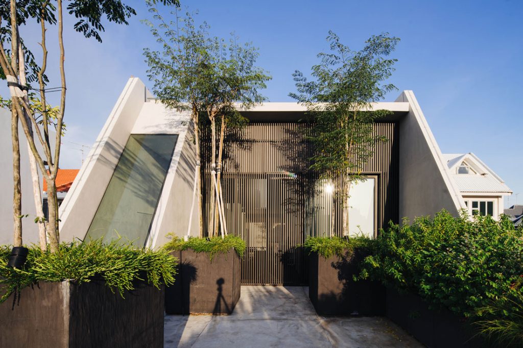
An arresting, monolithic form results from this differential height and use of off-form concrete. It is best appreciated via the long elevation, which is punctured with slit windows. Linear formwork imprints pare down the volume’s massiveness.
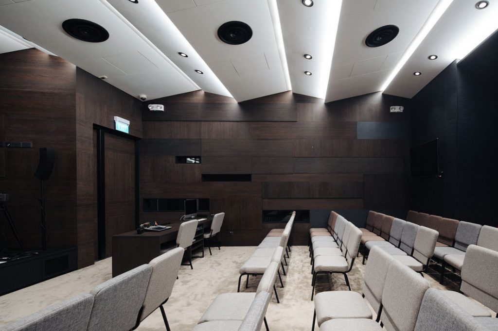
In contrast, the interior of the first-storey sanctuary, wrapped in dark-wood laminate from EDL, is intimate like a cave. In order to prevent noise from reaching neighbours, the front entrance and rear exit doors were designed as acoustic doors and Hewshott International was consulted to design an acoustically sound sanctuary that is wrapped in Oberflex acoustic panelling.
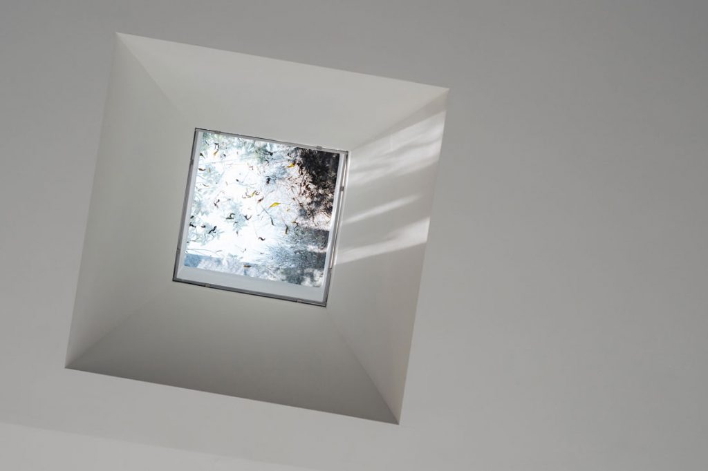
Abundant skylights ensure the good illumination of the second storey, which houses a multifunctional office, a counselling room and an open terrace. Viewed through glass apertures, the terrace extends the interior visually. For thermal comfort, Poiesis Architects introduced several vented skylights and hollow aluminium-section screens to line the windows. In the sanctuary, a shaft of light is designed to fall over the pulpit area to accentuate a steel cross.
This physicality of light was inspired by biblical reference of the church as the ‘light of the world,’ explains Tan. It is but one of the many allegorical representations present – albeit in subtlety due to guidelines – such as an implied cross formed from two inverted L-shaped timber handles on the main door, and strategically placed recessed grooves in the rear facade.
Throughout, flexibility makes the best of the building’s modest square footage. The car porch and entrance foyer (containing a pantry) double as gathering spots for the congregation. A customised mobile table in the office enables different spatial permutations. And in the counselling room, Tan designed a collapsible table that flips down like an airplane tray to minimise clutter and maximise the floor area.
It is clear that Poiesis Architects have applied much thought to creating an inspiring design despite the project’s small scale, down to the gate design – of lack thereof. This component has been excluded as a gesture of community building and neighbourly friendliness, reflecting the establishment’s aspirations as ‘The People’s Chapel’.
Photography by Roland Tan Yeow Teck and Khoo Guo Jie
INDESIGN is on instagram
Follow @indesignlive
A searchable and comprehensive guide for specifying leading products and their suppliers
Keep up to date with the latest and greatest from our industry BFF's!
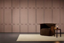
The difference between music and noise is partly how we feel when we hear it. Similarly, the way people respond to an indoor space is based on sensory qualities such as colour, texture, shapes, scents and sound.
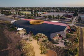
At the Munarra Centre for Regional Excellence on Yorta Yorta Country in Victoria, ARM Architecture and Milliken use PrintWorks™ technology to translate First Nations narratives into a layered, community-led floorscape.

Herman Miller’s reintroduction of the Eames Moulded Plastic Dining Chair balances environmental responsibility with an enduring commitment to continuous material innovation.
In a tightly held heritage pocket of Woollahra, a reworked Neo-Georgian house reveals the power of restraint. Designed by Tobias Partners, this compact home demonstrates how a reduced material palette, thoughtful appliance selection and enduring craftsmanship can create a space designed for generations to come.
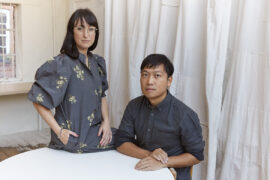
Founded by Simone McEwan and Sacha Leong, NICE PROJECTS is a globally connected studio built on collaboration, restraint and an ego-free approach to architecture and design.
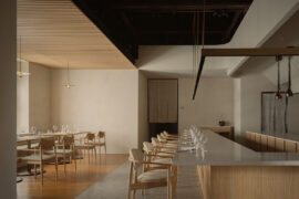
The Japanese firm brings elements of calm into Loca Niru, a fine-dining restaurant housed in a 146-year-old mansion in Singapore.
The internet never sleeps! Here's the stuff you might have missed
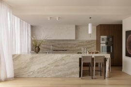
At Loller Street Apartments on Bunurong country, Mim Design’s interiors fuse with Telha Clarke’s modernist architecture, all while taking coastal cues from the bayside setting.

As the INDE.Awards enters its 10th year there are celebrations afoot as we welcome to the program the wonderful Ruth Allen of r.a.g.e as our Trophy Partner.