The home of architecture and design in the Asia-Pacific
Get the latest design news direct to your inbox!
Get the latest design news direct to your inbox!
LAANK’s interior design of Violet Oon Singapore brings to the forefront the influences of both the restaurant’s doyenne and the Nyonya cuisine. Luo Jingmei writes.

August 11th, 2015
Photos: Edwin Tan from Lumina
Interior architecture firm LAANK was founded two years ago and has been steadily building up an impressive portfolio. Helmed by brother-and-sister team, Clarence and Cherin Tan (Clarence handles the business development and Cherin, the design), it is the brains behind the design of projects such as the Bynd Artisan stationery boutique, Beauty Candy Apothecary, Prep Luxe Salon, Fullerton Healthcare Group, and several Fred Perry retail boutiques.
Its latest project to be completed is a restaurant – the iconic Violet Oon Singapore (formerly Violet Oon’s Kitchen) along Bukit Timah Road. LAANK’s approach was to retain familiar elements of the existing restaurant but also inject it with a more refined and recognisable identity worthy of international standing. At the same time, with Violet Oon being a well recognised local chef and food critic known for her Peranakan cuisine, the renovations had to reflect her illustrious career and contributions to the culinary world.
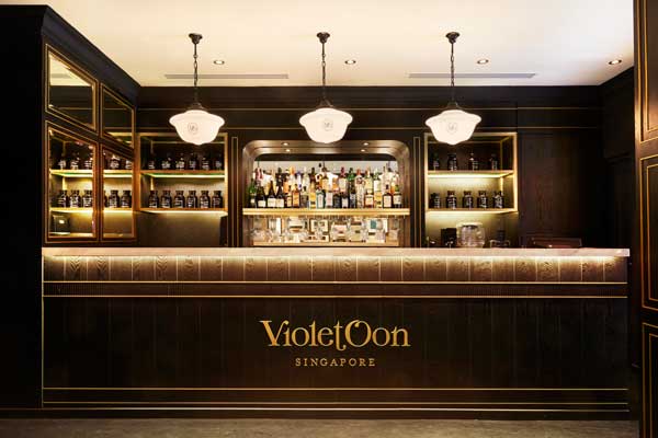
“When analysing the design and workflow of the existing space in the restaurant, we realised that the bar being upfront near the entrance placed a huge focus on it, leaving an impression to guests that the restaurant was like a ‘cool, chic restaurant and drinks bar’ rather than what it was truly about – its dedication and passion to the Peranakan cuisine and Violet herself,” says Cherin. She moved the bar to the back of the restaurant, which freed up the main dining area for more seating space, as well as more surfaces to integrate Peranakan elements right from the entrance.
Also new is the addition of a show kitchen, where cooking classes and demonstrations or filming of food-related TV programmes can be held. Here, certain dessert items will also be prepared and displayed for guests to witness – sometimes by Violet Oon herself. This is contained in the deeper part of the restaurant and sectioned off from the main dining area with glass doors that can be folded open for more seating if necessary or for events.
This corner is a key aspect of the identity of the brand, says Cherin. “To fully complete the ‘Violet Oon experience’, we wanted to carve out an area to represent her life and the colourful experiences and milestones that led her to where she is today. In this corner are a wall unit and an island unit that are designed to look similar to the ubiquitous kitchens that can be found in peoples’ abodes,” says Cherin. “We wanted guests to experience this space and feel as though they were in Violet’s very own home, hence the choice of a deep emerald green, which mirrors the influence of colours found in Peranakan tiles. We wanted to inject a value-added experience where guests can even see [for instance], desserts being flambéed before their eyes before being served to them,” she says.

Adding to the domestic ambience is a wall of framed photographs and documents that not only give a personal touch but also provide guests with bits of information on the chef. “This collage of frames is not an exhibition but a story about Violet’s life: pictures of Violet discovering her first baguette, her first cook book, her mother’s hand-written recipes, distinguished awards she has received, a painting of a Kuku (purple bird) named Violet that was photographed by her good friend, vintage Peranakan food moulds and graters, etc.,” Cherin describes.

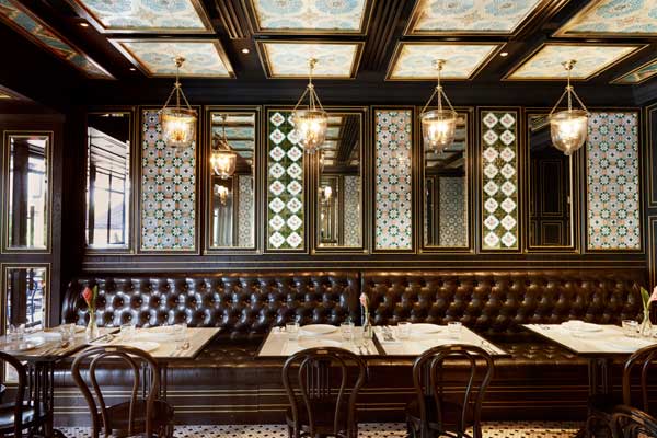
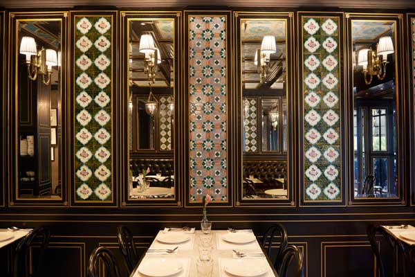
Peranakan tiles – beautiful, intricately patterned designs that line the ceiling and walls – are incorporated throughout the restaurant and are elements that showcase the Peranakan influence most directly. “For the tile features, we sourced for real Peranakan tiles from Peranakan houses that were torn down. It was crucial that we used real tiles for the authenticity in showcasing the Peranakan culture and influences,” Cherin highlights. At the same time, she explains that she was careful not to design the restaurant such that it appeared like a Peranakan museum, and also carefully avoided applying these cultural elements in a kitsch manner.
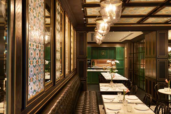
To that end, she has created an elegant, classic backdrop of mirrors, dark wood panelling and black-and-white hexagonal floor mosaic tiles – all reminiscent of a traditional, cosy kitchen, but with refined proportions and detailing. As reference, Cherin shares that she looked to spaces in iconic Singapore landmarks such as Raffles Hotel. Accents of brass and gold in the wall panelling and joinery also provide the air of sophistication, while black-and-white bamboo chicks at the outdoor area and kopitiam chairs from the old restaurant lend a hint of colonial nostalgia.
The design elements play out in the entire establishment in a very thorough manner, even through to the alfresco area where tall shrubs shield patrons from the carpark close by and where the black-and-gold palette continues onto the planter boxes. In the bathroom, LAANK worked closely with Black graphic design agency to create a ‘wallpaper collage’ of Violet’s food reviews and writings for The Food Paper, a magazine that she founded in 1987. Overall, the restaurant’s mood can be described as cosy-chic, echoing the cuisine and its presentation.
This sophistication reflects also the future expansion of the brand; it was recently invested in by TWG Tea co-founder Manoj Murjani, who plans to take the brand overseas as well as create product and merchandising lines. A second restaurant will be opening at The National Gallery, and LAANK’s interior design at this branch serves as an appropriate starting point for the new restaurant.
LAANK
laank.com.sg
INDESIGN is on instagram
Follow @indesignlive
A searchable and comprehensive guide for specifying leading products and their suppliers
Keep up to date with the latest and greatest from our industry BFF's!
The internet never sleeps! Here's the stuff you might have missed