The home of architecture and design in the Asia-Pacific
Get the latest design news direct to your inbox!

Get the latest design news direct to your inbox!
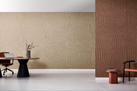
Bold gradient style effects define the new EchoPanel® Striae and Plaid by Woven Image.

February 13th, 2014
Top image: Plaid
The EchoPanel® print collection is recognised for its explorations of colour, dimension and texture using customised ecologically sustainable pigment inks that are GreenTag Gold third party certified. The pigment inks are water based (more than 70%), making them much safer to use and dispose of as compared to conventional textile inks. They are also non-flammable, low VOC and have an excellent light fastness.
Locally produced and printed in Australia, EchoPanel® Striae and Plaid are the latest additions to the story, and respond to the trend of bold gradient style effects via large-scale pigment printing.

Striae
Striae is a one colour print onto 7mm EchoPanel® combining individual vertical lines that travel from floor to ceiling with the careful design repetition creating an overall tonal effect. Striae comes in four commercial neutral colourways of white on cream, pebble on cream, black on charcoal and metallic silver on smoke grey.

Plaid
Plaid makes use of the same pigment printing technique as Striae onto 7mm EchoPanel® with the addition of a horizontal screen and therefore an additional colour. EchoPanel® Plaid references the trend of ‘classic reinvention’ in terms of traditional twill and plaid effects. It comes in six colourways incorporating both matte and pearlescent pigment inks. Current summer hues are reflected in the combination of sunshine yellow and crisp white as well as a copper and platinum combination.
EchoPanel® Striae and Plaid are suitable for contemporary office and hospitality interiors and can be used in a variety of ways – as fixed wall paneling, moveable room dividers and operable walls.
Woven Image
wovenimage.com.au
INDESIGN is on instagram
Follow @indesignlive
A searchable and comprehensive guide for specifying leading products and their suppliers
Keep up to date with the latest and greatest from our industry BFF's!
Presented by Woven Image
The internet never sleeps! Here's the stuff you might have missed