The home of architecture and design in the Asia-Pacific
Get the latest design news direct to your inbox!

Get the latest design news direct to your inbox!
Every store is different, yet each is recognisably Aesop. We look at the brand’s philosophy of customised, intellectualised retail design.

February 6th, 2013
A welcoming ambience, a tantalising fragrance, a meticulous linear arrangement of products, and a multiplication of unusual materials unite Aesop’s 64 stores. But that’s where the commonalities end.

Aesop Tiquetonne, Paris, designed by Cigue
‘Assemblage’ is perhaps the best word to describe each of the brand’s retail interiors, which contain unexpected materials such as corrugated cardboard (Melbourne), coconut husk string (Singapore), and cornices (Boston). Each interior is born of deep consideration and a considerable investment of time and resources.
A positive effect for customers is of course a chief goal, but so too is thoughtful engagement. “Our stores are quite challenging, or engaging in terms of intellectual recognition of architectural style and materials,” says Matteo Martignoni, Aesop’s Melbourne-based General Manager and Head of Global Marketing, Creative and Product Development.

Aesop Tiquetonne
Martignoni was in Singapore in late January to launch the brand’s latest product: Parsley Seed Anti-Oxidant Hydrator. Its carefully selected ingredients and pared-back packaging (for which Aesop is known) exemplify the brand’s thoughtfully understated approach.
Established in Melbourne in 1987, this skin, hair and body product brand carries a strong identity across all its communication and design platforms. “Aesop considers itself a more humble antidote to the over-marketed cosmetics industry,” says Martignoni. While other brands seduce with celebrity campaigns, Aesop has quietly shied away from advertising, instead building its reputation through rigorous research and attention to detail.

Aesop Tiquetonne
Its stores are a case in point. A key consideration in Aesop’s selection of collaborating architects and designers is their ability to form a “creative marriage” with the brand; to reflect Aesop’s way of working. Explains Martignoni, “We never go into a space, destroy everything and rebuild from scratch with a pre-packed project from abroad.”
Instead, inspiration is drawn from the area (often selected for its creative atmosphere) and the neighbouring buildings. Martignoni continues, “Every store is a self-existing project. That’s definitely time consuming; it’s the greatest investment we make in terms of marketing.” Not surprisingly, each architecture or design studio typically works on more than one store.

Aesop Tiquetonne
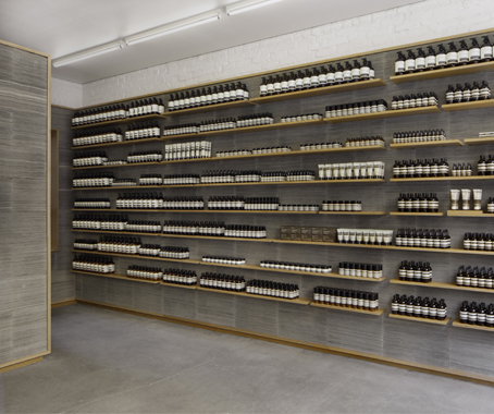
The newest Paris store on Rue Tiquetonne thematically builds on the heritage of its area and the timber structural elements common in buildings there. Designed by young architectural collective Cigue, it contains a shelving system composed of iron nails.
Home to many tradespeople in the mid-twentieth century, the area contains a number of workshops that have remained unchanged for decades. The store’s design is entirely in keeping with this aesthetic, making use of the large iron nails for shelving upon which Aesop products are arranged like ordered tools or implements.
Aesop Nolita, New York, designed by Jeremy Barbour
In the Nolita store in New York, compressed New York Times newspapers were used as a building material by architect Jeremy Barbour. Stacks of newspaper strips, framed in oak, are a tactile surface for walls and furniture, and provide (in Barbour’s words) a “slow material measure of time” that will change colour with age.
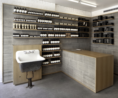
Aesop Nolita
This design also responds to Aesop’s respect for the written word and the history of each city with which it engages.
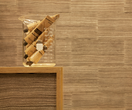
Aesop Nolita
Could one describe this as an intellectualised approach to retail? “Yes,” says Martignoni. “That word also explains something of the core of the company. Aesop finds a certain pleasure in everything around the human being and its intellectual beauty.”
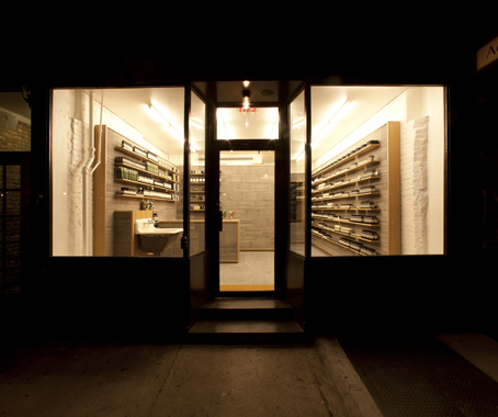
Aesop Nolita
Top image: Aesop Tiquetonne.
Images courtesy of Aesop.
Aesop
aesop.com
INDESIGN is on instagram
Follow @indesignlive
A searchable and comprehensive guide for specifying leading products and their suppliers
Keep up to date with the latest and greatest from our industry BFF's!
The internet never sleeps! Here's the stuff you might have missed