The home of architecture and design in the Asia-Pacific
Get the latest design news direct to your inbox!
Get the latest design news direct to your inbox!
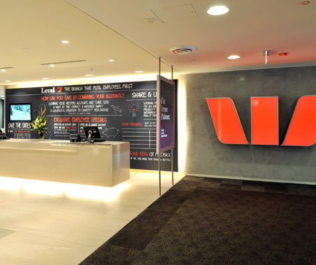
The Westpac Kent Street branch in Sydney by Landini Associates is part of a cultural change bringing the bank back to a local level, writes Mandi Keighran.
February 18th, 2011
The challenge for Landini Associates when tasked with re-branding Westpac branches across Australia was giving people a reason to visit branches when most banking transactions are no further than a click away.
The design concept developed by Landini Associates with the bank brings Westpac branches back to a local level with a focus on context and community.
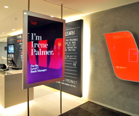
“We’re trying to make the branch more real, more human,” says Mark Landini, Creative Director of Landini Associates.
To create these connections with local community, three different material palettes are utilised. Each palette is specific to the branch’s context – city, suburban or regional – and respects the history and individuality of the branch building.
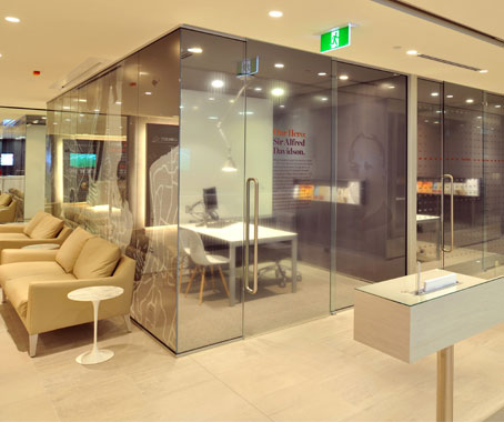
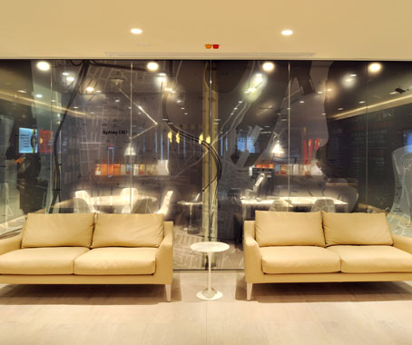
One of the first branches to roll out the concept is in Sydney’s CBD on Kent Street. Designed using the ‘city’ palette, the materials used in the fit-out are a sophisticated blend of neutral tones with a splash of red in the signage (also re-developed by Landini Associates).
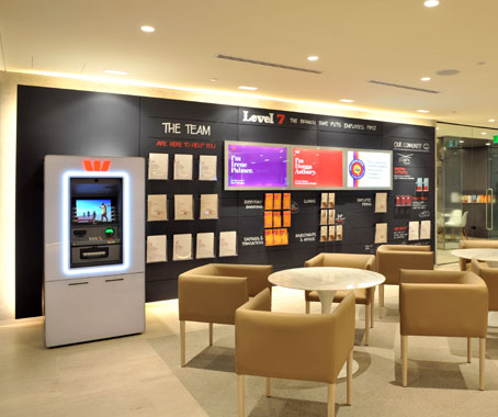
Like the rest of the re-branded Westpac branches, the Kent Street branch makes use of eye-catching signage – referred to as ‘conversation starters’ – to advertise the bank’s services and introduce employees and the bank manager.
Hard surfaces are employed to create acoustic privacy, encouraging customers to chat informally in the open ‘heart’ area. In the past, meetings were always conducted in private rooms. Here, comfortable seating and tables create an open space for initial conversations to take place.
“The central idea is that it’s all about the community,” says Landini. “But in order to implement that, you can’t do it in a cookie cutter approach.”
See the Westpac Kingsford branch by Landini Associates, which utilises the suburban palette, in Indesign #44 – out now.
Landini Associates
landiniassociates.com
INDESIGN is on instagram
Follow @indesignlive
A searchable and comprehensive guide for specifying leading products and their suppliers
Keep up to date with the latest and greatest from our industry BFF's!
Visit the Digital Lifestyle Show to experience the latest in digital technology, entertainment and lifestyle products. Experience the newest products coming to market and gain a greater understanding of how to get the most out of these exciting and innovative products by meeting the experts and discussing your needs one-to-one.
The internet never sleeps! Here's the stuff you might have missed