The home of architecture and design in the Asia-Pacific

Get the latest design news direct to your inbox!

Designing Police Stations can Actually be Cool

Find out how Greenway Architects play with materials and colours to design a number of police stations with a strong civic presence, regional context and to reflect the SAPOL brand to shift public perceptions.

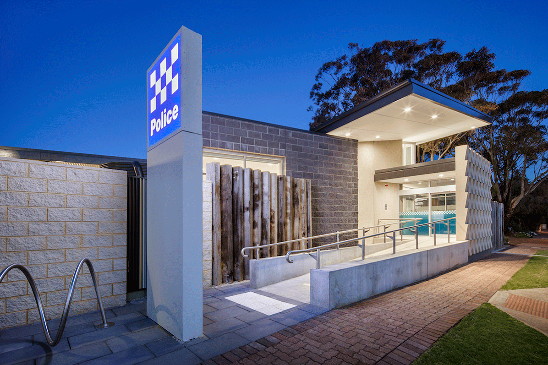
  • Henley Beach Police Station, Photo: David Sievers Photography

  • Henley Beach Police Station, Photo: David Sievers Photography

  • Golden Grove Police Station, Photo: Steve Rendoulis

  • Golden Grove Police Station, Photo: Steve Rendoulis

  • Roxby Downs Police Station, Photo: Aldo Trissi

  • Roxby Downs Police Station, Photo: Aldo Trissi

  • Murray Bridge Police Station, Photo: Trim Photography

  • Murray Bridge Police Station, Photo: Trim Photography

The architectural presence of the police – namely, the police station – often receives little attention despite being ubiquitous in communities across Australia. In recent years’ police stations are being redeveloped, refurbished and built new, in order to adapt them to contemporary models of policing and to assert and foster a fresh perception of the police force in the community.

In South Australia, Greenway Architects has worked with South Australia Police (SAPOL) to replace old stations with new facilities that better serve the community and promote SAPOL’s civic presence. “It is important that these facilities reflect the image of modern, contemporary and accessible police force,” says Simon Frost, Director of Greenway Architects. Indeed, by balancing the fundamental requirement that a police station be secure yet approachable, and by playing with materials and colours, Greenway Architects has designed a number of buildings with a strong civic presence and regional context that reflect the SAPOL brand.

“Both physical and visual security are important, yet these can sometimes counteract the desire for openness and transparency,” Simon explains. “Therefore, direct access from the street frontages and engagement with the public realm is important in making the public comfortable in accessing the police station and interacting with the officers within.”

In the beachside suburb of Adelaide, Henley Beach Police Station has a compact mid-century form, floating roof plane and expansive perimeter with geometrically patterned precast concrete and recycled jetty timber. “This fencing reduces the visual massing of the building and is a valuable element of the site’s interaction with the public realm,” Simon says. It is also designed that when viewed head on, the building appears visually closed, but when approached via the footpath the building is open with a sloped walkway to a light-filled entrance.

In Roxby Downs, the new police station is an inward-facing building (to withstand extreme variations in temperature) with a strong regional aesthetic. Its closed form has textures and colours reminiscent of the surrounding Strzelecki Desert and is protected by a long verandah referencing the traditional vernacular. Meanwhile, Murray Bridge Police Station is composed of a very different palette with polished black precast concrete, raw concrete blockwork and glazing to provide indirect visual accessibility to the site.

Despite being aesthetically very different, these police stations have one thing in common: different material and colour palettes have been used to shift public perceptions. Designed to be, look and feel secure, the buildings are in fact open, welcoming and approachable, promoting a modern and accessible image of the police in the community.


INDESIGN is on instagram

Follow @indesignlive


The Indesign Collection

A searchable and comprehensive guide for specifying leading products and their suppliers


Indesign Our Partners

Keep up to date with the latest and greatest from our industry BFF's!

From canvas to commercial interiors: Woven Image collaborates with Ben Goss

From canvas to commercial interiors: Woven Image collaborates with Ben Goss

As Woven Image celebrates 40 years, it introduces a new collection developed in collaboration with Australian artist Ben Goss, inspired by his original artwork Where the Kookaburra Sits into a vibrant collection of digitally printed EchoPanel® murals and patterns.

Michael Drescher and Jacob Olsen on finding the sweet spot with Herman Miller’s Sayl Chair

Michael Drescher and Jacob Olsen on finding the sweet spot with Herman Miller’s Sayl Chair

In the second instalment of our performance seating three-parter, we turn to DKO’s Michael Drescher and Jacob Olsen to peek behind Sayl’s confident architectural form and explore the ideas of inclusivity, adaptability and freedom to move as hallmarks of what sitting your best actually means.

Dipped in integrity: The profound depth of Aeron Chair’s extended palette

Dipped in integrity: The profound depth of Aeron Chair’s extended palette

Aeron Chair’s new shades, Nightfall and Jasper, arrive with a sense of quiet cohesion – no bells and whistles, no loud technicolour; just two timeless, perfectly versatile near-neutrals. But the new hues aren’t just about colour – and their significance is much more profound than their surface-level subtlety might suggest.

Dale O’Brien on sitting easy with Herman Miller’s Verus Chair

Dale O’Brien on sitting easy with Herman Miller’s Verus Chair

In the first instalment of our three-part series exploring what it means to sit your best, we pose the question to Gray Puksand’s Dale O’Brien, who discusses the importance of ease and majority rule when it comes to sitting and reveals why specifying a task chair is not unlike choosing a Volvo.

Related Stories


While you were sleeping

The internet never sleeps! Here's the stuff you might have missed