The home of architecture and design in the Asia-Pacific
Get the latest design news direct to your inbox!
Get the latest design news direct to your inbox!
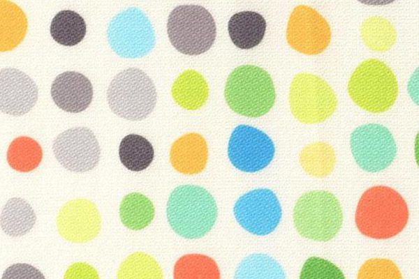
It’s no secret that strong, minimal geometric lines are in. But how can you freshen and soften those harsh composites for a more inviting, liveable/workable space? Polka – a new EchoScreen print story by Woven image – gives designers the answer.
August 4th, 2015
Modern work and living spaces alike are becoming increasingly minimal. Sharp, clean lines, muted colour palettes and bare furnishings are dominating both the commercial and residential environment.
In one way, this is positive thing – a blank canvas literally has the potential to be almost anything the user wants it to be. However, it also means that many spaces are lacking in personality, warmth, and an element of human-ness that makes a space comfortable.
Painting walls and adding fluro break-out spaces is perhaps a league too far – so what then, is the solution to inject these spaces with a bit of life?
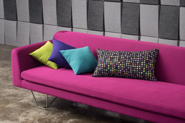
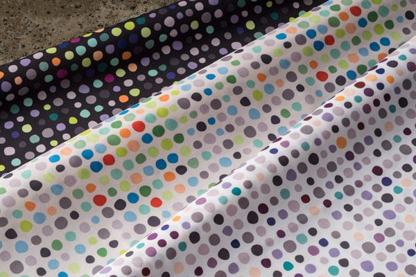
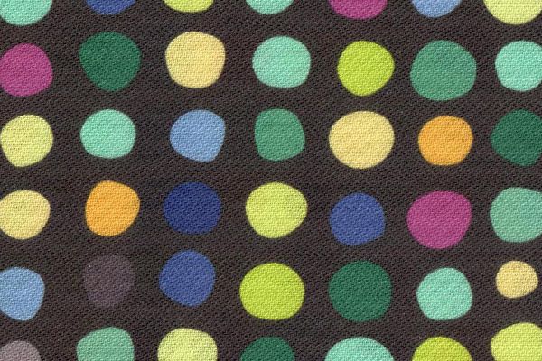
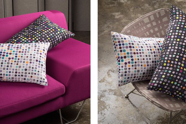
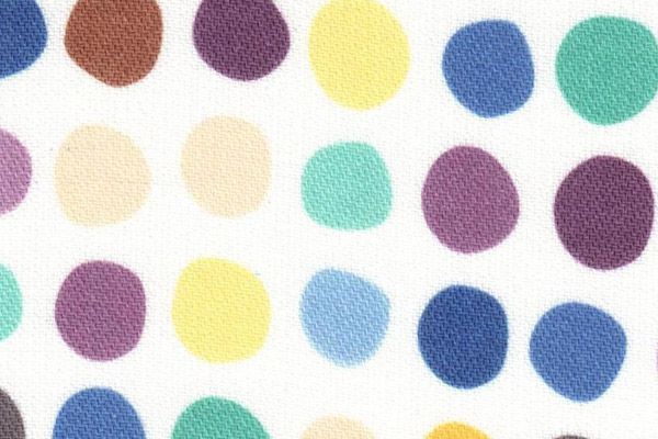
Woven Image, recently this month unveiled a new addition to the famed EchoScreen print story. Polka is a fun, high-impact yet still subtle “pop-of-colour” textile combining bright tones and pastel hues to soften to attitude of space.
The phrase “on trend” gets thrown around quite a bit. But for Woven Image – a company known for its investment in significant R+D – the three available Polka colourways were researched and well considered.
For example, the range features tones such as teal, magenta, apricot and mint – colours we are seeing pop up quite a bit throughout new ABW workplaces and multi-residential developments – which are then tempered with crisp white, cream and vivid charcoal; a known heavy favourite palette among the global design community.
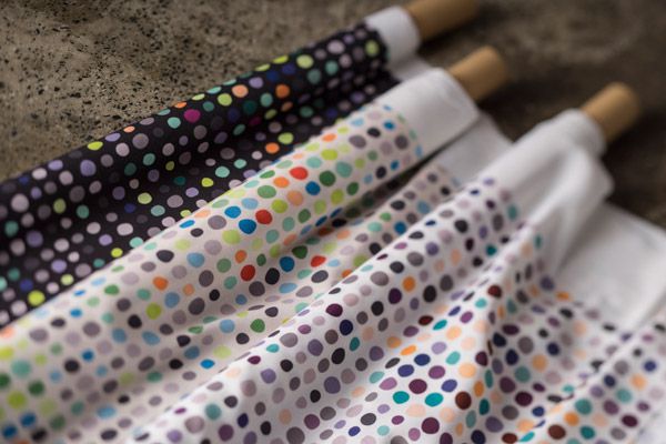
True to fine form, Woven Image have not only delivered an aesthetic, on-trend solution to challenge the blandness of modern spaces, but a functional material that also meets the standards and needs of the Australian market. Polka is heat transfer printed onto a 100% recycled polyester crepe fabric that receives an EcoSpecifier Environmental Certification. The max print width of 162cm makes it suitable for wrapped panels, operable walls, drapery and other vertical applications. Polka can also be railroaded to create a continuous seamless finish, meaning designers and specifyers can really make this their own project by project.
Solving the common problems of both form and function that are currently permeating the industry, Polka is sure to achieve cult status among its brothers and sisters in the wildly popular EchoScreen family.
For more information contact Woven Image
INDESIGN is on instagram
Follow @indesignlive
A searchable and comprehensive guide for specifying leading products and their suppliers
Keep up to date with the latest and greatest from our industry BFF's!
The internet never sleeps! Here's the stuff you might have missed