The home of architecture and design in the Asia-Pacific
Get the latest design news direct to your inbox!
Get the latest design news direct to your inbox!
Ken Woolley built three houses for himself in Sydney, all on sites with a topography of precipitous Sydney sandstone, but that is all they have in common, for the houses differ dramatically in form and resolution.

August 22nd, 2019
This differing of form was in part as a result of Woolley’s evolving circumstances, but moreover the houses are a response to differing places and times. One of Woolley’s key characteristics as an architect was that he had no ‘house style’, a pun that can explain a lot about his designs.
The first house, built in Mosman in 1961, is celebrated for its series of terraced levels, its spaces lit with raked highlight windows between the floating roof planes. It became very famous as the centrepiece of the 60’s ‘Sydney School’ as proselytised by Jennifer Taylor and others. Woolley lived in that family house for 18 years before moving from the suburbs to gentrifying Paddington, designing the second house on a steep ‘leftover’ block of land in what is a service lane way to shops at Five Ways. The third house in Palm Beach is an elegant series of pavilions, descending down a precipitous cliff face and water course through the palm trees that give the beach its name.
Each of the houses is different. And they are different in a number of ways that show the passage of time and ideas for the architect and for the address to different topography and landscapes. Woolley’s approach to the Paddington House is very different to Mosman. It came at a time in life when Woolley had less need for a family home, more connection to the inner city and the desire to try an alternative typology of house. This would not be a re-interpretation of the generic terraced house (which Don Gazzard had adapted into his own house in Paddington St), but rather to reference the other: the warehouse, small factory, and tiny commercial buildings that are dotted through Paddington in amongst the rows of terraces.

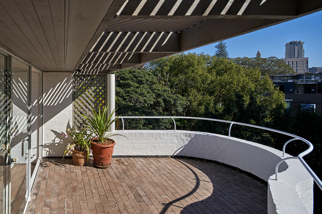
Where a terrace house might have a welcoming small, front garden and overhanging balcony or veranda space, this street was not so hospitable. And turning to the precedent found in small commercial buildings, Woolley erected a solid brick wall to the street with three larger opening, none windows: one for a person, another the car and a round giant bill’s eye for a view out from the upper living area.
The rough laid brick work, a feature in the Mosman house, was here painted Paddington white. Behind the flat front wall is a series of rooms on 3 levels that adopt a more flowing, curvilinear from, that gives rise to the iconic image taken from the garden below, but not publicly seen. The living area and terrace is on the upper level, bedrooms and service rooms on the 2 levels below, in spaces that are far more sculpted out of the concrete and brick than Woolley’s previous work.

This house demonstrates how Ken Woolley could change his approach to architecture based on a reading of the landscape and site, the surroundings and place, in the needs of the client, and most importantly the tempo of the times. So many of his buildings go unremarked because there is no ‘constant style’. It is this characteristic of being an architect, creating a new form, a new idea, a new arrangement, a new thinking in every building that attracts many architects to Woolley’s work.


The Paddington House runs entirely against the idea of ‘brand’ in these days where consistency and the development of one’s iconography is paramount. For that reason alone (let alone a fabulous piece of architecture) the AA is inviting everyone who is interested in architecture to visit this house on Sunday. You can book tickets at: Eventbrite


INDESIGN is on instagram
Follow @indesignlive
A searchable and comprehensive guide for specifying leading products and their suppliers
Keep up to date with the latest and greatest from our industry BFF's!
The internet never sleeps! Here's the stuff you might have missed