The home of architecture and design in the Asia-Pacific
Get the latest design news direct to your inbox!

Get the latest design news direct to your inbox!
Corporate identity and branded environments have come a long way in 9 years, as Stephen Minning of BrandCulture tells Ola Bednarczuk.
August 5th, 2011
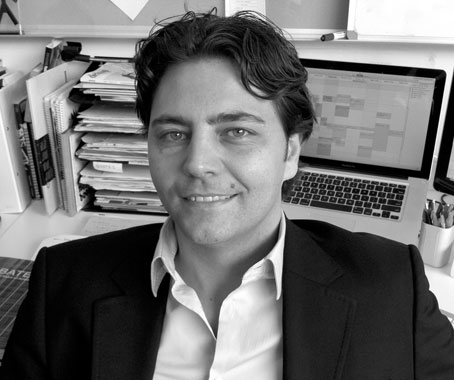
“Digging in and finding that magic” is one way Stephen Minning, Creative Director of BrandCulture Communications, describes the work of his company.
For almost 9 years, BrandCulture have been working with companies to drill down into their core values and aspirations, in order to express these culturally and visually.
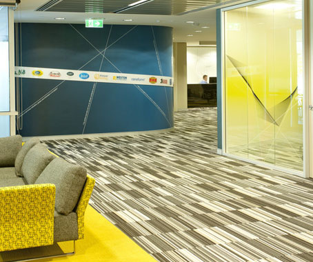
George Weston Foods
It’s much more than just wayfinding and graphics, incorporating an intellectual and psychological layer.
“It’s really the thinking and the structure and processes behind it all,” Minning explains. “We add a layer of relativity [to a company], so that you actually understand what the brand does and what it means to you.”
BrandCulture was founded in response to a changing shift in the late 1990s and early 2000s, when marketing and corporate identity came to be more integrated, combining communications, visuals and branding. In the early stages of BrandCulture’s formation, the competition in the field wasn’t yet very strong or fully aware of the centrality of branding.
“You look at the companies that lead the charge – their brand is at the front,” Minning says. “It’s the most important part of the company.”
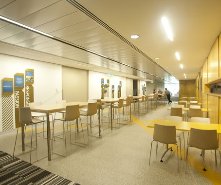
George Weston Foods
Initially, the BrandCulture approach was more purely pragmatic and linear.
“When we first started out, we were doing the more obvious style of design. I think we were still good at understanding what the balance was back then, but now we’ve gone way beyond that.
“Slowly, bit by bit, we found ourselves immersed in the stories and cultures of the companies.”
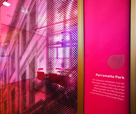
Sydney Water Parramatta
The change in approach arose naturally from the experience that came with dealing with different companies and brands.
Two recent key projects best encapsulate what BrandCulture are about. When Sydney Water moved from the CBD to Parramatta, they needed their new office (a 17-storey building designed by Denton Corker Marshall, with interiors by Woods Bagot) to reflect their long company history and culture, as well as the physical journey they had undertaken.
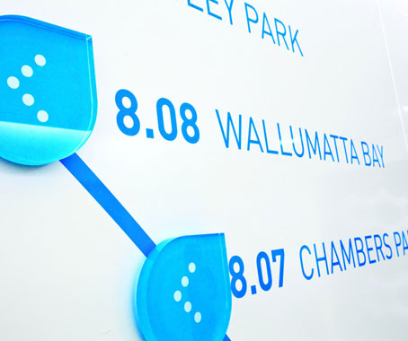
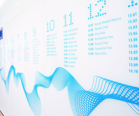
Sydney Water Parramatta
Minning and his team came up with a ’Journey to Parramatta’ concept, with each of the building’s floors marking a different milestone in the journey, interpreted graphically throughout the building, representing the rich heritage of Sydney Water and giving both workers and visitors a ’snapshot’ of what the company is about.
Recent work on the offices and corporate identity of George Weston Foods required “understanding the complexity of GWF, one of Australia’s biggest food manufacturers,” Minning explains.
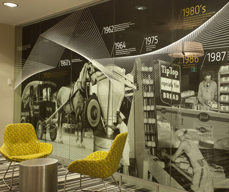
George Weston Foods
The focal point of the office fit-out is a string art installation between 2 layers of glass, a visual interpretation of the company’s complexity, which then became the graphic key to the rest of the environment.
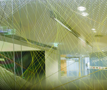
George Weston Foods
One of the most exciting features of BrandCulture’s work is the energy and vigour that goes into each project.
“We don’t do anything by halves – we get right into it!” Minning enthuses.
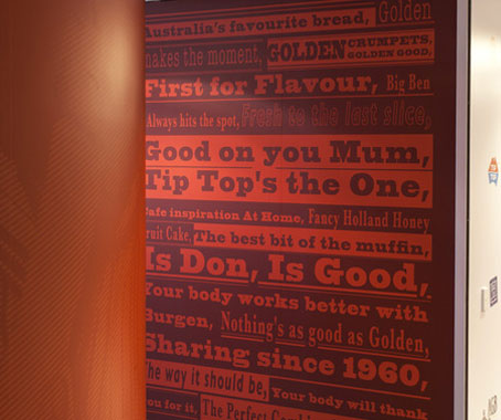
George Weston Foods
They also pride themselves on never doing the same thing twice.
“We can use the same thinking, but there’s no way we’re just going to do the same stuff,” Minning explains.
“We’ll go find new materials, new finishes – and that’s the joy of working with architects and interior designers, because they’re always trying to find new boundaries in what they can do.”
BrandCulture Communications
brandculture.com.au
INDESIGN is on instagram
Follow @indesignlive
A searchable and comprehensive guide for specifying leading products and their suppliers
Keep up to date with the latest and greatest from our industry BFF's!
Iken are launching their FutureWall platform in Sydney on Thursday 23 June. FutureWall interior building platform offers a suite of solutions that gives you unprecedented freedom to design and creates spaces of any scale. These removable partitions and cladding are available in a variety of materials and finishes. Award-winning architect and Ecospecifier CEO, David Baggs, […]
The internet never sleeps! Here's the stuff you might have missed