The home of architecture and design in the Asia-Pacific
Get the latest design news direct to your inbox!
Get the latest design news direct to your inbox!
Stone has become synonymous with the language of interior design. Here are 5 projects that reveal the beauty of stone when used in interior design.


June 30th, 2022
Stone has increasingly become synonymous with the language of interior design. Where once it was relegated to benchtop or splashback, kitchen or bathroom, it is now a material for all surfaces including walls, floors, seating, plinths, detailing and joinery.
Moreover, there is no limit to the amount of stone used in a project with designers mixing stone types, colours and degree of variation. Calcutta Viola, for example, is having a huge impact as small to medium inclusions in interior.
More subtly, Elba stone has been wildly popular over the years and the popularity is showing no signs of slowing down. “Coveted for its cool grey tones and soft brown markings, this unique dolomite-based stone offers a subtle, sophisticated colour palette.
“With low porosity, it is a beautiful natural stone that is hardwearing, long-lasting and distinctly easy to live with.
“We see this precious material used in such varied ways, from kitchens and bathrooms surfaces, to feature walls and incredibly unique joinery elements,” says Phil Brenton, Artedomus’ managing director.
Of course, classic white marble will always be popular, but in contemporary design it’s more likely to be featured as a great expanse with book-matched grain, or taken up a notch with a detailed shape or accent of something astounding.


Photography by Prue Rosco.
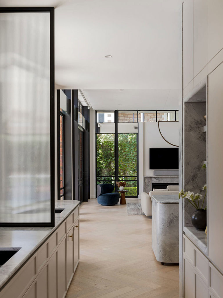
Arguably the queens of stone, Arent&Pyke has been at the forefront of seamlessly incorporating extraordinary stone into its projects. La Casa Rosa, for example uses a huge variety of stone from classic white marble to pink terrazzo, but never is the stone delivery as expected. The kitchen island in classic white for example, is curved, fluted and suspended, while the splashback in a highly figured blue and brown quartz is simply astounding. Revisited in the butler’s pantry as benchtop and wall and splashback, this quartz is one of the prettiest stones imaginable with light and shade responding across its surface. Read more


Photography by Sharyn Cairns.
Never one to shy from colour and volume, Flack Studio’s use of stone is inspired. Pink, white and brown are the primary tones used in stone for this project, with deep green, apricot and peach used in paint and textile. Using the natural variation of the stone to bring visual interest without clutter, stone is used as a finishing detail that is both opulent and simple. Paired with terrazzo flooring, the textural variation in the project is a delight. “The main design approach was similar to navigating a 1970s Australian caravan – these small spaces pack a punch and everywhere you turn reveals something new to discover. We wanted something new to discover every time you turned around,” says Flack. Read more

Also from Flack and proving once again that David Flack can turn his hand to anything, classic white marble is used with extraordinary elegance. For this project, Flack was tasked with working to the client’s preference for a restrained colour palette, where everything the eye alights appears meticulously handpicked. Foregoing a rush of bold, visual interest, here instead the eye is unhurriedly drawn to the floor’s textural chevron timber of soft geometries. Offsetting the lustre of its patina by adjacent white walls and generous use of Calacatta marble, the pristine expanse of white allows the interventions of time and nature to shine through – whether that be in the curious knotting and ring marks of timber, or the delicate veining and variegation decorating stone surfaces. Read more


Eschewing expectations, SJB has used marble in the bathrooms as visual balustrades and trims, however beautiful, her use of this material steps way beyond its aesthetic delivery. Colour, texture and a sculptural nuance cleverly reject the notion that an ageing resident requires clunky rails and serviceable seats. Yet the bathroom design is wholly sensitive to accessibility. Tiled floors and surfaces are secure, curved and without steps or edges. Positioning of cabinetry is such that stable surfaces suffice for hand-holds and are inherently where they need to be. Very importantly, the aesthetics of the bathroom provide assurance that the client is in fact fabulous, rather than a constant reminder that they are perhaps less-firm than they once were. Read more

Photography by Caroline Cameron.
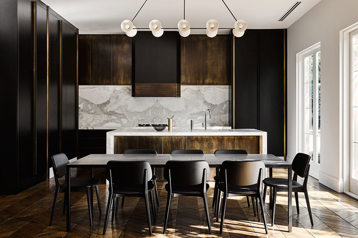
For Unley Park Residence, Williams Burton Leopardi has given marble a curved and tailored appearance. Subtly book matched on the kitchen feature wall and expressed as a continuum on the island, the grain and texture of the stone adds visual interest without dominating. Within the Butler’s pantry marble surfaces are continued as alcove lining and shelving. This luxurious and simple material is used again on the fire place to express visual continuity. Read more
We think you might like this article about 5 groundbreaking poured concrete structures.
INDESIGN is on instagram
Follow @indesignlive
A searchable and comprehensive guide for specifying leading products and their suppliers
Keep up to date with the latest and greatest from our industry BFF's!
The internet never sleeps! Here's the stuff you might have missed