The home of architecture and design in the Asia-Pacific
Get the latest design news direct to your inbox!
Get the latest design news direct to your inbox!
Bold and inventive use of colour defines the winners of the 2015 Dulux Colour Awards, announced on Wednesday 25 March in Melbourne.
March 26th, 2015
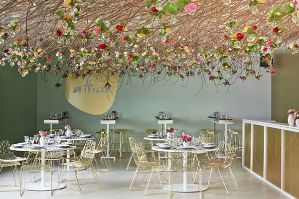
Above: Lexus Design Pavilion by Mim Design. Image Credits Sean Fennessy
The theme of revealing the artist was poignant with entries throughout showcasing a change in paint usage with art references and unique graphics. This approach is not dissimilar to modernist art, highlighting a movement away from the minimalist method seen in previous years.
This was shown in a ‘more is less’ approach which seemed to be embraced in an overwhelming use of colour throughout elements. However, it was the projects that juggled this colour explosion in a considered approach who shone in their respective categories.
Judges were unanimously impressed by the cross-sectional use of colour, overall creativity and calibre of professional and student entries.
A clear standout was the Grand Prix winner, Lexus Design Pavilion, beautifully crafted by Mim Design. The installation used subtle ombre colour appearing to ‘come off the wall’, which flat colour alone cannot achieve. With a stunning alignment to a French Impressionist feel the project was a great example of colour expression.
The judging panel in the 2015 Dulux Colour Awards included highly-regarded design industry leaders from a range of disciplines:
Andrea Wilson – Senior Associate at ARM Architecture
Hannah Tribe – Principal and Founding Director of Tribe Architects
David Bromley – contemporary artist
Sian MacPherson – interior designer and editor of EST magazine
Alice Lines – editor of homestyle from New Zealand.
The 2015 Dulux Colour Awards winners are:
1. Grand Prix Project
Project: Lexus Design Pavilion, VIC
Company name: Mim Design
Judges comment: A clear standout, this incredibly sophisticated fitout was a unanimous category winner. Rebalancing the harsh metallic of a Lexus car, the gentle palette helps visitors understand the softness within. The subtle ombre in Dulux Leek and Coral Atoll was used to great effect, providing a dimensional impact which flat colour alone couldn’t achieve. The sage green gives the illusion of a floating sea with the floral ceiling display a beautiful upside down ‘Monet’s Garden’. Truly angelic, the space would be lovely to enjoy a champagne trackside.
2. Installation & Events
Project: Lexus Design Pavilion, VIC
Company name: Mim Design
Judges comment: As above
Polychrome by David Boyle Architect. Image Credits David Boyle
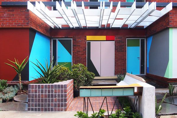
3. Multi Residential
Project: Polychrome, NSW
Company name: David Boyle Architect
Judges comment: A clever project which managed to juggle various elements and still present a wonderfully cohesive visual. It is reminiscent of a modernist painting and an interesting example that more is less. With red brick remaining in the space, the chosen palette of bright
hues including Dulux Lilac Fluff, Hot Lips, High Blue, Vintage Green and many more, is a clever and playful decoy. The judges unanimously awarded this project for the creation of a fun and energetic facade.
4. Commercial Exterior
Project: Brompton Pavilion, VIC
Architect: Craig Tan Architects
Judges comment: The Brompton Pavilion created a dynamic display of colour within a sparse landscape. The 3D outer framing provided a sneak preview of vibrant colour. The structure balanced external, internal and in-between spaces through thoughtful use of colour. The palette combines both muted and bright shades highlighting the unusual structural aspects, including bright oranges and reds in Dulux Circus and Red Clown.
Koko Black Indooroopilly by Russell & George. Image Credits Scott Bur
5. Commercial Interior Workplace & Retail
Project: Koko Black Indooroopilly, QLD
Architect: Russell & George
Judges comment: This fitout replaces the decadence associated with chocolate with clever colour combinations of Tuscan oranges, light blues and copper highlights in a fresh and contemporary palette, creating a welcoming and emotive space. It pushes the boundaries through its bold ceiling which features a sponged down effect on the walls creating an organic feel. Finished with a nice interplay between shadows and tone it was a well-deserved winner.
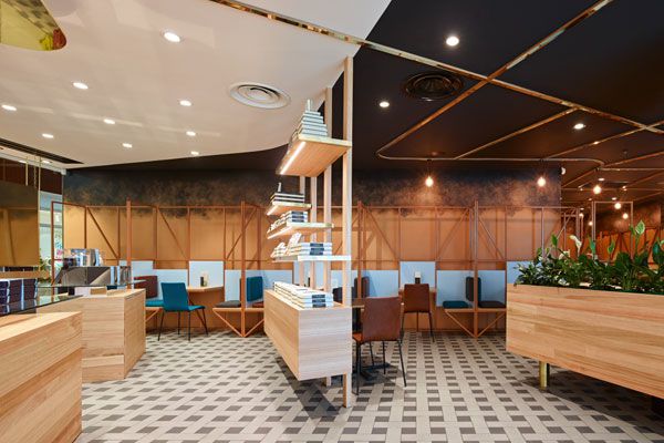
6. Commercial Interior Public Spaces & Hospitality
Project: Phamily Kitchen, VIC
Architect: Mathew van Kooy
Judges comment: This project was awarded for its boldness and brilliance. A truly evocative fitout, the space transforms from a classic Victorian terrace to a vibrant Vietnam eatery achieved through colour and clever use of fluoro lights. Positioning the design artistically the architect was brave to commit to one colour, Dulux Santorini, at level and colour match all grounded elements creating a daring statement. The look was softened by the addition of Dulux Ice Vovo on the ceiling and Antique White on the upper walls.
Single Residential Exterior
Project: Anglesea House 4, VIC
Architect: Emma Mitchell
Judges comment: With an empathy to traditional design and a known difficult structure to work with, Emma Mitchell has created an emboldened space. The design introduces contemporary links through daring colour. Using bright Dulux tones – Succulent and Peppermint Bar – it is balanced by the dark grey Dulux Cave Man, producing a design that is playful but with great honesty and broad appeal.
Courtyard House by Aileen Sage Architects. Image credits Tom Ferguson
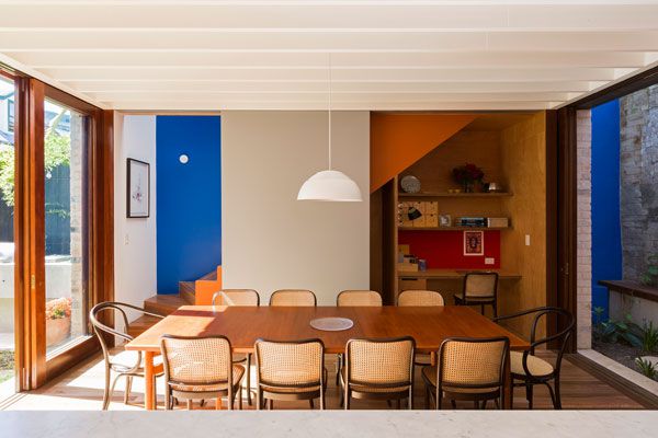
7. Single Residential Interior
Project: The Courtyard House, NSW
Architect: Aileen Sage Architects
Judges comment: The Courtyard House is an innovative design. Rather than using colour to delineate between zones, it cleverly uses colour in a thought provoking manner, using different combinations to mark your journey through the house. The considered use of colours, not only in the bold and various pops used throughout but also in the neutrals, beautifully highlight and complete a bright and playful palette.
8. International
Project: Otoparae, NZ
Architect: SPACE Architecture Studio
Judges comment: Elegantly executed, Otaparae is a fine example of a contemporary approach to domestic environments. As a comfortable and relaxed space, colour has been used to heighten the experience and initiate a more intimate setting for entertaining.
Concealing the Crisis by Amelia Ng
9. Student
Project: Concealing the Crisis, VIC
Student: Amelyn Ng
Judges comment: Concealing the crisis cleverly utilises a traditional colour palette to convey a contemporary vision. A difficult and polarising brief which is translated into an interesting and harmonious proposal. The colour palette of Dulux Rodham, Red Stop, Orangeade, Black and Golden Marguerite was considered.
The 2015 Dulux Colour Awards were proudly sponsored by Katnook Founders Block, Regency Distribution, Walter Herman Interiors, Fiorina Jewellery, Bandhini Homewear Design and Voluspa.
View all 2015 Dulux Colour Award winners and other entries at dulux.com.au
INDESIGN is on instagram
Follow @indesignlive
A searchable and comprehensive guide for specifying leading products and their suppliers
Keep up to date with the latest and greatest from our industry BFF's!
The internet never sleeps! Here's the stuff you might have missed