The home of architecture and design in the Asia-Pacific
Get the latest design news direct to your inbox!
Get the latest design news direct to your inbox!
The annual Dulux colour forecast is out! Take a peek at the eye candy and make note of what colours are making a splash across the design world.

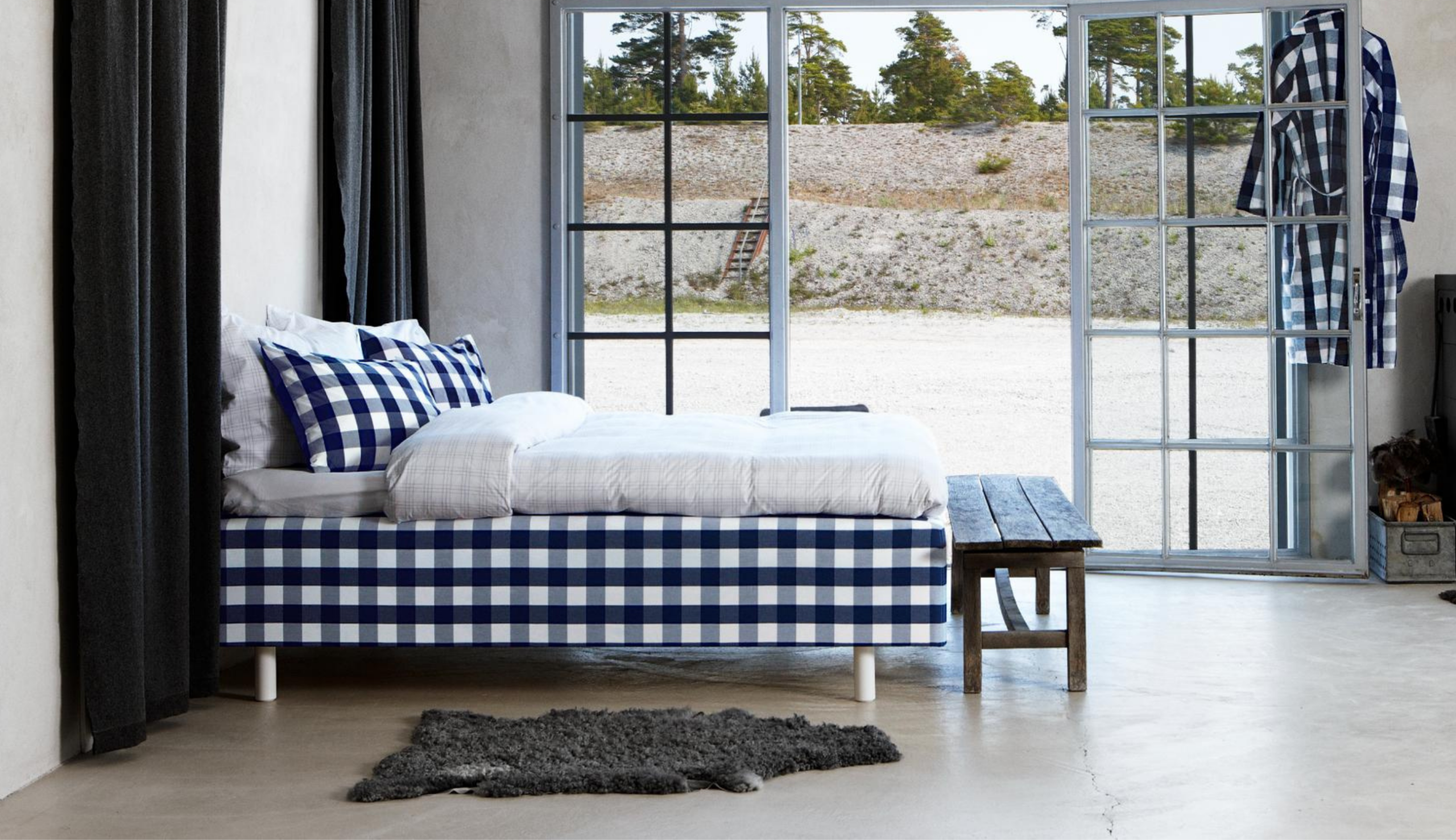
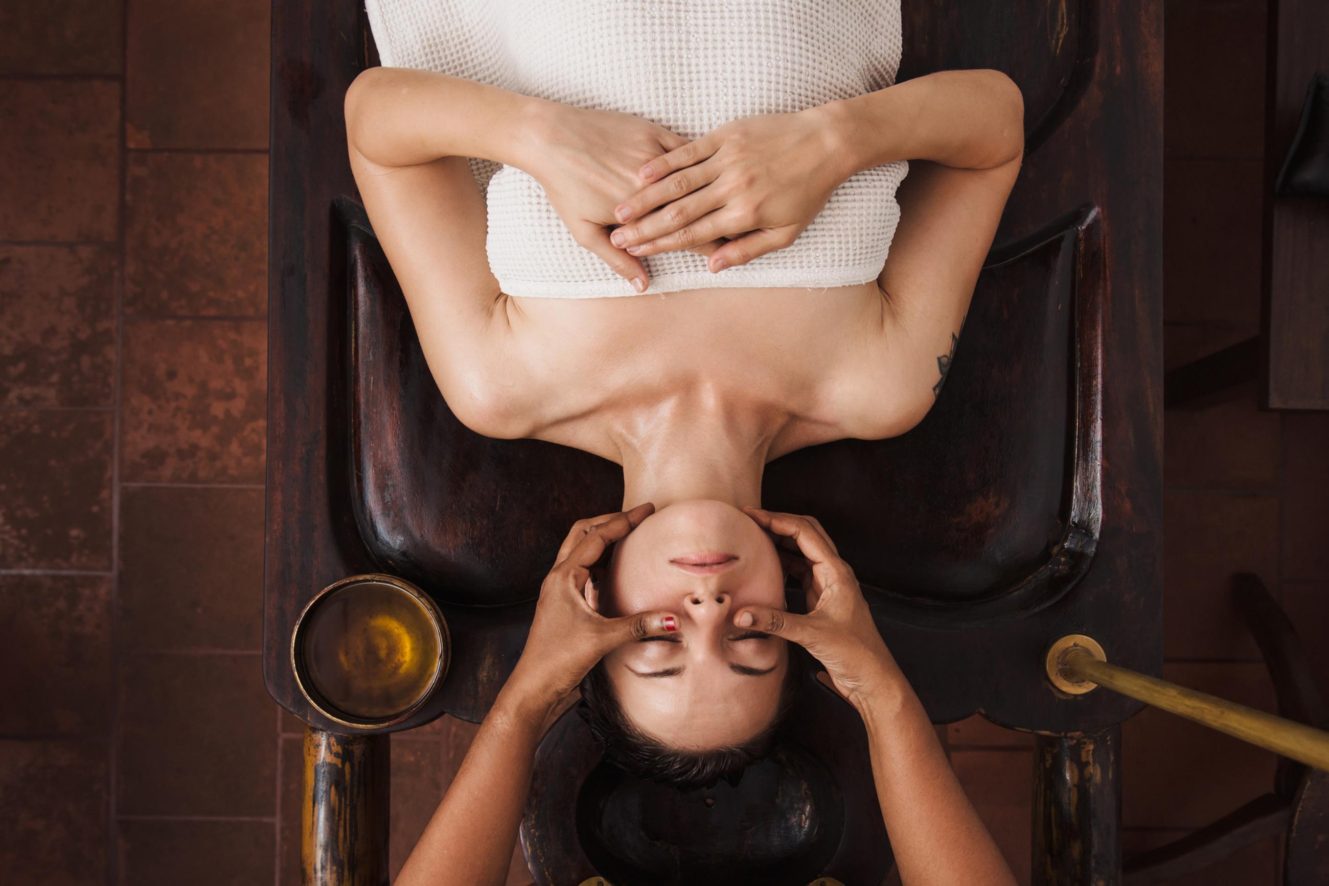
Wholeself

Wholeself

Wholeself

Wholeself

Wholeself

Wholeself

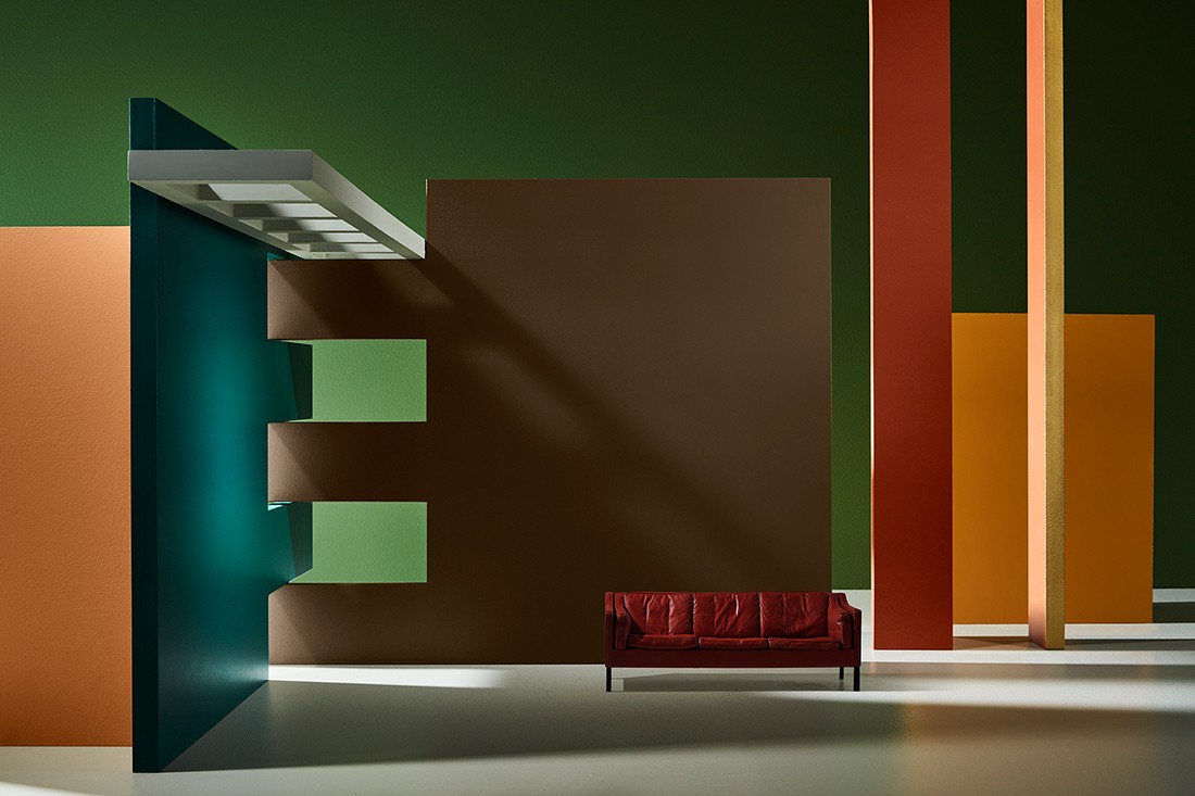
Legacy

Legacy

Legacy

Legacy
Repair

Repair

Repair

Repair

Repair

Identity
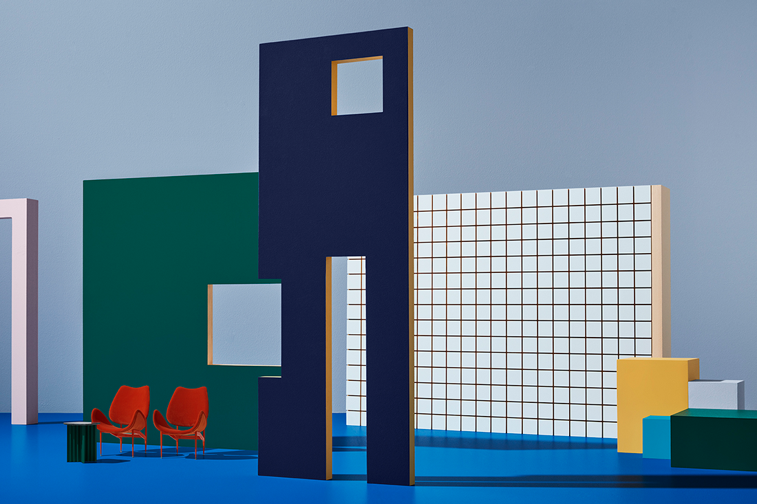
Identity

Identity

Identity
Always something for a designer to look forward to, the annual Dulux Colour Forecast presents a fresh new perspective of what colours we can expect to see popping up over the course of the year.
Presented by Dulux’s colour and communications manager Andrea Lucena-Orr with trend forecaster Bree Leech, the range draws on a variety of influences and travels, including the Salone del Mobile Milan. This year the palettes were created through a prism of wellness, rejuvenation and environmental consciousness.
When talking about how the palettes are developed, Lucena-Orr shares, “We discuss what is on people’s minds, what factors affect where design and colour is going and what’s happening from a technical and pigment perspective.”
The overarching theme for the four palettes is ‘Filter’ – which draws on the combination of self-care and wellness with the increasing influence of technology. “This theme highlights the aim to home in on what is meaningful and to mindfully tune into what we care about,” says Lucena-Orr, “Whether it’s filtering our smart device usage and longer working hours, filtering our consumption of the new and shiny, or simply filtering out the noise of life – we strive to focus on what really matters.”
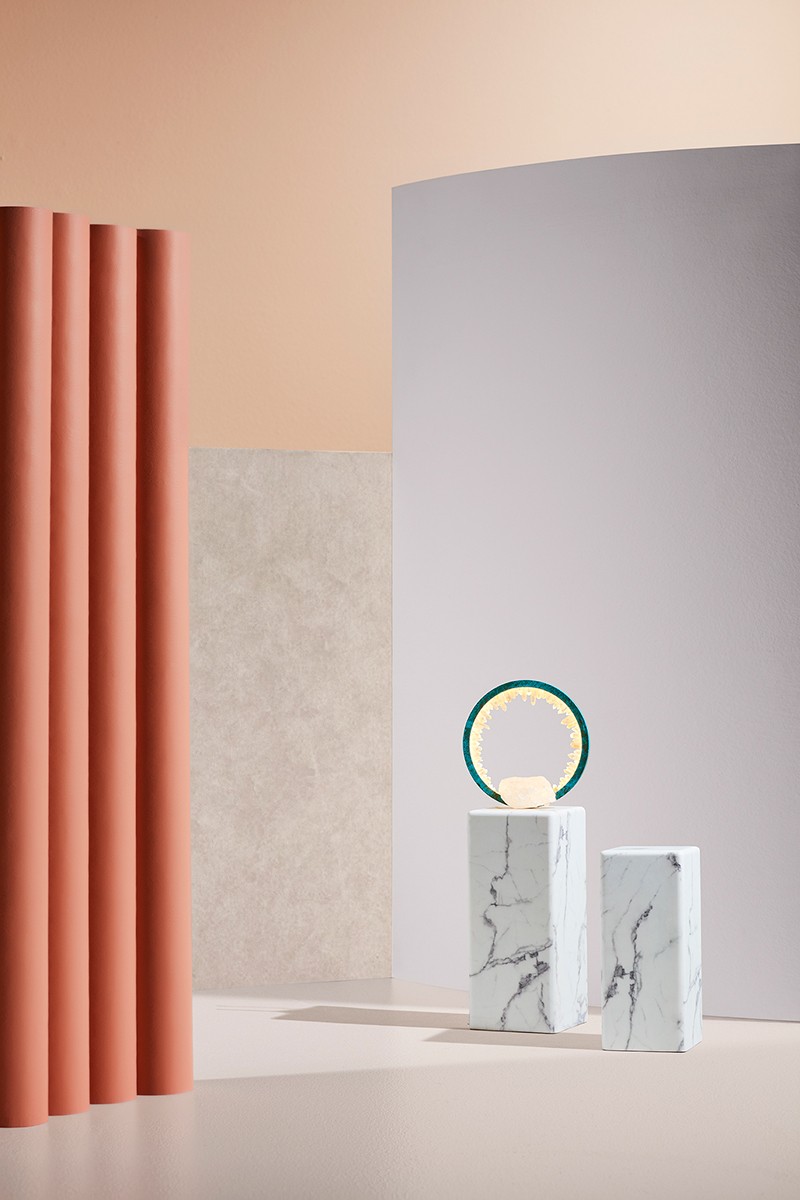
This palette conjures undulating forms and light muted shades. Sparse, paired back and soft these colours truly reflect the rise in the wellness revolution. Warmth is expressed through neutrals and soft pinks, with touches of gold. In a word, this collection is calm.

Keeping with the overall theme and also focused on ideas around the self, the Identity palette continues in its soft, wellness approach while allowing for opportunities of individual expression or imagination. Continuing the focus on self, however, with a shift in emphasis, the Identity palette encourages individuality and imagination.
Bringing in a playful mix of colours, Identity is non-conformist in its approach. The range is made up of saturated blues, purples and oranges with clashing patterns and contrasts.


Again calling on the overarching theme of ‘Filter’, the Repair palette draws on the natural world and an increasing need to rethink the way we consume. It presents a dichotomy of strength and fragility.
Finishes are more textured and hues derived from nature, with earthy cinnamons and siennas complemented by warm greens and lively yellows.


The final palette in the new forecast is Legacy. This range is directly influenced by craftsmanship, timelessness and weaving together old and new. Best described as elegant eclecticism, it is expressed through contemporary takes on Art Deco.
Colours include warm pinks, shades of lilac and mauve with deeper highlights of reds, blues and greens.


See the Dulux Colour Forecast from 2018.
INDESIGN is on instagram
Follow @indesignlive
A searchable and comprehensive guide for specifying leading products and their suppliers
Keep up to date with the latest and greatest from our industry BFF's!
The internet never sleeps! Here's the stuff you might have missed