The home of architecture and design in the Asia-Pacific
Get the latest design news direct to your inbox!
Get the latest design news direct to your inbox!
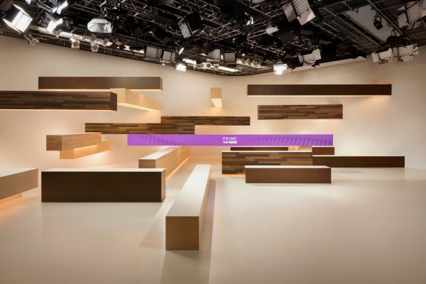
Nendo designs a single set for Fuji Television Network that allows for a variety of angles and moods that can reflect the time of the broadcast.

Japan’s ‘PRIME News’ service, produced by the Fuji Television Network, is the recently created product of a consolidation effort by the station. Four different news programs have been unified into a single brand (‘PRIME’) with a single set and common graphic elements.
Nendo was engaged to develop the new brand identity and set, and applied the ingenuity that’s synonymous with Oki Sato and his team.
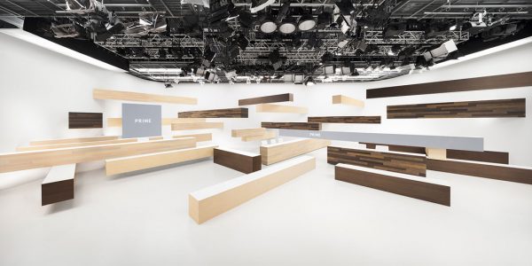
The set is composed of thick rectilinear bars that cantilever from walls and stretch across the floor, embedding the news readers in a three-dimensional matrix. Positioned at various heights, the bars create the opportunity for a dynamic backdrop to the daily news. And with seating on two levels, there is more opportunity for a variety of angles and effects. Additionally, bars can double up as seating benches or platforms on which to stand at a dramatic height.
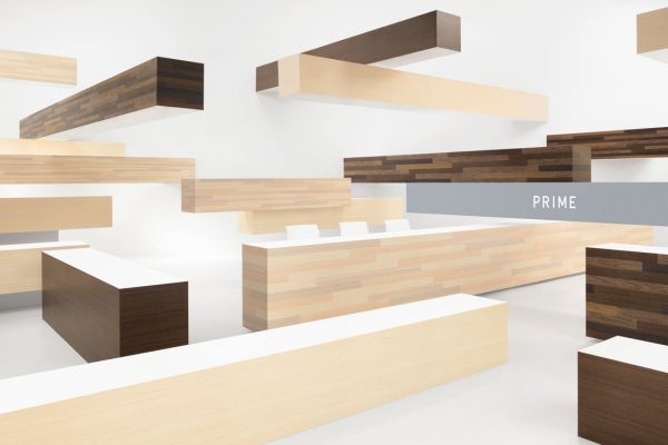
The bars are finished with two tones of wood cladding: ‘natural’ and ‘dark’. When the camera is positioned to the right, the dominant hue is ‘natural’. When positioned to the left, the ‘dark’ finish prevails. Nendo’s intent was to create feelings of intimacy and comfort, and calmness and gentility, respectively. When the camera is positioned centrally, the mix of hues creates a more vibrant effect.
One nine-metre-long bar and a two-metre-square surface are fitted with monitors for a spatial presentation of visual information. Nendo also designed the graphics for ‘PRIME’ and took into account the potential for colour to work with studio lighting to communicate a sense of time.
The colour allocated to each program relates to the colour of the sky at the time of broadcasting: light blue for the day, crimson for the evening, purple for the night sky, and emerald blue for Sunday morning. The lighting for the set was given equal consideration, and as such hints at the morning sun shining through the trees, or the rich warmer colours of evening.
Says Nendo, “Unlike the internet, where necessary information can be obtained instantly with precision, TV is a media where the viewers obtain information passively. Therefore, the role partaken by these news programs is not to offer an extraordinary and strong stimulating experience, but more of a source of information that integrates into everyday life, making a rhythm for daily life. The goal of the design was to achieve a sense of a comforting ‘matter of course’, resembling freshly baked bread that you will not get tired of eating everyday.”
INDESIGN is on instagram
Follow @indesignlive
A searchable and comprehensive guide for specifying leading products and their suppliers
Keep up to date with the latest and greatest from our industry BFF's!
The internet never sleeps! Here's the stuff you might have missed


")