Paola Lenti makes a case for colour confidence

Published

Paola Lenti makes a case for colour confidence

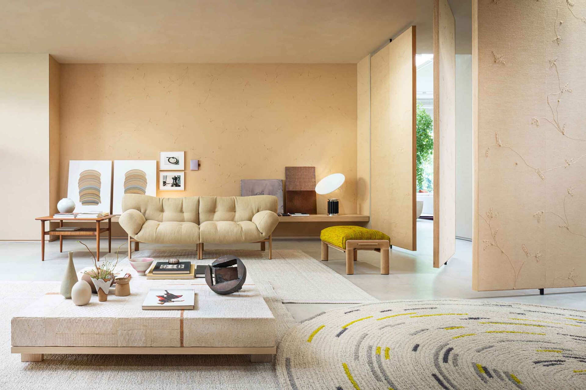
At dedece Sydney, Anna Lenti introduced the Chromatic Alphabet, a new design tool intended to make architects and designers less hesitant about working with colour.

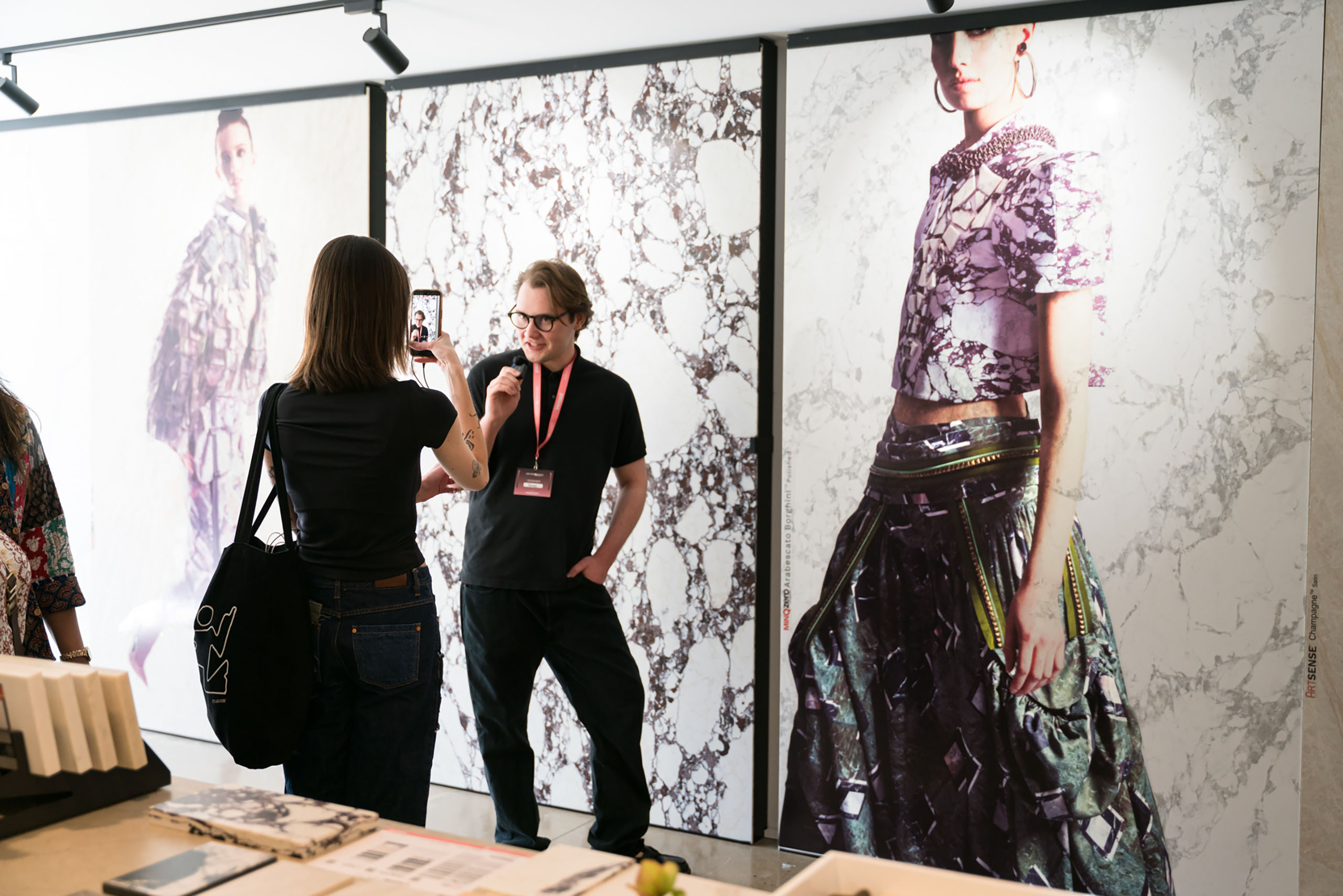
Fresh from its launch at Milan Design Week, Paola Lenti’s Chromatic Alphabet made its Australian debut at dedece Sydney, where CEO Anna Lenti led architects and designers through the brand’s latest approach to colour.

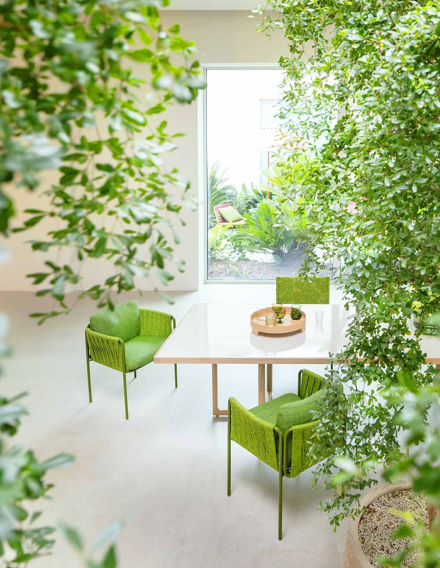
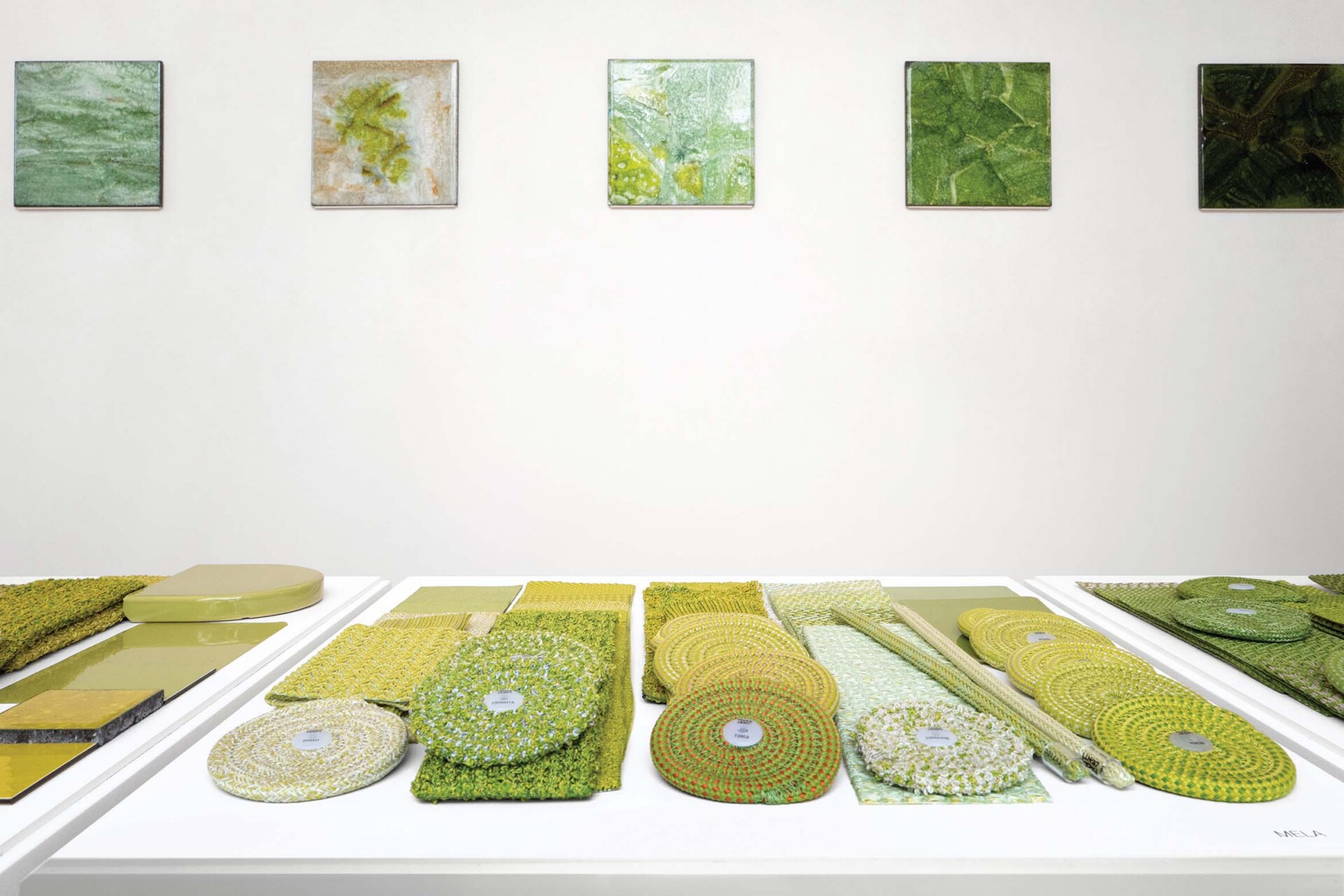
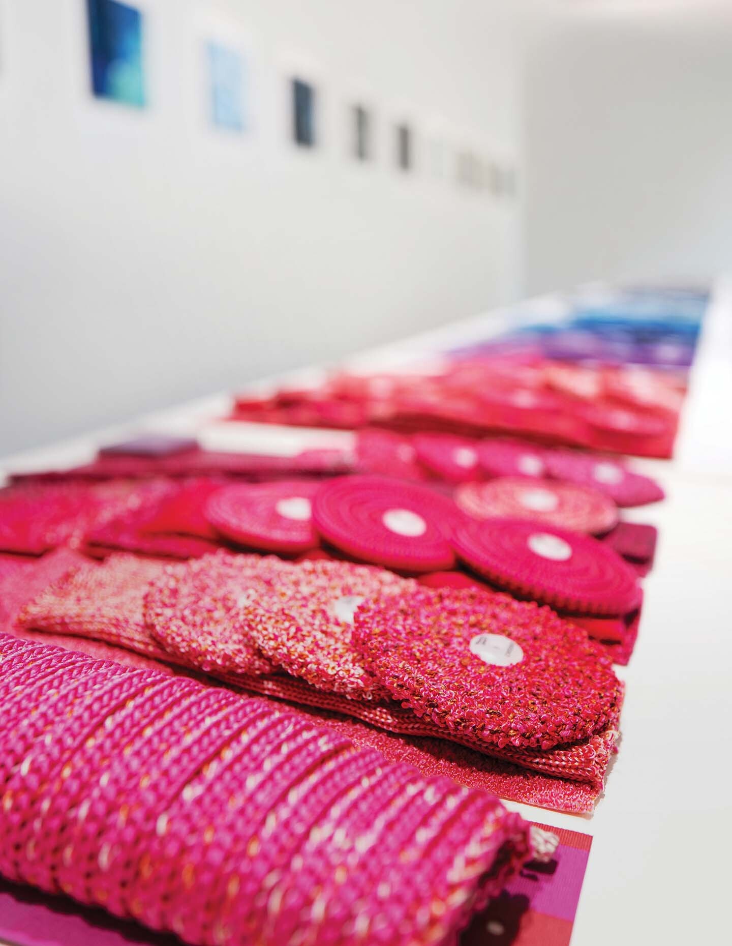
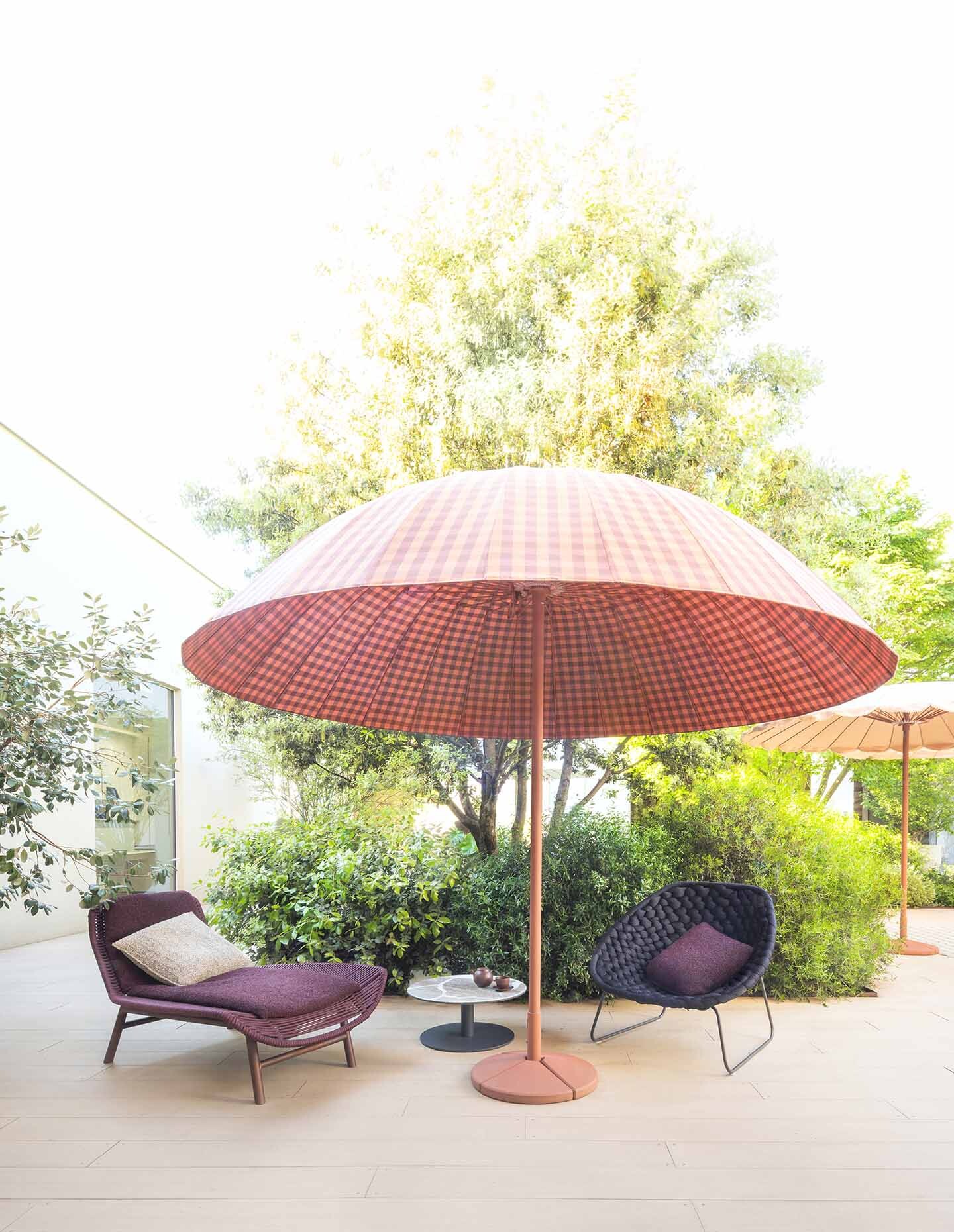
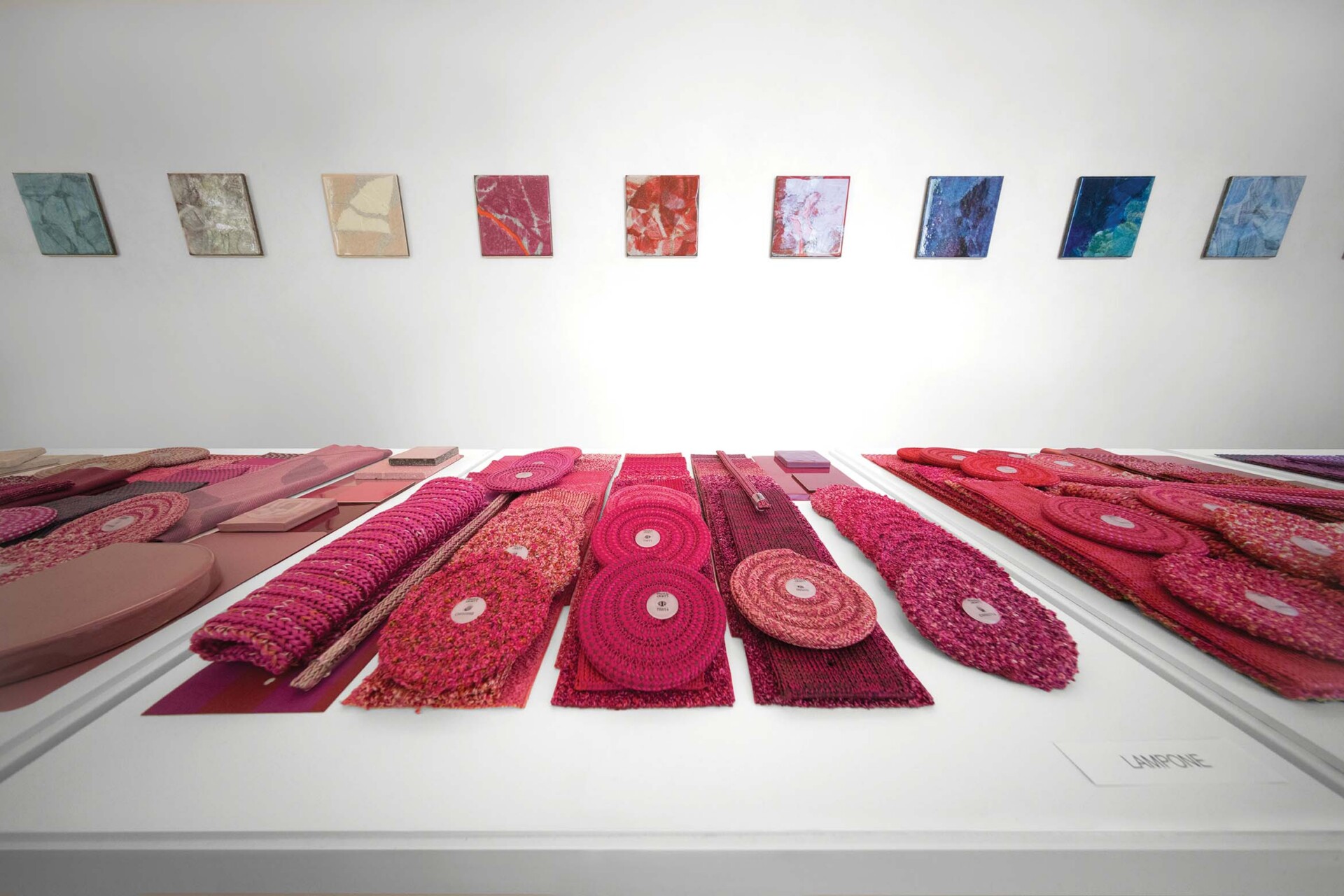
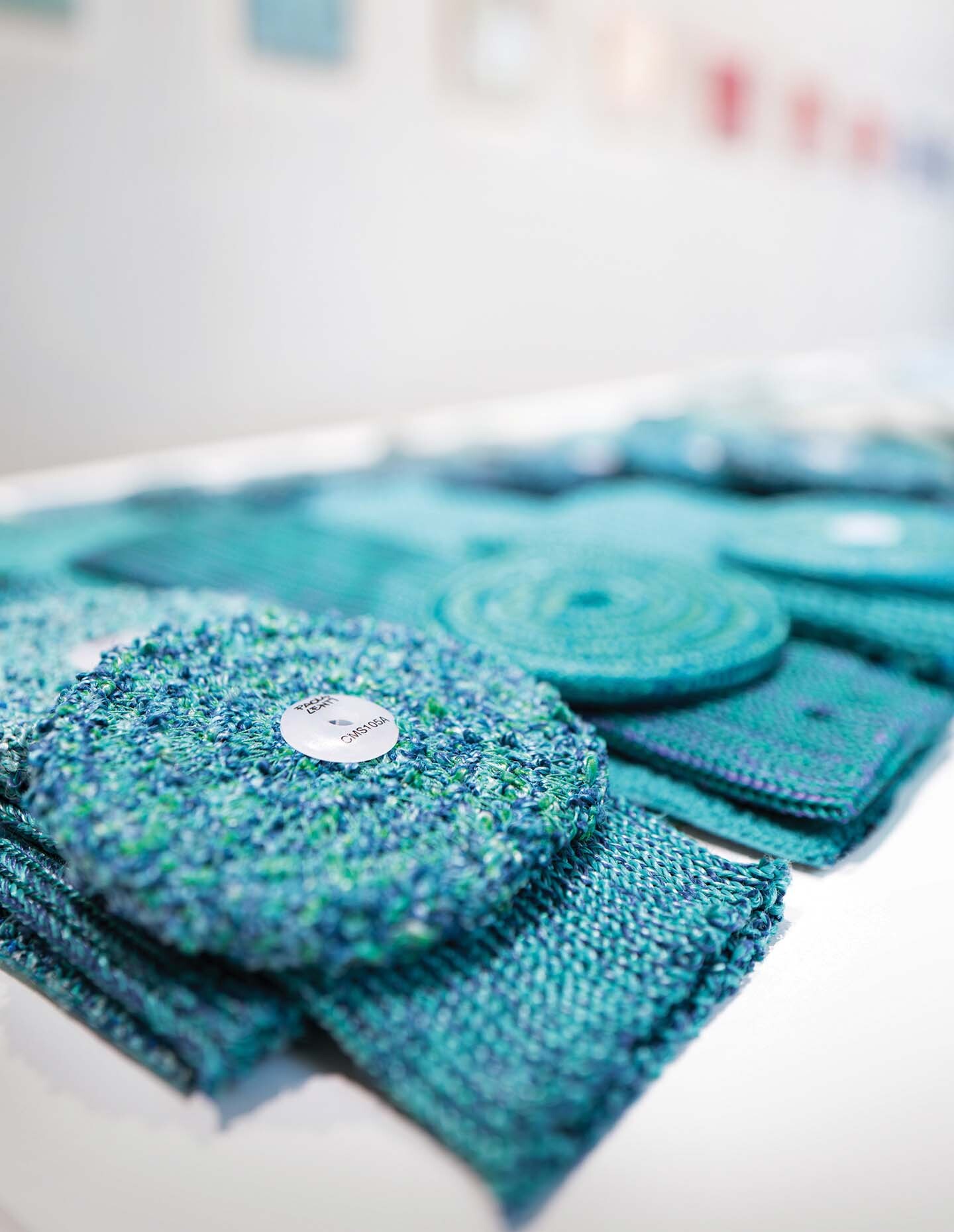
More than a palette, the Chromatic Alphabet organises over 30 years of Paola Lenti‘s material research into 44 colour families spanning textiles, ceramics, concrete and woven fibres. During the workshop, guests were encouraged to handle samples, build combinations and see how colour shifts across different materials.
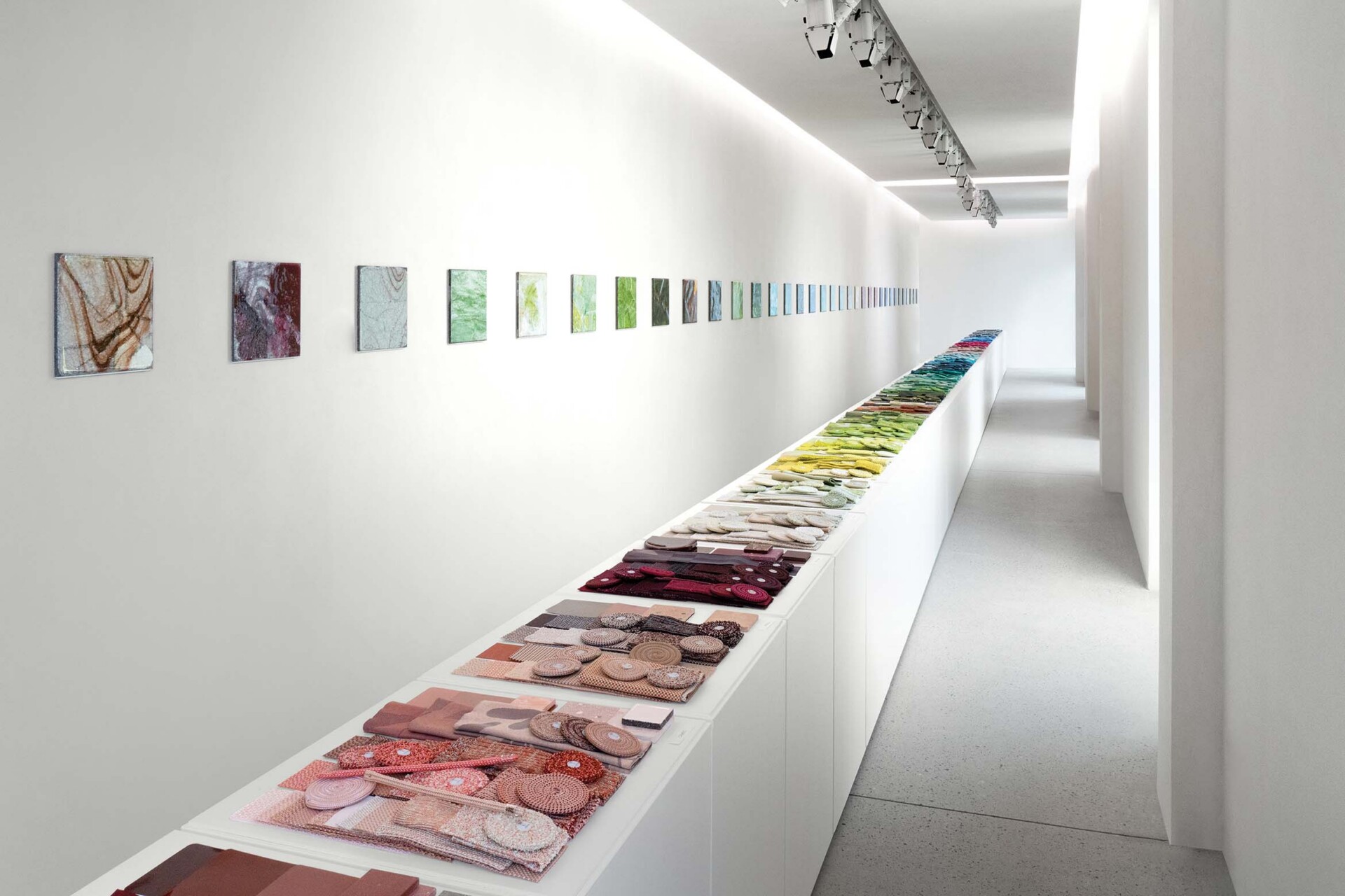
For Anna Lenti, the workshop was just as important as the system itself. “We wanted people to experience it because it’s a way of working that’s very easy,” she said. “Sometimes people are a little afraid of colour. This helps them understand they can mix and match and be creative.”

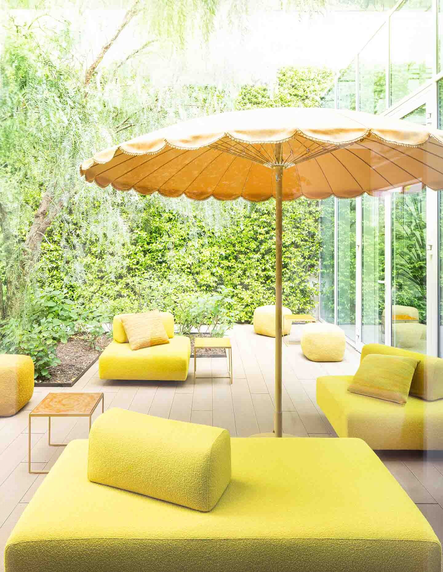
That hands-on approach was evident throughout the afternoon. Rather than presenting fixed palettes, the workshop encouraged experimentation, showing how colours within a family could move across furniture, rugs and architectural finishes while maintaining a sense of cohesion.
The Sydney presentation also followed another milestone for the Italian company. Earlier this month, founder Paola Lenti received the XXIX Compasso d’Oro Career Award, recognising more than three decades of innovation in colour, materials and manufacturing.

Speaking after the presentation, Anna reflected on working alongside her sister, who founded the company in 1994. “We love each other,” she laughed. “She’s very demanding. She’s very precise.”

Related: The national architecture awards shortlist has dropped!
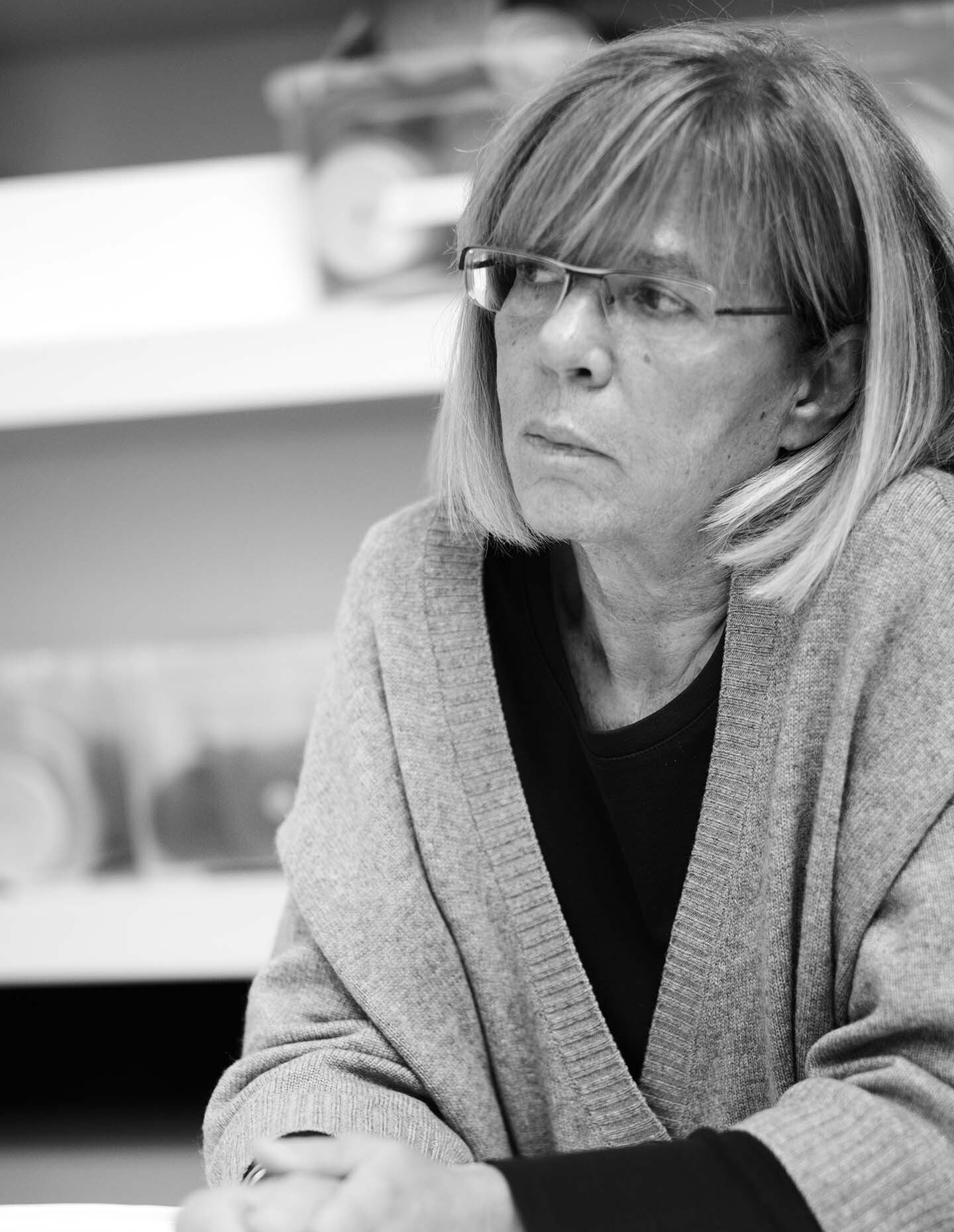
Anna Lenti.

The comment made me smile, but it also hinted at the relationship behind one of Italy’s most distinctive furniture brands. Paola leads the creative direction while Anna has guided the business as CEO for more than two decades, helping transform years of material research into an international design company.

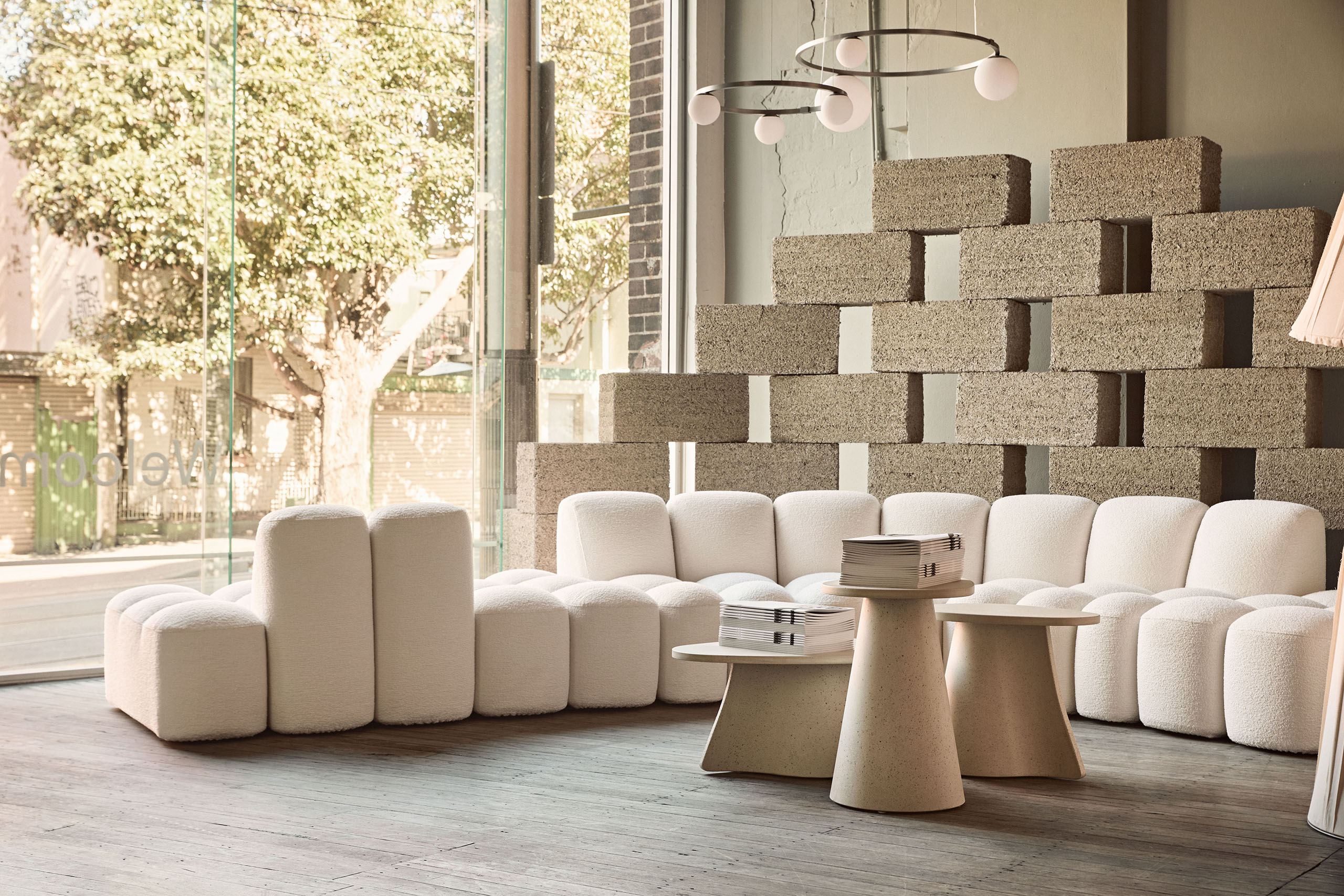
Available through dedece’s Sydney and Melbourne showrooms, the Chromatic Alphabet gives Australian designers a practical way to navigate the breadth of Paola Lenti’s collections — and perhaps a little more confidence to embrace colour.

Paola Lenti
paolalenti.it

dedece
dedece.com

Photography
Sergio Chimenti
Maurizio Natta
Related Articles

A new designer-led trade program takes the guesswork out of rug specification

Advertorials

A new designer-led trade program takes the guesswork out of rug specification

Developed by designers, for designers, Miss Amara Trade is the latest launch by leading Australian online rug specialists, Miss Amara. Working in partnership with designers, the trade program provides the expertise and tools to combat the pressures and uncertainty involved in specification.

From Our Partners
Shapeshifters of workplace design: a furniture brand providing flexibility across diverse design visions

Articles

Shapeshifters of workplace design: a furniture brand providing flexibility across diverse design visions

Today, workplace settings are fluid, ebbing and flowing between focus, informal discussion and collaboration. For this reason, versatility is at the core of Klaro Industrial Design’s perspective. Their designs continue to push the boundaries of what commercial furniture can offer, as demonstrated in a new collaboration between Klaro Industrial Design and Concept CI, a design and construction company focused on commercial interiors.

From Our Partners
Small Gestures, Distinctive Design: Inside Gaggenau’s Approach to Interaction

Articles

Small Gestures, Distinctive Design: Inside Gaggenau’s Approach to Interaction

With Gaggenau’s floating control ring, interaction and interface designer Soeren Strayle brings physical presence to the digital interface, finding room for precision and familiarity.

From Our Partners
The material promoting local expression across borders: American hardwood harmonises with Indonesian design and craftsmanship.

Articles

The material promoting local expression across borders: American hardwood harmonises with Indonesian design and craftsmanship.

When the American Hardwood Export Council (AHEC) first collaborated with Studio Hendro Hadinata in 2025, they presented the KARANA collection, featuring three gallery-worthy pieces poetically flowing as though under a sculptor’s hand. Now in 2026, the collaboration brings the same finesse to everyday dining and living, expanding the collection with KARANA Habitat.