The home of architecture and design in the Asia-Pacific
Get the latest design news direct to your inbox!

Get the latest design news direct to your inbox!
2016/ is a design collaboration that commemorates the historic porcelain practice in Japan, its provincial artisans, and the pursuit of slow design in a fast-paced world. Sammy Preston writes.

October 20th, 2016
2016 marks the 400th anniversary of Arita – an ancient porcelain practice named after an idyllic village surrounded by mountains and forests in the Saga Prefecture of Japan. It was in Arita where Japan’s very first porcelain was made, and while the local industry has waned significantly over the years, Arita remains as a porcelain town.
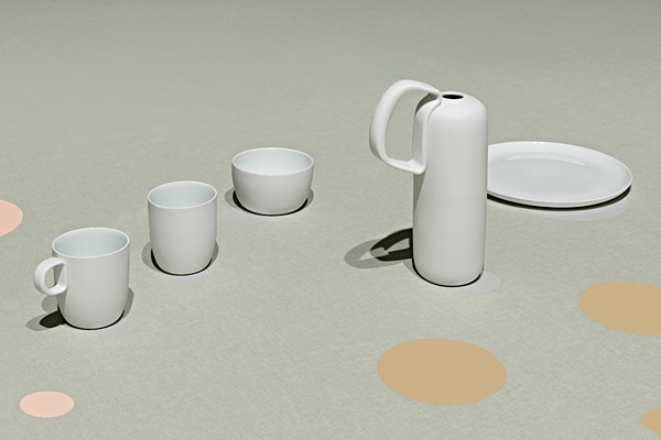
Led by Dutch design duo Scholten + Baijings and Japanese designer Teruhiro Yanagihara, 2016/ is a collaborative design project aimed at preserving the ancient Arita technique and reviving its local industry through design. 2016/ also commemorates 400 years of Dutch-Japanese relations. In the past centuries, The Netherlands stood as a significant importer of Arita porcelain. Today, this unique and longstanding relationship formed part of the inspiration for reviving Arita wares.
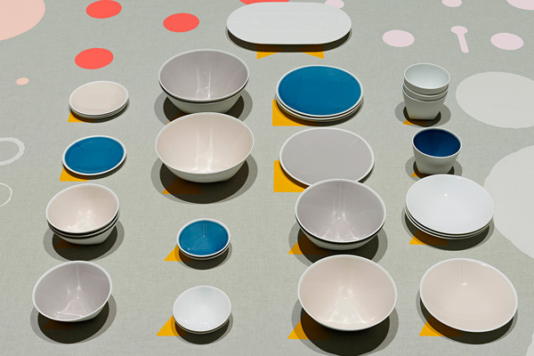
The 2016/ project includes 16 collections of contemporary porcelains created by Arita’s local artisans and 16 international designers, handpicked by Yanagihara and Scholten & Baijings. These designers were paired with Arita-based pottery producers, who guided the process.
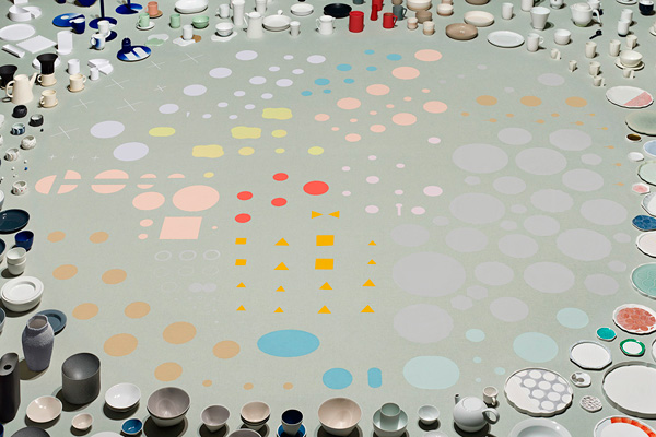
For the project, Scholten + Baijings designed 27 hand-painted dishes, and each piece has its origins in actual historical forms. These styles were superimposed on one another by combining two, or even three outlines, forming complex new shapes, which could only be produced with the help of the latest technology. Supported by the Saga Ceramics Research Laboratory in Arita, Scholten + Baijing’s highly detailed moulds were created using 3D printing and 5Axis CNC milling.
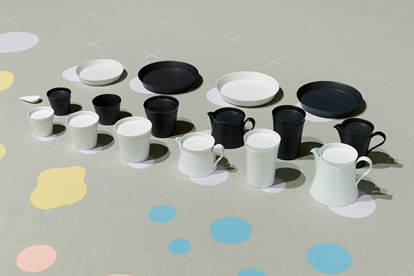
Other 2016/ designers include New York studio Leon Ransmeier, jewellery designer Saskia Diez and her partner industrial designer Stefan Diez, Zurich designers Kueng Caputo, and Christian Haas.
Arita
2016arita.com

INDESIGN is on instagram
Follow @indesignlive
A searchable and comprehensive guide for specifying leading products and their suppliers
Keep up to date with the latest and greatest from our industry BFF's!
The internet never sleeps! Here's the stuff you might have missed